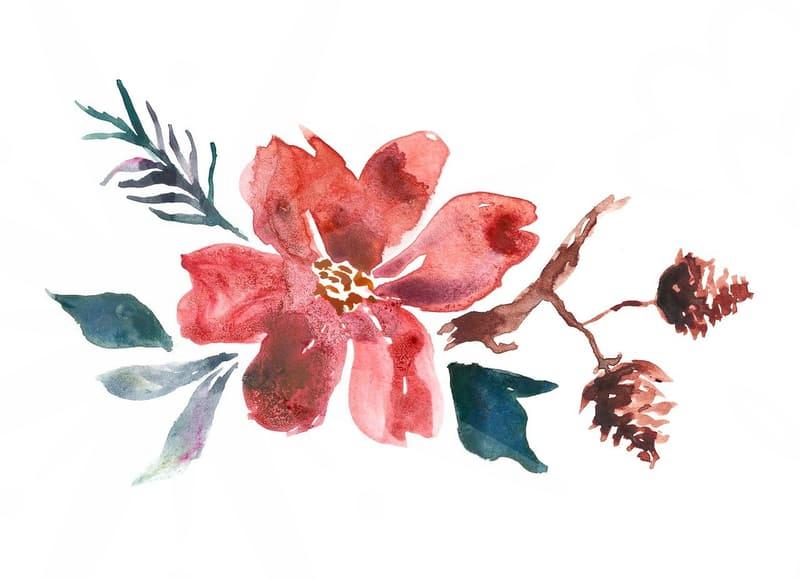
Why You Should Stop Searching for the Perfect Illustration Image
Why most illustration image searches end in failure
Many professionals spend hours scrolling through stock sites looking for that one perfect illustration image to complete a project. The reality is that the more time you spend searching, the more likely you are to settle for a generic graphic that fails to convey your specific brand message. If you are a designer or a marketing lead, you know the frustration of finding a high-quality file that refuses to resize without losing its crisp lines. Most of these files are locked in raster formats, meaning they lose their clarity the moment you scale them beyond their original dimensions.
I have observed many colleagues struggle because they treat stock libraries as a primary resource rather than a fallback option. When you rely on pre-made graphics, you inevitably end up with a visual that someone else is also using for a completely different purpose. This creates a disconnect in your content. If you are building a professional presentation or a business website, the lack of visual consistency becomes a liability rather than an asset. You end up wasting time attempting to recolor or distort an existing image to fit your layout instead of creating something that actually works from the start.
How to judge if your illustration image is actually usable
Before you commit to a specific graphic, you need to verify its technical integrity. A major mistake is assuming that a high-resolution preview translates to a functional asset. If you are dealing with a complex project like a custom event landing page or a detailed menu design, the file structure matters more than the visual appeal. Does the file come in a scalable vector format like AI or SVG? If it is a flat JPEG or PNG, your ability to edit the composition is virtually zero. You are effectively trapped by the choices of the original artist.
Consider this step-by-step checklist when selecting assets: First, identify the primary color space. If it is meant for print, it must be in CMYK mode to avoid color shifting during production. Second, check the layer complexity. If you need to remove a background or change a specific character, a flat file will require at least 30 minutes of manual masking work in Photoshop. Third, evaluate the licensing. Many free resources have hidden terms that restrict commercial use. If you fail to verify these three points, you risk either a technical failure during production or a copyright dispute later down the line.
The hidden trade-off between AI generated graphics and custom work
We see a rapid rise in AI-driven tools that promise instant creation of complex scenes, but this introduces a distinct set of limitations. While you can prompt an AI to generate a scene, the resulting illustration image often lacks the precision required for tight UI layouts. AI often struggles with specific branding requirements, such as maintaining a consistent style across ten different screens of a mobile app. You might get a great result on the first try, but generating a matching secondary visual is often a nightmare of hit-or-miss prompting.
Comparing this to professional manual design reveals a harsh truth. A human designer might take 4 to 8 hours to create a bespoke set of icons or a hero image, but those assets will be perfectly modular. You can pull them apart, swap colors, and reuse them across different marketing materials for years. When you rely on AI for every asset, you gain speed in the initial ideation phase but pay for it with maintenance debt. You are essentially building a brand on top of sand, constantly regenerating images rather than building a stable asset library.
Moving away from reliance on stock assets
If you want to improve your workflow, prioritize building a library of modular components. Instead of searching for a complete, busy scene, look for individual elements that you can combine yourself. This is a common strategy among senior designers who treat an illustration image as a set of parts rather than a finished product. By focusing on simple shapes and paths, you gain control over the weight, stroke, and color profile of your graphics. This makes your final design look cohesive rather than a patchwork of mismatched styles found on different stock websites.
Practical application is simple. Dedicate one afternoon to creating a basic set of assets that align with your brand identity. You might need to study basic vector path manipulation, which takes roughly two hours of practice for an intermediate user. Once you have a base, you stop searching for external graphics because you have a standardized internal resource. This approach saves you from the cycle of searching and failing, providing a permanent solution that grows with your business.
Is your current visual strategy sustainable
The ultimate limitation of using off-the-shelf graphics is the lack of uniqueness. If you are competing in a saturated market, your visuals need to signal that your business is distinct. Using the same stock illustration image as your competitor is an subtle way of telling your audience that you do not value custom detail. If you are a solo entrepreneur or a small team, the best move is to allocate budget toward creating a signature set of icons or visuals rather than paying for stock subscriptions that yield mediocre results.
Think about the last time you downloaded an asset just to satisfy a deadline. Did that image really fit, or did you just force it into the space? If you want to refine your process, search for vector path tutorials or basic illustration workshops that focus on modular design. Start by identifying the three most common visual tasks you perform each month and try to build a custom template for just one of them. The next time you need a graphic, resist the urge to search and see if you can assemble it from your existing set of shapes.