Effective Business Card Design Production Strategies
Creating effective business cards is more than just putting your name and contact information on a piece of cardstock. It’s about making a tangible first impression that reflects your professionalism and brand identity. As someone who works with design tools daily, I’ve found that the most impactful business cards are often the simplest, yet thoughtfully executed.
When approaching business card design production, consider the primary goal: to be remembered and easily contacted. This means clarity and readability are paramount. A common mistake I see is cramming too much information onto the card, making it look cluttered and overwhelming. Think about what information is absolutely essential for someone to reach you or learn more about your services. Usually, this includes your name, title, company name, phone number, email address, and website. A physical address is often less critical in today’s digital age, unless your business relies heavily on local foot traffic.
The Core Elements of Business Card Design
A well-designed business card effectively communicates who you are and what you do. Let’s break down the essential components. Firstly, the typography. Choosing the right font is crucial. It should align with your brand’s personality – elegant, modern, or perhaps more traditional. For instance, a law firm might opt for a serif font like Times New Roman or Georgia for a sense of gravitas, while a tech startup might prefer a clean sans-serif font like Open Sans or Lato for a contemporary feel. Legibility at a small size is key; tiny, ornate fonts are a recipe for disaster. Aim for a font size that is easily readable, generally around 7-8 points for contact details.
Secondly, consider the layout and white space. Many clients mistakenly believe that more content equals more value. However, strategic use of white space, or negative space, actually enhances the readability and visual appeal of your card. It guides the viewer’s eye to the most important elements. Imagine a busy street versus a quiet park; the park allows you to focus on individual elements more easily. A common mistake is placing elements too close to the edge of the card, which can look unprofessional and may even be cut off during the printing process. Leaving a margin of about 3-5mm from the edge is a safe bet.
Design Production Process: Step-by-Step
Producing a professional business card involves several key steps. It’s not just about opening a design program and throwing things together. The first step is Information Gathering and Prioritization. Before you even think about design, list out all potential information you’d like to include. Then, ruthlessly cut it down to the essentials. What do you absolutely need on there? Who is your target audience and what information will they find most useful?
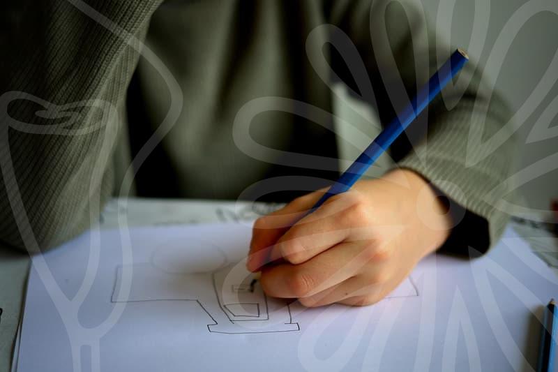
The second step is Concept and Sketching. Even for a simple business card, a quick sketch can help visualize different layouts and arrangements. Think about where your logo should go, how your name should be emphasized, and how contact details will be organized. This might take anywhere from 15 to 30 minutes. Don’t underestimate the power of a rough doodle on a piece of paper.
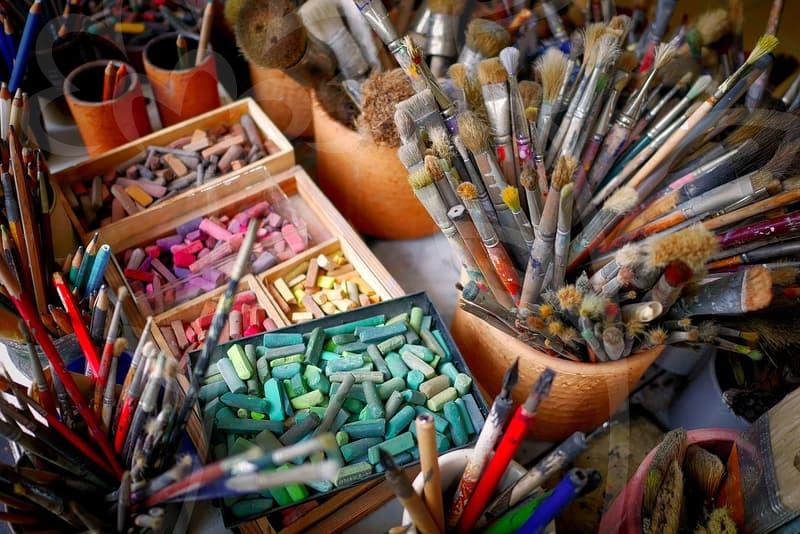
Third, Digital Design and Refinement. This is where you translate your sketches into a digital format using software like Adobe Illustrator or even simpler tools if your needs are basic. Pay attention to color palettes, ensuring they align with your brand. If your brand uses specific colors, use those precise CMYK or RGB values. For instance, if your brand color is a specific shade of blue, use its exact CMYK value, say C:80 M:60 Y:20 K:10, to ensure consistency across print materials. Check the resolution; designs intended for print should ideally be at least 300 DPI (dots per inch).
Finally, File Preparation and Printing. Once the design is finalized, you need to prepare the files correctly for your chosen printer. This often involves saving in a print-ready format like PDF, with bleed and trim marks included. Bleed is an extra margin of your design that extends beyond the trim edge, ensuring no white borders appear after cutting. A typical bleed is 3mm. It’s also important to work with a reputable printing service. Many online printers offer various paper stocks, finishes like matte or gloss, and edge painting options, which can add a unique touch but also increase costs. A standard business card size in Korea is 90mm x 50mm.
The Trade-offs in Material and Finish Choices
When it comes to business card production, the material and finishing touches offer a wide array of choices, but each comes with trade-offs. Standard cardstock, typically around 250-300gsm, is the most cost-effective option. It’s durable enough for everyday use and readily available. However, it might not convey a sense of luxury or uniqueness.
Moving up, thicker stocks like 400gsm or even 600gsm provide a more substantial feel, suggesting quality and permanence. This can be a positive psychological cue for potential clients. The downside is the increased cost. A set of 100 cards on premium, thick stock can cost significantly more than the same quantity on standard paper. Furthermore, very thick cards might not fit easily into some wallets or cardholders.
Finishing options also present interesting dilemmas. A matte finish offers a sophisticated, non-reflective surface that’s good for readability and avoids fingerprints. It feels understated and professional. A gloss finish, on the other hand, makes colors pop and provides a shiny, modern look. It can make your card stand out visually, but it’s prone to glare and smudges. Spot UV, where a glossy coating is applied to specific design elements on a matte background, can add a premium feel, highlighting logos or text. However, this adds another layer of cost and complexity to the printing process.
Specialty papers, such as textured linen or cotton-based stocks, can add a tactile dimension that makes your card memorable. These often feel more artisanal or high-end. The major trade-off here is the price; these materials are considerably more expensive than standard options. Also, intricate designs might not print as sharply on heavily textured surfaces. For example, a QR code needs a clear, flat surface to be scanned reliably. If your primary goal is to maximize reach through QR codes, a highly textured paper might be a poor choice.
Ultimately, the best approach is to align your material and finish choices with your brand identity and budget. A minimalistic design on a high-quality, textured paper can speak volumes without needing excessive embellishments. Conversely, a vibrant, modern design might benefit from a gloss finish to emphasize its boldness. It’s about finding that sweet spot where aesthetics, functionality, and cost intersect. A common rejected reason by printers is incorrect file setup, like missing bleed or incorrect color profiles (e.g., using RGB for print instead of CMYK). Always confirm the printer’s specifications before sending your final files.
For those just starting out or with a tight budget, focusing on clean typography and layout on standard cardstock is a perfectly viable strategy. The most effective business cards are those that are clear, professional, and easy to act upon. You can always explore premium options later as your business grows. If you’re unsure about printing requirements, contacting your chosen print shop directly before you finalize your design is a prudent step. They can often provide templates and specific guidelines.