Understanding the difference between CI and BI when building your brand
When starting a business or refreshing a brand, you will inevitably run into the terms CI and BI. They are often used interchangeably in casual conversation, but in the professional world of branding, they serve distinct roles. Understanding the difference is not just about vocabulary; it is about how you approach your business’s visual and strategic foundation. CI stands for Corporate Identity, while BI stands for Brand Identity. Think of CI as the internal DNA of the entire company, whereas BI is the public-facing personality of a specific product or service line.
CI is usually what a company uses to communicate its vision, culture, and core values to the world. It encompasses the official logo, the color palette, and the typographic rules that apply to the organization as a whole. When you see a large organization launch a new campus or a community project—like the recent I-RISE project in Incheon—the development of a CI is a critical step in signaling that the entity is officially active and unified. For a small business owner, your CI might be simple, but it represents the stability and promise of your business entity. It is the “face” of your company on legal documents, office signage, and staff uniforms.
BI, on the other hand, is much more fluid and product-focused. If your company is a food manufacturer, your CI is the company logo that appears on the website footer, while your BI might be the unique branding for your specific line of energy drinks or health supplements. Large companies, such as KGC with the ‘JeongKwanJang’ brand, treat BI as a strategic weapon. They register trademarks not just for the corporate logo, but for individual product names and packaging designs. This is a practical reality of modern business; protecting your BI with trademarks acts as a shield against competitors who might try to mimic your market success. If you are creating a logo for a new restaurant or an apparel line, you are essentially developing a BI that needs to be distinctive enough to stand out on a shelf or a social media feed.
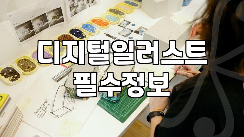
From a design process perspective, the difference is also in the scale of the work. When designers handle a CI project, they are creating a comprehensive manual. This manual defines how the logo is used in various environments, from a tiny business card to a massive billboard. It dictates spacing, color values (CMYK and RGB), and forbidden uses. A BI project is often more experimental. It allows for creative freedom that matches the target demographic of the specific product. Whether you are working with a design agency or trying to draft a logo yourself, realize that the goal of a CI is consistency, while the goal of a BI is resonance with the customer.
One common frustration for new business owners is the time and cost involved in securing these assets. Developing a proper CI or BI is not just about drawing a pretty icon. It involves initial research, concept sketches, vectorization, and finally, the arduous process of checking for trademark availability. If you are hiring a designer, expect to pay for the intellectual labor of “brand strategy” rather than just the hourly rate of drawing. If you are doing it yourself using software like Adobe Illustrator, the technical skill required for professional-grade results is significant. Even if you manage the design aspect, the legal side—registering your trademarks through an intellectual property office—adds another layer of cost and time that many people underestimate. It can take months for a trademark to be officially recognized, which is why it is best to start the process as early as possible before you spend money on physical signage or marketing materials.
Ultimately, whether you are developing a CI for your company or a BI for your signature product, remember that these elements are meant to be long-term investments. They are the shorthand that customers use to identify your quality and reliability. Do not get too caught up in trends that might look dated in two years. Focus instead on clarity and legibility. A logo that looks beautiful on a high-resolution computer screen but becomes a muddy mess when printed on a small coffee cup or a product tag is not an effective brand asset. Practicality should always win over unnecessary complexity when it comes to visual identity. Keep your files organized, keep your trademark filings up to date, and treat your brand identity as an evolving asset rather than a static “finished” project.