Realistic Graphic Design for Busy Professionals
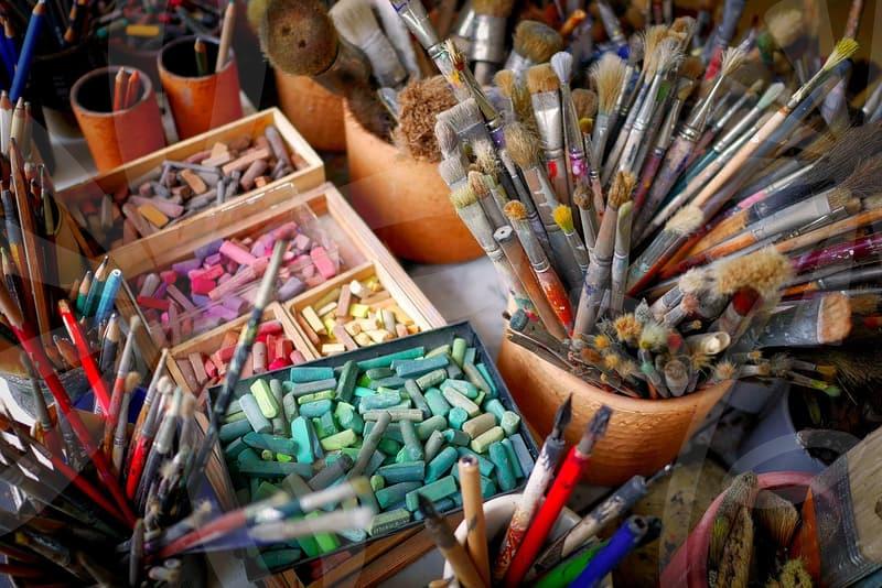
Graphic design for professional use often gets bogged down in feature bloat. Many tools promise the moon with endless options, but what we really need are efficient ways to get solid results quickly. For someone juggling multiple projects and tight deadlines, a tool that simplifies the process without sacrificing quality is key. It’s not about having every brush stroke or gradient option imaginable; it’s about achieving a professional look with minimal fuss.
Think about a typical scenario: needing to create a quick social media graphic, a simple flyer for an internal event, or an updated presentation slide. You don’t have hours to spend learning a complex interface. The goal is to get the job done and move on to the next task. This is where practical design tools and a clear understanding of core graphic design principles become invaluable. It’s about making informed choices that save time and effort.
Choosing the Right Graphic Design Software: Efficiency Over Extravagance
When selecting graphic design software, the temptation to go for the most feature-rich option is strong. However, for the day-to-day needs of a professional, this can be counterproductive. Consider Adobe Photoshop and Illustrator, industry standards with unparalleled depth. Yet, for many common tasks, they might be overkill. Learning their extensive functionalities can take weeks, even months. This learning curve is a significant time investment that may not yield proportional returns for simpler projects.
For instance, creating a clean, professional-looking banner for a company intranet or a basic infographic doesn’t necessarily require advanced masking techniques or complex vector manipulation. Tools like Canva, Affinity Designer, or even simpler vector editors can often suffice. Canva, with its template-driven approach, allows users to produce presentable designs in minutes. Affinity Designer offers a powerful, one-time purchase alternative to subscription-based software, striking a balance between features and cost. The decision hinges on what problems you’re trying to solve most frequently. If your primary need is rapid output for digital platforms, a template-based or streamlined vector tool might be far more effective than a full-blown professional suite.
Streamlining Your Graphic Design Workflow: Practical Steps
Effective graphic design isn’t just about the software; it’s about the process. A common mistake is starting without a clear plan, leading to endless revisions and wasted time. Before even opening a design program, take a few minutes to sketch out your concept. What is the core message? Who is the target audience? What feeling should the design evoke? Having answers to these questions provides direction.
Let’s break down a typical workflow for creating a social media post. First, define the objective: is it to announce an event, promote a product, or share a company update? Next, gather your assets: logos, brand colors, and any relevant images. If you’re using brand guidelines, ensure they’re readily accessible – this saves the time of looking them up later. Then, select your tool. For a quick social post, a platform like Adobe Express or even Canva can be efficient. Start with a template that aligns with your brand or concept. Modify text, replace placeholder images with your own, and adjust colors to match your brand palette. The crucial step here is iteration within defined limits. Avoid endlessly tweaking fonts or colors. Aim for a solid first draft that meets the objective. A realistic estimate for creating a well-designed social media post using these streamlined steps might be 15-30 minutes, rather than several hours.
Common Pitfalls to Avoid in Professional Graphic Design
One significant pitfall is the temptation to over-design. Adding too many elements, using excessive fonts, or packing in too much information can overwhelm the viewer and dilute the message. Clarity and simplicity are often the most powerful design choices. Consider a recent internal company newsletter redesign. The initial draft was filled with complex graphics and multiple font styles, making it difficult to scan. The revised version, focusing on a cleaner layout, consistent typography (using just two font families), and clear visual hierarchy, was far more effective. It took roughly 4 hours for the redesign of the template, including initial concept and final output, significantly less than the previous attempts at detailed graphics.
Another common mistake is neglecting legibility. Text that is too small, has poor contrast against its background, or uses overly decorative fonts can render the design ineffective. For example, trying to fit too much text into a small banner or using a script font for body copy will invariably lead to rejection or poor user engagement. Always check text readability at the intended display size. Ensure sufficient contrast, aiming for a contrast ratio of at least 4.5:1 for normal text, as recommended by WCAG guidelines. This focus on fundamental usability is often overlooked in the rush to create something visually striking.
Graphic Design Beyond the Screen: Print Considerations
While much of our daily work involves digital graphics, understanding print design is still relevant for many professionals. The requirements for print differ significantly from screen-based design. Color modes, resolution, and bleed areas are critical factors that can lead to costly mistakes if ignored. For instance, using RGB color mode for a brochure intended for professional printing will result in dull, inaccurate colors because printers use CMYK.
The resolution of images is another crucial point. For print, images should generally be at least 300 DPI (dots per inch) at their intended print size. Using lower-resolution images intended for web (often 72 DPI) will result in pixelated, blurry prints. A print project can be rejected outright by a printer if these specifications aren’t met. For a standard A4 flyer, ensuring all elements are set to 300 DPI and include a 3mm bleed area around the edges is a non-negotiable step if you want a professional finish. This is a trade-off: the detailed preparation for print takes time upfront but prevents expensive reprints and reputational damage.
Ultimately, mastering graphic design for professional purposes is about efficiency and impact. It’s about knowing when to use a powerful tool and when a simpler solution will suffice. The focus should always be on clear communication and achieving project goals with minimal wasted effort. For those needing to create professional-looking visuals regularly without a steep learning curve, exploring streamlined graphic design software and focusing on fundamental principles will yield the best results.