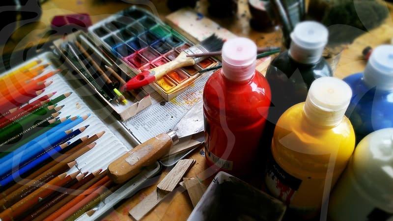
Practical Workflow Strategies for Professional Digital Illustration
Why professional digital illustration requires a systematic workflow
Many beginners treat digital illustration as a purely artistic endeavor, but professionals view it as a logistical task. When working in a production environment, the goal is not just to make a pretty image, but to deliver assets that fit within specific technical constraints. You need to consider resolution, color profiles, and file layering early on, or you will end up wasting hours on revisions later. If you start a project without defining the output requirements, you are essentially gambling with your time.
Most artists fall into the trap of over-rendering early details. A professional approach involves creating a rough composition first, verifying it with the client or team, and then moving to refined stages. This modular methodology allows for rapid iteration without losing progress. When you view the canvas as a series of manageable layers, you gain the freedom to correct mistakes without affecting the entire composition. This is why mastering the workspace layout is often more important than mastering a specific brush set.
Step by step process for building a balanced canvas
The most common mistake I see is rushing straight into coloring before the base shapes are solid. Here is how I organize a standard project from start to finish. First, establish the layout with basic geometric shapes. This prevents the tendency to fixate on fine details too early. Second, define the color palette using a limited set of hues. Third, apply shadows and highlights using a restricted range of opacity to ensure consistent light direction. Finally, clean up the lines and add textures to bring the elements together.
If you find yourself stuck at the rendering stage, go back to the base. If the composition is weak, no amount of detailed shading will save the work. I typically spend 40 percent of my time on the initial planning phase and only 20 percent on final polish. This ratio ensures that the final result is technically sound and visually impactful regardless of the complexity. If you follow this structure, you will naturally eliminate the guesswork that causes most artists to burn out.
Comparison between Adobe Illustrator and raster software
Many people confuse vector-based tools like Adobe Illustrator with pixel-based painting applications. Adobe Illustrator excels at scalable shapes and clean logos, but it lacks the nuance required for organic, painterly digital illustration. If you attempt to use vector tools for complex lighting or texture work, you will find the process cumbersome and unrewarding. Conversely, using a raster application for vector-heavy graphics creates blurry edges that look unprofessional at larger scales.
Think of the choice as using a knife versus a laser cutter. For organic, hand-drawn styles, a pixel-based brush environment provides the necessary fluidity and pressure sensitivity. If you are designing for print or UI elements that need to be resized constantly, the precision of vector paths is mandatory. I often combine both by creating assets in vector format and bringing them into my painting software for final rendering. Choosing the right tool depends entirely on your final deliverable, not on which software is currently trending on social media.
Managing the technical constraints of digital illustration projects
Working with digital illustration often involves adhering to strict technical documentation and file standards. Whether you are exporting for a game engine or a high-resolution print, the metadata and layer structure matter. I personally keep my source files under 500 megabytes to ensure performance remains snappy. If a file becomes too bloated, I export flattened versions of completed sections to keep the computer running efficiently. Ignoring these technical housekeeping tasks leads to corrupted files and missed deadlines.
For those working in collaborative settings, naming layers is not optional. If someone else has to pick up your file, they should be able to navigate the folder structure within seconds. I use a simple prefix system, such as BG for background and FG for foreground, to keep everything organized. Consistency here is the hallmark of a true professional. It might feel tedious at the start, but it prevents the common headache of searching for that one stray light layer five minutes before the deadline.
What defines the limit of your creative output
The biggest trade-off in professional work is the balance between quality and speed. You can always spend another three hours refining a shadow, but you must ask if that addition adds value to the final goal. The most successful artists are those who know exactly when to stop. If you are struggling with this, try setting a timer for the final rendering stage. Once the time is up, force yourself to finish the file and move on to the next one.
This approach helps you identify where your bottlenecks are and which techniques are actually worth the time investment. You will find that some stylistic choices are simply not worth the labor, and that is a perfectly valid insight to have. Use this experience to refine your future workflow. If you want to get started, I recommend auditing your last three projects and noting exactly where you spent the most time. Check your software documentation for scripting or shortcut features that could automate these repetitive tasks. Ask yourself if the time spent on a specific effect truly contributes to the final result, or if it is just vanity.