Practical Graphic Art Tips for Busy Professionals
As someone who navigates the world of visual content daily, I’ve learned that ‘graphic art’ often sounds more complex than it needs to be. It’s not just about creating stunning visuals; it’s about making them work efficiently. Many tools promise the moon, but the real value lies in how quickly you can get a professional result without a steep learning curve.
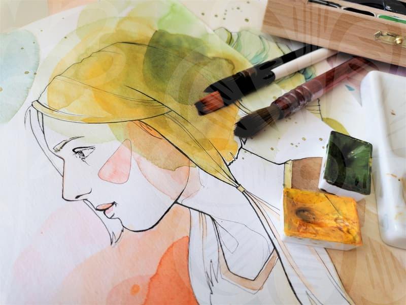
Graphic art, at its core, is about communication through visual elements. Think of a well-designed book cover or an eye-catching social media ad. These aren’t born from magic, but from a combination of design principles and practical application. For instance, when a client asks for a new logo, they aren’t just looking for a pretty picture. They want a visual representation that’s memorable, scalable, and reflects their brand identity. A common mistake I see is focusing too much on intricate details that get lost at smaller sizes, or using color palettes that don’t translate well across different media. A simple, bold design often performs far better in the long run.
Consider the trade-off between a highly specialized, feature-rich software and a more accessible, user-friendly one. While a program like Adobe Illustrator offers unparalleled control, for many everyday graphic art tasks – like creating social media graphics or simple brochures – Canva can be significantly faster. I’ve spent countless hours in Illustrator perfecting gradients, but for a quick promotional banner, dragging and dropping pre-designed elements in Canva can save me an hour or more. It’s about choosing the right tool for the job, not necessarily the most powerful one.
Deconstructing a Common Graphic Art Task: Social Media Banners
Let’s break down creating a social media banner, say for an Instagram post. The goal is to grab attention quickly. First, determine the correct dimensions. For Instagram, 1080×1080 pixels (square) or 1080×1350 pixels (vertical) are standard. Using a template in a tool like Adobe Express or even a robust online editor is a good starting point. The next step is adding compelling imagery. This could be a high-quality photograph or an illustration. If using stock photos, ensure they are relevant and not overly generic; something like a specific product shot or a lifestyle image that aligns with the message is better than a cliché handshake photo. Then, layer in text. This is where readability is paramount. A common pitfall is using too many fonts or colors. Stick to one or two complementary fonts. Ensure sufficient contrast between the text and the background. For instance, white text on a dark background, or vice versa. Finally, add a clear call to action – a website URL, a discount code, or a prompt to ‘Learn More.’ The entire process, from concept to final export, should ideally take no more than 30-60 minutes for a seasoned professional using efficient tools and workflows.
When Does Simplicity Outweigh Complexity in Graphic Art?
The question of complexity versus simplicity is a constant balancing act in graphic art. Think about corporate branding. A company like Google or Apple doesn’t rely on overly ornate logos. Their strength lies in their minimalist designs that are instantly recognizable and reproducible across an enormous range of applications, from a tiny app icon to a massive billboard. This is a result of deliberate design decisions. Over-designing a graphic art piece can lead to confusion and dilute the core message. For instance, trying to cram too much information or too many visual elements into a single flyer for a local event can make it look cluttered and unprofessional. Potential attendees might simply overlook it because it’s overwhelming.
Conversely, there are times when intricate graphic art is not only appropriate but necessary. Consider detailed technical illustrations for a manual or a complex infographic explaining scientific data. In these cases, precision and depth are key. A tool like Adobe Illustrator or Affinity Designer allows for the vector-based precision needed to create sharp lines and accurate shapes that can be scaled infinitely without losing quality. The choice hinges on the intended audience and purpose. If your graphic art is for a quick social media announcement, simplicity is king. If it’s for a scientific publication, detailed accuracy is non-negotiable. The decision-making process involves asking: What is the primary message? Who is the audience? What is the context of its display?
One area where graphic art is often underestimated is in marketing materials. Take the example of a small business owner trying to create flyers for a local community fair. They might spend hours trying to make something ‘unique’ with elaborate fonts and flashy backgrounds in a basic image editor. The result is often amateurish. A more practical approach would be to utilize design templates offered by services like Vistaprint or even within Adobe Express. These templates are professionally designed, tested for readability, and optimized for print. By simply swapping out the placeholder text and images with their own relevant content, they can achieve a professional look in a fraction of the time. This approach often requires minimal design knowledge and yields much better results than trying to reinvent the wheel from scratch.
For those starting out, understanding basic color theory and typography is more impactful than mastering every advanced filter in a photo editing suite. Knowing that, for example, blue often conveys trust and calmness, while red can signify urgency or excitement, is a fundamental piece of graphic art knowledge. Similarly, understanding font pairings – like a sans-serif for headings and a serif for body text – can dramatically improve legibility. These foundational elements, applied consistently, contribute more to effective graphic art than any flashy, albeit time-consuming, special effect.
Ultimately, the effectiveness of graphic art lies in its ability to connect with its intended audience clearly and efficiently. While powerful tools exist, understanding the core principles and choosing the right level of complexity for the task at hand is crucial. This approach saves time and produces more impactful results.
If you’re looking to improve your skills, focus on mastering one versatile tool like Adobe Photoshop or Illustrator for raster and vector work respectively, or explore user-friendly platforms like Canva or Adobe Express for quicker projects. Experiment with different layouts and color schemes for hypothetical projects to build your portfolio. The next step is often figuring out how to effectively present your work, so consider how your creations will be viewed across different devices.