Mastering Digital Illustration: Beyond Basic Tools
When diving into digital illustration, it’s easy to get caught up in the sheer volume of tools and software available. Most people begin with the expectation that more features equate to better results, but often, a few core programs and a solid understanding of fundamentals are far more effective. For those creating digital illustrations, whether for personal projects or professional work, focusing on efficiency and clarity is key.
Many beginners might look at programs like Adobe Photoshop or Illustrator and feel overwhelmed by the hundreds of brushes, filters, and layer effects. It’s a common mistake to think mastering every single feature is necessary for creating great art. In reality, a significant portion of professional digital illustration work relies on a much smaller subset of tools, used with precision and intent. Think of it like cooking; you don’t need every conceivable spice to make a delicious meal, but knowing how to properly use salt, pepper, and a few key aromatics can elevate any dish. The same principle applies to digital art. Spending weeks learning obscure blending modes might not yield as much improvement as understanding how to effectively use a basic hard round brush or a well-chosen textured brush.
The Core Workflow: From Sketch to Final Polish
Creating a digital illustration often follows a predictable, albeit flexible, path. The initial stage is usually sketching, where the idea takes shape. This can be done directly in the illustration software or even on paper and then scanned or photographed. The crucial part here isn’t the tool, but the clarity of the lines and the overall composition. A rough sketch might only take 30 minutes to an hour, depending on complexity.
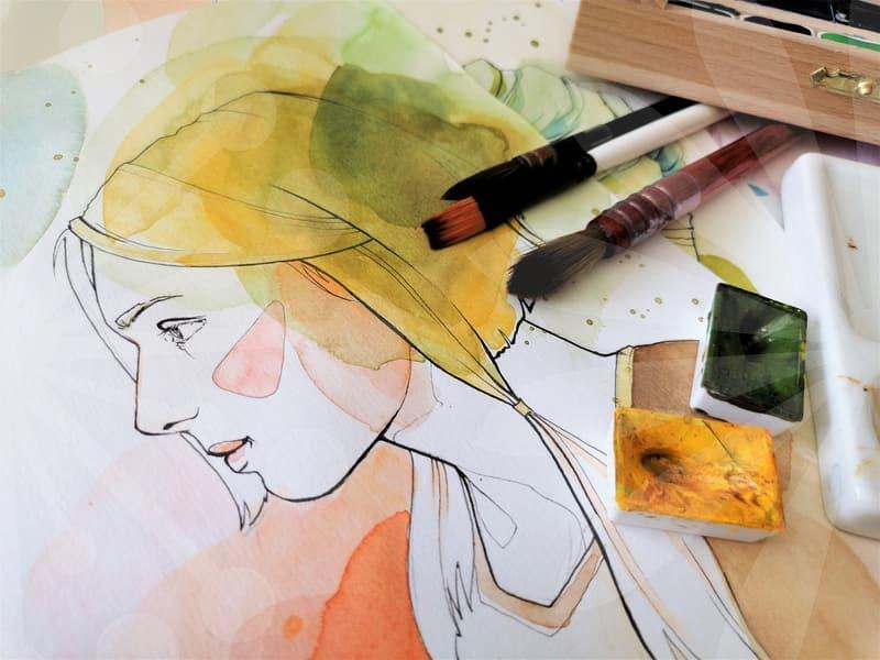
Following the sketch, most artists move to linework. This is where the rough sketch is refined into clean, defined lines. For programs like Clip Studio Paint, which is specifically geared towards illustration and comics, dedicated line art tools are often employed. In Adobe Illustrator, vector paths offer a different kind of clean line that can be scaled infinitely without losing quality. A common pitfall is spending too much time on perfecting every single line, when in fact, subtle imperfections can add character. Aim to have your linework complete within a few hours, depending on the detail required. This stage often involves decisions about line weight and style, which significantly impact the final feel of the illustration.
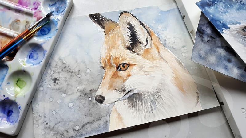
Coloring is the next major phase. This is where the artwork truly comes to life. Many artists debate between raster-based programs (like Photoshop) for painterly textures and vector-based programs (like Illustrator) for crisp, flat colors. A trade-off exists: raster offers more organic blending, but can become pixelated if scaled too large. Vector art is infinitely scalable but can sometimes look too clean or graphic for certain styles. A practical approach is to understand the strengths of each. For instance, if you need a graphic illustration for a website banner that might be resized frequently, vector might be ideal. If you’re aiming for a textured, painterly feel for a book cover, a raster program might be better suited. Expecting to spend anywhere from 2 to 10 hours on coloring, depending on the complexity and number of elements. Color theory, understanding complementary colors, analogous schemes, and saturation levels, is far more impactful here than knowing how to apply a specific gradient filter.
Finally, shading, highlights, and final touches are applied. This stage adds depth and polish. It’s about defining light sources and ensuring consistency. Over-shading is a common mistake, leading to muddy or overworked images. Often, a few well-placed highlights and shadows are all that’s needed to make the illustration pop. This finishing stage might take another hour or two.
Choosing the Right Software: Practical Considerations
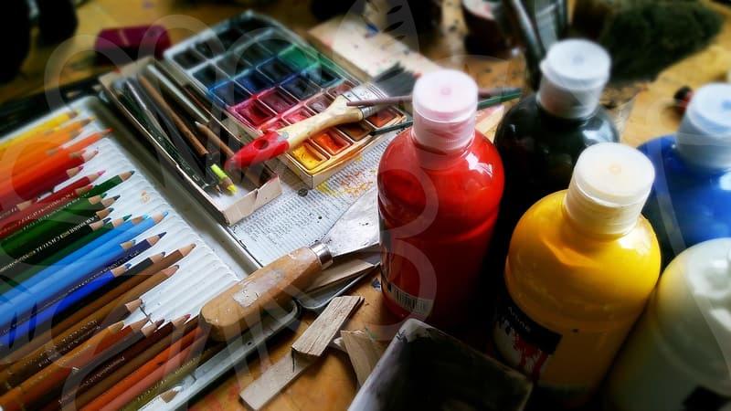
When selecting software for digital illustration, the options can seem endless. Adobe Photoshop is a dominant force, offering a vast array of tools suitable for both painting and photo manipulation. However, its subscription model can be a barrier for some. Adobe Illustrator, a vector-based program, is excellent for graphic styles and scalable art. Then there are specialized programs like Procreate for iPad, which offers a streamlined, intuitive experience that many find excellent for sketching and painting on the go. Clip Studio Paint, as mentioned, is a powerhouse for comic artists and illustrators, offering specific tools for paneling and speech bubbles alongside robust painting features. Affinity Designer and Photo present a one-time purchase alternative to Adobe’s subscription, offering robust feature sets. For beginners, considering the cost, learning curve, and intended output is crucial.
If your goal is to produce scalable graphics for logos or web elements, Illustrator or Affinity Designer might be more appropriate than Photoshop. If you’re leaning towards a painterly, textured style, Procreate or Photoshop would be strong contenders. A common rejection reason for early-career artists is inconsistent output quality, which often stems from using a tool not best suited for the job or not understanding its fundamental capabilities. For example, trying to achieve complex painterly effects in a purely vector-based program like Illustrator can be frustrating and time-consuming.
Common Pitfalls and How to Avoid Them
One of the most frequent issues newcomers face is over-reliance on filters and effects. While these can be useful for specific stylistic choices, they are rarely a substitute for skilled drawing and coloring. Relying solely on a “sketch effect” filter, for instance, produces work that often lacks originality and depth. A more effective approach is to learn the underlying principles of linework and shading and then apply them manually. This gives you far greater control and leads to a more unique artistic voice.
Another common mistake is poor resolution management. When creating illustrations, especially for print or high-definition display, starting with a sufficiently high resolution is critical. For example, an illustration intended for a standard A4 print needs to be created at a minimum of 300 DPI (dots per inch) at the intended print size. If you start too small, scaling it up later will result in a blurry or pixelated image. Many online articles suggest starting at 1920×1080 pixels for web use, which is a good baseline, but for anything potentially larger or requiring higher detail, consider canvases of 3000 pixels or more on the longest side.
Finally, neglecting file organization can lead to lost work or confusion. Saving your work frequently, using clear file naming conventions (e.g., ProjectName_Illustration_v03.psd), and backing up your files are simple habits that prevent major headaches. Losing hours of work due to a software crash or file corruption is a frustrating but entirely preventable experience.
When Digital Illustration Isn’t the Answer
It’s important to acknowledge that digital illustration isn’t always the most practical or efficient solution. For certain types of tactile art, like traditional oil painting or detailed watercolor, the digital medium can’t fully replicate the texture, material feel, or the unique process. If a project demands a specific, organic texture that’s difficult to achieve digitally, or if the client specifically requests a physical artwork, then pursuing a digital route might be a suboptimal choice. For example, a museum exhibit requiring a piece with genuine canvas texture might not be best served by a digital print, no matter how skillfully it’s rendered. In such cases, understanding the limitations of digital tools and knowing when to revert to traditional methods is a sign of professional maturity. If you’re unsure about the best medium for a specific project, consulting with professionals in traditional art fields can provide valuable insight.