Mastering Color Correction: Beyond Basic Adjustments
Achieving the right color balance in images isn’t just about making things look pretty; it’s fundamental to conveying the intended mood and message. For anyone working with visual content, whether it’s for marketing, social media, or personal projects, understanding color correction is essential. It’s not a magical process, but a systematic approach to refining the hues, saturation, and brightness of an image.
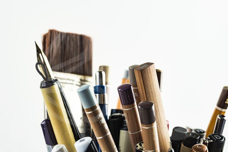
Many newcomers to photo editing dive straight into filters, hoping for a quick fix. While filters can offer a starting point, true color correction involves a deeper understanding of how light and color interact. For instance, if you’re shooting a product photo and the white background looks decidedly blue, simply applying a warmer filter might skew other colors, like a red product, into an undesirable orange hue. This is where a more nuanced approach to color correction becomes crucial. It’s about making precise adjustments rather than broad strokes.
Why Subtle Color Correction Matters More Than You Think
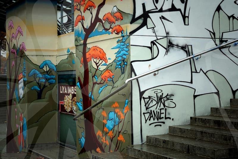
The subtle differences in color can drastically alter perception. Consider a landscape photo: a slight shift in the blue of the sky can evoke a feeling of a crisp, clear day or a moody, overcast afternoon. Similarly, skin tones can appear healthy and vibrant or sallow and tired depending on how they are color corrected. Many professional photographers spend significant time in post-production, sometimes an hour or more per image, just on color grading and correction to achieve a specific aesthetic or to ensure consistency across a series of photos.
A common mistake is over-saturation. Pushing colors too hard can make an image look artificial and distract from the subject. For example, trying to make a green forest unnaturally vibrant can result in a cartoonish look, which is rarely the desired outcome for professional content. Another pitfall is neglecting the white balance. If your camera’s white balance is set incorrectly, everything will have a color cast – too blue, too yellow, too green. Correcting this is often the very first step before any other color adjustments are made. A simple white balance adjustment in software like Adobe Lightroom can often fix this in seconds, preventing hours of wasted effort trying to correct unwanted color shifts elsewhere.
The Step-by-Step Process of Effective Color Correction
Let’s break down a practical approach to color correction that moves beyond simple sliders. Assume you have a photograph taken indoors under mixed lighting. The first step is always to assess the overall color cast. Look at areas that should be neutral, like white walls or a grey object.
-
White Balance Adjustment: Use the eyedropper tool in your editing software (like Photoshop’s Camera Raw or Lightroom) and click on a neutral grey or white area in the image. This will automatically adjust the temperature (blue/yellow) and tint (green/magenta) to neutralize the cast. If an eyedropper isn’t an option or doesn’t yield perfect results, manually adjust the temperature slider towards blue if the image is too yellow, or towards yellow if it’s too blue. Fine-tune the tint slider as needed.
-
Exposure and Contrast: Before diving into color, ensure the image has a good tonal range. Adjust the exposure slider to make the image brighter or darker. Then, use the contrast slider to increase or decrease the difference between the light and dark areas. Sometimes, just a slight adjustment here can make colors pop more naturally.
-
Saturation and Vibrance: Now, tackle the colors. Saturation affects all colors equally, making them more or less intense. Vibrance is more intelligent; it boosts muted colors more than already saturated ones, protecting skin tones from becoming unnatural. For general correction, start with vibrance, increasing it gradually. Use saturation sparingly, especially if you’ve already achieved a good look with vibrance.
-
HSL Adjustments (Hue, Saturation, Luminance): This is where finer control comes in. The HSL panel allows you to adjust specific color ranges. For instance, if your blues are too green, you can select the ‘blues’ range and shift its hue towards blue. You can also adjust the saturation and luminance of individual colors. This is invaluable for refining skies, foliage, or specific colored objects without affecting the entire image.
This systematic approach, taking about 5 to 10 minutes per image for a professional, ensures that each element is addressed logically, leading to a more natural and impactful final image. It’s about understanding the tools, not just applying them.
When Color Correction Becomes a Trade-Off
While color correction is powerful, it’s not without its limitations and trade-offs. The most significant trade-off is the potential for image degradation. Every time you adjust an image, especially by pushing sliders to their extremes, you are essentially reinterpreting the data. Excessive adjustments can lead to posterization (banding of colors), loss of detail in highlights or shadows, and noise. For example, trying to recover extreme underexposure might result in a grainy, muddy image, no matter how skilled you are.
Another consideration is the time investment. While simple adjustments might take minutes, achieving a highly polished look, especially for a series of images that need to match, can take hours. If you’re on a tight deadline, spending 30 minutes on each of 20 product shots for an e-commerce site might be unsustainable. In such cases, a slightly less perfect but faster approach might be necessary, or perhaps exploring professional editing services. For instance, if you need 100 photos color-corrected for a catalog with a turnaround time of 2 days, you might have to prioritize speed over minute perfection for each shot.
Alternatives and What to Consider Next
For basic color correction, many free apps and built-in phone editors offer simple sliders for brightness, contrast, and saturation. These are often sufficient for social media posts where extreme accuracy isn’t paramount. However, they lack the fine-grained control of professional software. For instance, an app like VSCO offers various presets and editing tools that are more sophisticated than basic phone editors but still easier to use than desktop software.
If you find yourself spending too much time on color correction and are not seeing the results you want, consider investing in professional presets for your editing software, like Lightroom. These are pre-made settings developed by professionals that can apply a consistent look quickly. You can then fine-tune them. For example, many photographers sell landscape or portrait presets that can give a stunning starting point for color correction. The trade-off here is cost and the fact that presets may not work perfectly on every image, requiring manual tweaks anyway.
Ultimately, effective color correction is about understanding your goals and the capabilities of your tools. It’s a skill that develops with practice, and recognizing when a subtle adjustment is better than a dramatic one is key. If you’re frequently struggling with consistent colors, look into shooting in RAW format. RAW files contain much more image data than JPEGs, offering significantly more flexibility during the color correction process without sacrificing quality. Searching for tutorials on “RAW vs JPEG editing” will offer more insight.