I thought making a few web cards would be quick
When the scope creep hits your schedule
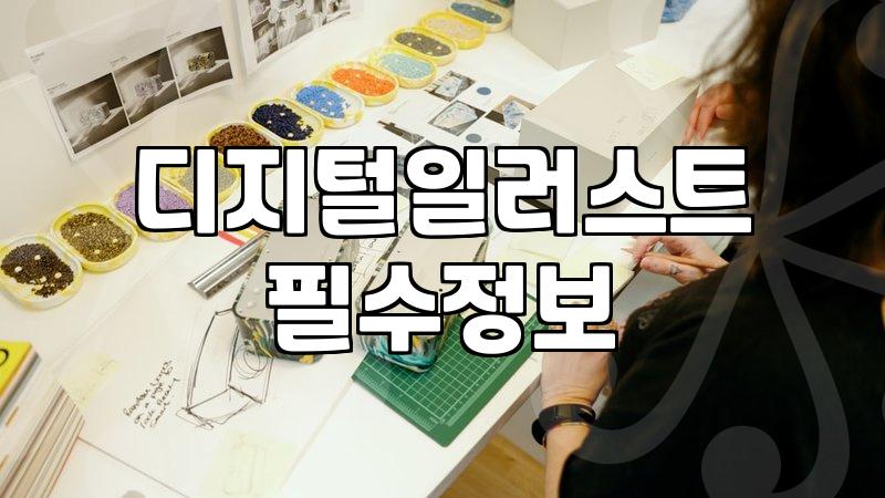
I sat down last Tuesday thinking I would just spend three hours updating some web cards for a project. It started with a simple request from a client who wanted to freshen up the UI on their landing page. I figured, I use Figma all day, I know the components, I know the grid—this shouldn’t take longer than a morning. But then the questions started coming in. Why is this button color slightly off from the brand guidelines they sent over three months ago? Does this icon really look like it belongs on a modern service site, or is it just something I pulled from an old library because I was being lazy? Before I knew it, I was deep into rethinking the entire interaction flow for a section that wasn’t even part of the original brief.
The reality of being the only design point of contact
Working as a designer often means you end up wearing about five hats you didn’t ask for. It is not just about moving pixels around in Figma anymore. I spent an hour yesterday just trying to explain to someone why the current layout was making it hard for users to find the checkout button. They wanted it ‘pop’ more, which usually translates to adding more neon colors, but that would have killed the user experience we had spent weeks testing. I find myself constantly having to justify why ‘clean’ is actually better than ‘busy.’ It gets exhausting when you have to play diplomat while you’re also trying to get the actual work done by 6 PM.
Why simple updates take an entire afternoon
There is a weird friction that happens when you try to change one single component in an existing design system. You change the border-radius on a card, and suddenly every other card in the project looks like it belongs to a different century. So you end up updating the entire style guide just because one thing felt ‘off.’ I remember when I was still learning the basics, I thought the professional stuff was all about high-level strategy and massive overhauls. In reality, about 70% of my time is spent fixing these tiny inconsistencies that nobody else even notices until the final export. I was working on a small set of SNS assets for a local cafe project—just a basic card design—and I ended up spending 45,000 KRW just to license a font because the free one didn’t have the specific weight I needed to match the mood.
The endless loop of feedback and revisions
I sometimes look back at my early days in school and think about how I used to obsess over the perfect pixel placement. Now, I mostly obsess over how many times I can copy and paste the same layer before it becomes a total mess. You submit a draft, and the feedback comes back asking for things that completely contradict the previous version. It is not that they are trying to be difficult, it is just that they don’t see the underlying grid. Explaining the ‘why’ behind a design choice to someone who thinks it’s just ‘making things look pretty’ is a skill nobody tells you that you need to master. I honestly still feel like I’m guessing half the time, hoping that the user finds the interface intuitive enough that they don’t have to think about it.
Being stuck between technical debt and design debt
Sometimes I wonder if I should have gone into something where the result is more permanent. In this field, your work is often replaced within a year or two because technology moves faster than my ability to keep up with the latest design trends. I keep using Figma because it’s the standard, but I have this lingering feeling that I am just running on a treadmill. Even after finishing the task, I’m not sure if the new cards are actually better or if I just spent six hours changing the spacing by two pixels. I’ll probably look at them tomorrow and see five things I want to fix again. It never really feels finished, just abandoned because the deadline arrived.