Finding Your Style in Fairy Tale Illustrations
Creating compelling fairy tale illustrations isn’t just about drawing pretty pictures; it’s about capturing a feeling, a story, and an atmosphere that resonates with viewers, especially younger ones. As someone who spends a good chunk of time working with visual content, I’ve seen how easily people can get bogged down in technicalities or chase after the latest trends, forgetting the core of what makes an illustration work.
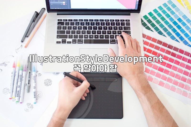
Let’s talk about developing your own unique style for fairy tale illustrations. Many beginners struggle with this, often trying to mimic established artists. While studying others is valuable, true style emerges from practice and self-discovery. It’s about finding your visual language, the recurring shapes, color palettes, and linework that feel authentic to you. For example, some illustrators lean towards soft, watercolor textures, reminiscent of classic storybooks, while others might prefer bolder, more graphic lines for a modern twist. Think about the difference between the delicate, almost ethereal artwork in some older European fairy tales versus the vibrant, dynamic illustrations found in contemporary children’s books. Your style should serve the story, not the other way around.
The Core Elements of a Fairy Tale Illustration
What actually makes an illustration feel like it belongs in a fairy tale? It’s a blend of several key elements. Firstly, there’s the mood. Is it whimsical, mysterious, cozy, or adventurous? This is often conveyed through color choices and lighting. A dark, moody palette with deep shadows might suit a tale of a hidden forest, while bright, sunny hues are perfect for a princess’s cheerful awakening. Secondly, character design plays a huge role. Even simple characters need to express emotion and personality. Consider how a slight tilt of the head or the shape of the eyes can communicate curiosity or fear. I recall a project where the client wanted a ‘magical’ feel, and by adjusting the saturation of colors and adding subtle glowing effects around key elements, we managed to achieve that without overcomplicating the drawing itself. Finally, the environment sets the stage. Is it a grand castle, a humble cottage, or an enchanted landscape? The details in the background can tell a story all on their own, hinting at the world the characters inhabit. For instance, a few strategically placed, oddly shaped trees can instantly suggest a magical forest, far more effectively than a generic drawing of trees.
Step-by-Step: Bringing a Fairy Tale Scene to Life
Let’s walk through the process of creating a single fairy tale illustration, focusing on practical steps rather than abstract concepts. Suppose we’re illustrating a scene where a lost child encounters a friendly forest spirit. The entire process, from initial sketch to final polish, might take anywhere from 4 to 8 hours, depending on the complexity and the artist’s familiarity with the subject.
- Concept and Sketching: First, understand the core emotion of the scene. Is it fear turning into wonder? Jot down a few rough thumbnail sketches. Don’t worry about perfection; focus on composition and pose. For our lost child, maybe the first sketch shows them huddled and scared, while the spirit appears cautiously. A common mistake here is to make the first sketch too detailed, which can limit creative exploration later. Let’s aim for 2-3 very loose sketches, focusing on the flow of the scene.
- Refining the Sketch and Character Design: Choose the strongest thumbnail. Now, refine the sketch, paying attention to the child’s posture and expression, and the spirit’s form. Should the spirit be humanoid, animal-like, or something entirely abstract? Perhaps we opt for a creature made of moss and light, adding an element of the mystical. We might spend about an hour on this stage to ensure the core elements are solid.
- Blocking in Colors (Base Layers): Lay down the main color areas. What’s the dominant mood color? For a forest encounter, greens and browns are natural, but maybe we introduce an unexpected color for the spirit’s glow, like a soft violet or gold, to make it stand out. Think about how to use color to guide the viewer’s eye. For instance, using a warmer, brighter color for the spirit than for the surrounding forest can draw attention to it.
- Adding Light and Shadow (Rendering): This is where form and volume come into play. How does the light source (perhaps the spirit itself) interact with the child and the environment? Adding subtle shadows under the child can ground them in the scene, while highlights on the spirit enhance its ethereal quality. This stage often takes the longest, maybe 2-3 hours, as it involves building depth.
- Details and Texture: Now, add finer details. The texture of the moss on the spirit, the rough bark of a tree, the weave of the child’s clothing. These small touches add realism and richness. We might also add atmospheric effects like mist or dappled sunlight filtering through leaves. This is where a drawing can truly come alive.
- Final Adjustments and Polish: A final review. Are the colors balanced? Is the mood effectively conveyed? Sometimes, a slight adjustment to contrast or color balance can make a significant difference. Maybe a touch of saturation boost on the spirit’s glow, or a slight darkening of the forest background to emphasize the central figures. This final polish usually takes under an hour.
A common pitfall in this step-by-step process is getting stuck on perfecting one stage, like endless sketching, and never moving forward, or rushing through rendering and ending up with flat images. The trade-off is always time versus detail; you have to decide how much polish is ‘enough’ for the intended purpose.
When Fairy Tale Illustrations Don’t Quite Hit the Mark
Why do some fairy tale illustrations fall flat? One major reason is a lack of clear storytelling. An illustration should evoke a narrative, even a simple one. If the viewer looks at it and doesn’t get a sense of ‘what’s happening’ or ‘who are these characters,’ it fails. Another common issue is inconsistent style. A piece might have beautifully rendered characters but a very simplistic, almost amateurish background, or vice versa. This jarring contrast breaks the immersion. Think about how a children’s book editor might reject a submission not because the drawing skill is poor, but because the overall feeling is off, or the characters don’t connect with the intended audience. This often happens when an artist focuses too much on technical rendering, like perfectly smooth gradients, without considering the emotional weight of the scene. For example, trying to achieve hyper-realistic textures in a whimsical fairy tale can sometimes drain the magic out of it, making it feel less like a story and more like a still life.
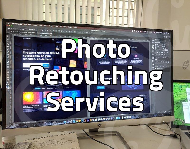
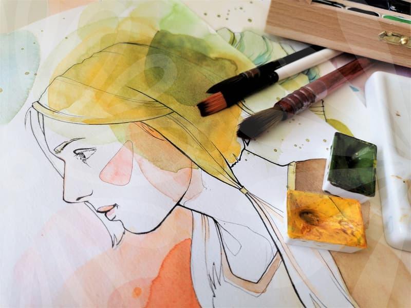
Choosing Your Tools: Digital vs. Traditional Approaches
Many aspiring fairy tale illustrators wonder whether to go digital or stick with traditional media. Both have their strengths and weaknesses. Traditional media, like watercolors or gouache, offers a unique texture and organic feel that can be beautiful for fairy tales. The physical act of painting can be very satisfying. However, corrections can be difficult, and reproducing the work for print or online use requires scanning or photography, which can be an additional step and cost. Digital art, using software like Procreate or Photoshop, offers immense flexibility. You can undo mistakes, experiment with colors easily, and duplicate layers for variations. Tools like Photoshop allow for effects that mimic traditional textures quite convincingly. For instance, using digital brushes designed to replicate watercolor or charcoal can give you much of the aesthetic without the mess or the permanence of traditional art. However, digital art can sometimes lack the tactile quality of traditional media, and staring at a screen for hours on end can be taxing. The initial investment in a drawing tablet and software can also be a barrier. A good starting point might be to try out digital brushes that mimic traditional media if you’re used to painting, or to experiment with simple digital sketches before committing to expensive software. Ultimately, the best tool is the one that helps you achieve your vision most efficiently and creatively, not necessarily the trendiest one. For those just starting, even a simple graphite pencil and paper can be enough to develop foundational drawing skills. The medium should support your artistic voice, not dictate it.