Why perspective still breaks good images
Why does perspective fail even in polished work.
Perspective errors rarely look dramatic at first. A product mockup can have clean color, expensive lighting, and sharp masking, yet still feel wrong because the table edge rises too fast or the phone looks wider at the far end than the near end. People may not name the problem, but they sense it in less than a second.
This happens often in image editing because software makes local fixes easy and spatial consistency easy to ignore. You can brighten, clone, liquify, and sharpen one area at a time, but perspective asks a stricter question. Does every object belong to the same camera height, lens behavior, and viewing angle.
In commercial work, that question decides whether an image feels trustworthy. A real estate interior with a slightly collapsed vertical line can make a room feel cheaper. A food photo with a plate ellipse that does not match the tabletop angle can make the whole scene look assembled rather than photographed.
The practical test I use before touching color.
Before adjusting tone or texture, I check perspective in four steps. First, I identify the horizon line by looking for eye-level clues such as shelf edges, countertop lines, window frames, or repeated furniture heights. Second, I extend those lines mentally or with guides until I see where they converge.
Third, I compare the major objects against that same logic. If the desk, monitor, and notebook all point to slightly different vanishing points, the image may still pass on social media, but it will usually fail in print or in a portfolio review. Fourth, I look at circles and faces because they expose mistakes fast. A mug rim, a plate, glasses, or a turned head will reveal whether the camera angle and object distortion agree.
This check usually takes three to five minutes, which is less time than one round of corrections after a client says something feels off. That is the trade many editors learn the hard way. Fixing perspective early is dull work, but it prevents the expensive kind of revision.
One-point, two-point, and lens distortion are not the same problem.
Many beginners mix perspective systems with lens distortion, and that confusion leads to bad corrections. One-point perspective is mostly about surfaces facing the viewer, like a hallway or a straight road. Two-point perspective appears when corners face the viewer, which is common in architecture, packaging shots, and desk scenes.
Lens distortion is different. A wide lens can stretch edges and enlarge foreground objects even when the perspective structure is technically consistent. If you treat barrel distortion as a vanishing-point issue, you will over-transform the image and introduce new shape problems.
A common example is a room photo shot at 24 mm. The verticals may lean because the camera tilted upward, while the outer walls also bow slightly because of the lens. Correcting only one of those issues produces the awkward result many listing photos have: straighter lines, but a room that still feels rubbery.
This is why image editors should separate three decisions. Is the camera level or tilted. Are the vanishing points coherent. Does the lens profile need correction. Once those are handled in order, the image starts behaving predictably.
What painters and illustrators still teach editors about space.
Perspective is not just a technical rule from drafting manuals. It has always shaped how images feel culturally and emotionally. When East Asian painting moved toward modern forms, the adoption of Western perspective changed not only spatial depth but also how viewers entered the scene. Space became more directional, more measurable, and in some cases less symbolic.
That matters for editing because perspective controls attention. When depth is organized clearly, the eye moves with less resistance. In a campaign visual, that can mean the face lands first, then the product, then the background story. When space is flattened on purpose, the image can feel calmer, more decorative, or more iconic.
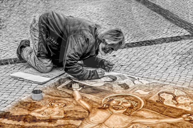
There is also value in knowing when artists broke the rule. Cezanne is a useful case because he often let tables, fruit, and edges suggest multiple viewing positions at once. The result feels unstable in a productive way. For an editor, that is a reminder that perspective does not always need to be corrected toward realism. Sometimes the better question is whether the image needs credibility, tension, or stylization.
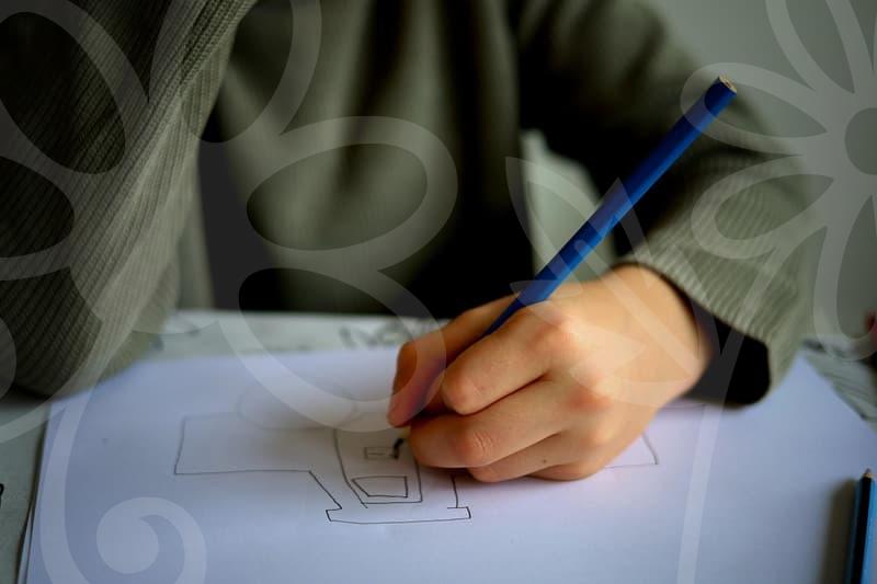
Editing a person in perspective without making them look warped.
Half-body portraits are where many retouching mistakes become obvious. A near shoulder grows, the head tilts slightly toward camera, and one arm advances. If you liquify features without respecting depth, the body starts to look assembled from separate distances.
My working order is simple. I first judge the torso block, then the head angle, then the shoulder relationship, and only after that do I touch facial proportions. If the near shoulder is supposed to be larger because it is closer, reducing it for symmetry can remove the very depth that made the shot feel alive.
There is a cause-and-result chain here that matters. When the camera is close, perspective exaggerates the nearest forms. If you slim only the near arm or narrow only the near cheek, the face and body stop agreeing about camera distance. Viewers may describe it as awkward posture or a strange lens, but the root problem is inconsistent spatial editing.
This is especially visible in fashion and profile images made for mobile feeds. On a small screen, viewers scroll fast, and any mismatch between head size, shoulder angle, and background lines reads as artificial. A technically perfect skin cleanup cannot rescue that.
How to correct perspective without flattening the image.
A lot of editors overcorrect because straight lines feel safer than believable depth. The goal is not to make every vertical perfectly upright and every plane perfectly rectangular. The goal is to preserve the camera position while removing the parts that distract.
A practical sequence works better than random tool use. Start with lens correction if the file needs it. Then use guided transform or perspective warp for the global structure. After that, handle local repairs like stretched labels, bent wall art, or a distorted tabletop edge. Leave tonal editing and compositing until the space feels stable.
The order matters because each stage changes the next one. If you retouch dust, reflections, and seams before a major transform, you will often soften them twice and lose edge quality. If you composite first and correct perspective later, shadows, scale, and contact points start drifting apart.
I usually stop when the image feels internally consistent at 100 percent view and still natural at fit-to-screen size. That is different from mathematical perfection. In lifestyle work, a slight wide-angle feeling can be useful because it keeps the scene energetic. Removing all of it can make the frame dull.
When strict perspective is worth the effort and when it is not.
Strict perspective correction pays off most in architecture, interiors, product advertising, and educational visuals. Those fields ask the viewer to trust dimensions, surfaces, and spatial logic. If a cabinet door, bottle label, or room corner is off, confidence drops even when the audience cannot explain why.
It matters less in images designed around mood, collage, or deliberate flatness. Editorial illustrations, expressive composites, and some poster work can benefit from bent space, mixed viewpoints, or compressed depth. The key is intention. A broken rule is useful when it supports the image, not when it comes from skipping basic checks.
For readers who make social content, online shop images, or client presentations every week, the most useful next step is modest. Spend one session correcting perspective before color on ten existing images and compare the results side by side. If the image depends on dreamlike distortion or a hand-drawn look, strict correction may not be the right tool at all.