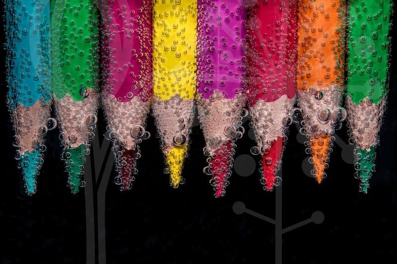
When Vector Tracing Is Worth Doing
Why do people reach for vector tracing in the first place
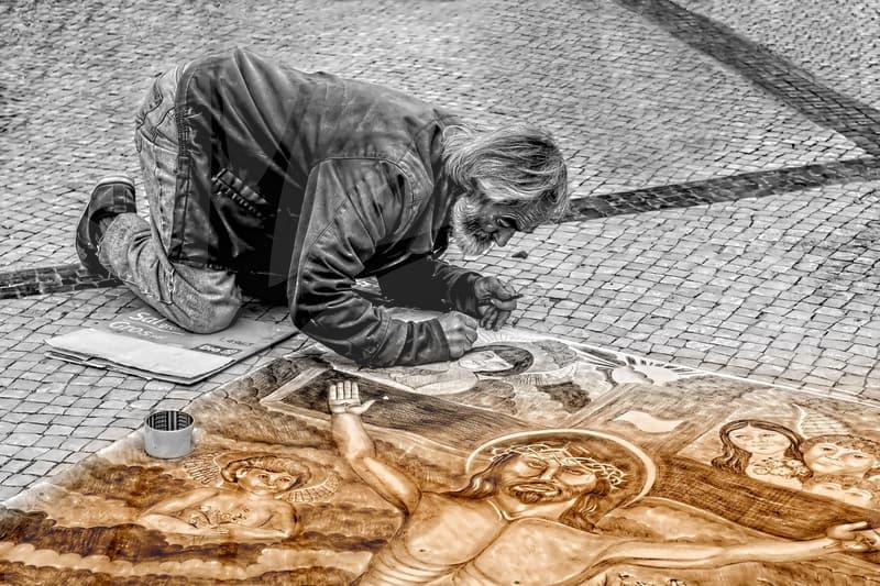
Most people do not look for vector tracing because they are curious about design theory. They look for it because a logo is blurry, a scanned badge needs to go on packaging, or a client sends the only surviving file as a 640 pixel JPEG from ten years ago. That is the real entry point. The problem is rarely artistic. It is about salvage.
In daily production work, the pressure usually appears at the moment output size changes. A mark that looked acceptable on a presentation slide suddenly has to sit on a 2 meter trade show panel, an app splash screen, and a one color stamp. Raster artwork breaks under that kind of pressure. Vector tracing becomes the bridge between poor source material and repeatable, scalable use.
There is also a common misunderstanding here. People assume tracing is a magic restore button, as if software can recover design intent from compression noise and broken edges. It cannot. What tracing does well is convert visible shape information into editable paths. If the original image is weak, the vector result will often preserve that weakness with mathematical precision.
That is why experienced editors treat tracing as a reconstruction task, not a conversion trick. The better question is not Can I trace this. The better question is Which parts deserve to become vectors, and which parts should be rebuilt by hand. That distinction saves hours.
Auto trace or manual redraw
Automatic tracing is attractive because it looks fast. Drop an image into Illustrator, hit Image Trace, expand, and in under a minute you have shapes. For simple icons, black and white marks, or clean lettering with strong contrast, that can be enough. If the source is already disciplined, the software does not have to guess much.
The trouble starts when the image contains soft shadows, uneven anti aliasing, old JPEG artifacts, or thin strokes sitting close together. Auto trace tends to interpret noise as form. One rough edge becomes twenty anchor points. A subtle corner becomes a lumpy curve. The file may look fine at 100 percent view and then fall apart when enlarged.
Manual redraw is slower at the front, but it often wins on the back end. A traced logo with 1,200 anchor points may take more time to clean than a fresh redraw built from circles, rectangles, and a pen tool. I have seen a badge icon take 8 minutes to auto trace and 45 minutes to repair, while a controlled redraw took 25 minutes start to finish. That is the sort of trade-off people only notice after doing this work repeatedly.
There is a practical rule that helps. If the source has clear geometry, repeated symmetry, or standard letterforms, redraw first. If the source is organic, hand drawn, or textured in a way that must be preserved, use tracing as a base and edit from there. Think of automatic tracing as a rough draft generator, not an approved final.
A clean vector trace follows a sequence
The quality of the result is decided before the trace button is pressed. First, inspect the source at high zoom and decide what the image is supposed to become. A screen graphic, print logo, laser cut outline, and embroidery file do not need the same structure. The destination changes the tracing strategy.
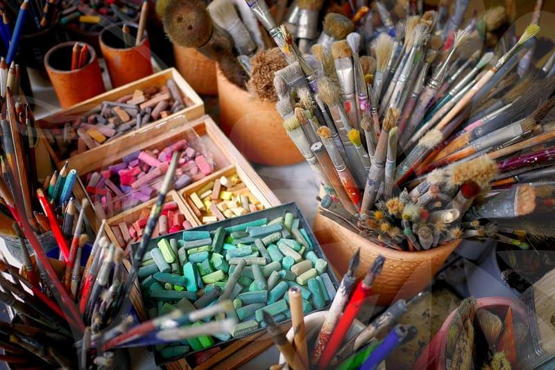
Second, prepare the raster file. Increase contrast if the shape is muddy, remove obvious background noise, and separate overlapping tones when possible. Even a two minute cleanup in Photoshop can reduce path clutter dramatically. A threshold adjustment or a quick levels pass often matters more than any trace preset.
Third, choose the tracing mode based on the asset, not habit. Black and white mode is good for marks, line art, and single color signage. Grayscale can help when tone changes define structure, but it also produces more shapes. Color mode sounds tempting, yet it frequently creates dozens of tiny islands that are useless in production unless you truly need posterized color blocks.
Fourth, limit complexity early. Set a reasonable path threshold, reduce corners when the design should feel smooth, and do not let the software preserve noise as detail. After expansion, inspect the anchor points. If you see dense clusters on what should be a simple arc, the software has already overinterpreted the source.
Fifth, rebuild the important parts by hand. This is the step many skip. Clean circles should be circles, not jagged approximations. Straight segments should align. Corners that carry brand identity need deliberate placement. A trace is not finished when it becomes vector. It is finished when the shapes behave predictably under scaling, recoloring, offsetting, and output.
Finally, test the file in at least two real contexts. Shrink it to favicon size or app icon size and enlarge it for print. If a mark only works at one scale, the tracing was too literal. Good vector work survives both reduction and enlargement without turning nervous.
Where vector tracing fails and why
The most common failure is false detail. A low resolution image contains blur, compression blocks, and halo edges that the eye mentally ignores. Tracing software does not ignore them. It converts them into paths, which means the vector file can become more complicated than the original while still looking less intentional.
Another failure appears in typography. Many people trace text because it seems easier than identifying the font or rebuilding the lettering. That shortcut usually leaves uneven baselines, awkward inner counters, and inconsistent stroke widths. If the text is important, tracing letters should be the last option, not the default one.
Small production errors can also grow into expensive problems. A slightly open path might not matter on screen, but it will matter if the file goes to vinyl cutting or CNC output. Extra points hidden inside compound shapes can create unpredictable fills. A tiny gap at one node can turn a clean one color mark into a troubleshooting session at the print shop.
There is also the issue of legal and ethical use. Tracing is a technical method, not a permission slip. If someone grabs artwork from a search result and traces it, the legal status of the result does not improve just because the lines are now paths. This comes up often in webtoon backgrounds, product decals, and online shop graphics. The tool is neutral. The source is what carries the risk.
A useful metaphor is this. Vector tracing is like making a mold from an object that is already damaged. The mold can be precise, but it cannot restore the missing corner by itself. Someone still has to decide what the original corner should have been.
How tracing changes by output type
A logo trace for print needs discipline. The shapes must hold up in one color, reverse white, spot color, and tiny use cases such as labels or stamps. In this situation, fewer points and cleaner geometry matter more than visual resemblance at 400 percent zoom. The mark has to behave under pressure, not just resemble the damaged original.
An illustration trace asks for a different balance. If the source is a sketch with intentional wobble, overcleaning can erase its character. Here the job is to preserve energy while removing accidental mess. You may keep irregular contour rhythm on purpose while still fixing tangents, overlaps, and unstable fills.
Cutting workflows are stricter than general design output. For vinyl, laser, or plotter use, every path needs to be closed or intentionally open according to the machine requirement. Tiny internal fragments become a physical issue, not a visual one. A decorative flourish that looks harmless on screen can become a tearing point in material.
Embroidery and screen printing impose their own logic as well. A trace with narrow gaps, micro notches, or stacked color islands may be technically vector, yet it is still unsuitable for stitching or limited color separation. That is why experienced editors ask about final use before touching the file. The same source image may lead to three different vector solutions.
This is the point many non specialists miss. Vector is not a quality label by itself. A bad vector prepared for the wrong output is still bad, just cleaner looking on the surface.
The moments where hand tracing earns its time
There are projects where careful manual tracing is not optional. Heritage logos, signatures for packaging, old seal marks from scanned paper, and signage pulled from photographs all fall into this category. The source often contains distortion, lens perspective, paper texture, and wear. Automatic tracing will follow those defects too obediently.
In those cases, I usually split the work into three passes. The first pass identifies stable structure such as major circles, stems, baseline rhythm, and repeated motifs. The second pass redraws distinctive features that carry recognition, including unusual terminals, joins, and negative space. The third pass trims point count and tests reproduction at small sizes.
This sounds slower than pressing one button, and it is. But the output becomes usable across future jobs without repeated cleanup. Spending 30 extra minutes once is cheaper than reworking the same weak vector across ten separate files over the next year.
There is also a trust issue in client work. If a company uses one traced mark on a website, another on a brochure, and a third on packaging, inconsistency becomes visible even to people who cannot explain what is wrong. They just feel the brand looks unstable. Clean hand tracing reduces that drift because the structure is explicit.
Ask yourself one uncomfortable question in the middle of the process. Am I preserving the original, or am I preserving its defects because I am afraid to decide. Good tracing often requires judgment, not obedience.
Who benefits most from this and where it stops helping
Vector tracing helps the most when someone repeatedly reuses visual assets across sizes and outputs. Designers handling legacy brand files, small business teams rebuilding old marks, print shops cleaning customer art, and content teams preparing icons for web and packaging all benefit from understanding where tracing saves time and where it creates debt. The gain is not only cleaner artwork. It is fewer surprises later.
It helps less when the source image is conceptually weak to begin with. If the logo was poorly drawn, if the lettering is inconsistent, or if the artwork relies on photographic texture, tracing may lock in a bad foundation. At that point, redesign is often the more honest path, even if it sounds heavier at first.
The practical takeaway is simple. Use auto trace when the source is clean and the goal is modest. Switch to manual rebuilding when identity, production reliability, or long term reuse matters. If someone is staring at a fuzzy PNG today, the next useful step is not to chase the perfect preset. It is to decide whether this file needs conversion, cleanup, or a full redraw.