When image quality enhancement works
Why do some images fall apart so quickly.
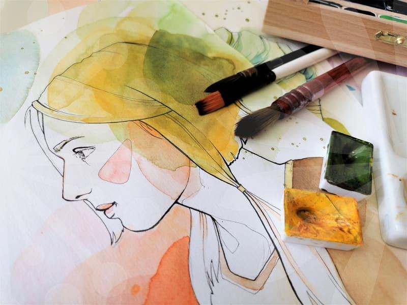
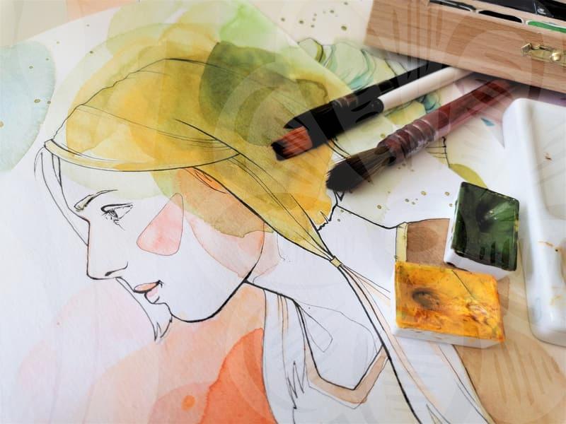
Most people notice image quality loss at the worst possible moment. A wedding photo looks acceptable on a phone, then turns soft and blotchy when printed at album size. A portrait taken in dim indoor light seems usable until skin texture turns into wax after a quick edit. The problem is rarely one thing. It is usually a stack of small compromises that become visible all at once.
In image editing work, the first question is not how to sharpen the file. It is what kind of damage the file already carries. Low resolution, compression artifacts, motion blur, missed focus, noise from high ISO, and bad resizing all create different failures. Treating them as one issue is like using the same screwdriver for every stripped screw. Sometimes the file needs detail recovery. Sometimes it needs noise control first. Sometimes it needs to be left alone because more processing only makes the damage louder.
This is why image quality enhancement feels disappointing for many people. They expect a blurred image to become naturally crisp in one click. What actually happens is that software amplifies edges, pores, hair strands, and JPEG blocks with the same enthusiasm. A stronger result is not always a better result. If the eye starts noticing halos around a face before it notices the eyes, the edit has already crossed the line.
What should be checked before raising resolution.
Resolution increase sounds simple because the interface is simple. You pick a larger pixel size, press export, and the number goes up. The hard part is deciding whether the file contains enough structure to survive enlargement. A 1200 pixel image can work for a small web banner, but it will not suddenly behave like a clean studio image just because it was enlarged to 4000 pixels.
A practical check takes three steps. First, view the image at 100 percent, not at fit-to-screen size. This is where blocked skin, jagged eyelashes, and mushy fabric texture become obvious. Second, identify the subject that matters most. In a portrait, the eyes and facial outline matter more than background leaves. In aerial photography, roof lines, roads, and field boundaries matter more than clouds. Third, decide the final use before editing. Screen use, social upload, and A4 print do not demand the same treatment.
That last step is where people waste the most time. If the final use is a product page image at about 1600 pixels wide, pushing the file to poster dimensions is unnecessary and often harmful. For a document photo that must be submitted at 300 DPI and a fixed size such as 3.5 by 4.5 centimeters, the target is specific and manageable. For a wedding print that will be viewed up close, the tolerance is lower. The sharper number on paper does not matter if the face looks artificial.
There is also a trade-off between upscaling and file size reduction. Many users compress a photo heavily to send it quickly, then later try to recover quality. That sequence usually loses more than it saves. Compression throws away information early, and quality enhancement can only guess at what used to be there. If you know a file may need editing later, keep the least compressed version even if it is less convenient in the short term.
A step by step approach that avoids the fake sharp look.
When I work on photo restoration or general image quality recovery, the order matters more than the tool brand. Start with exposure and white balance only if they are clearly off. A file that is too dark or too warm can hide detail problems, and sharpening it first only locks those problems in. After that, inspect for noise and compression damage. If the shadows are crawling with grain or the flat areas show square blocking, reduce that before attempting detail enhancement.
The next step is to separate blur types in your head. Motion blur, focus miss, and low-resolution softness are not the same. Motion blur often creates directional smearing on hair, hands, or text edges. Focus miss tends to flatten everything evenly in the plane that should have been sharp. Low-resolution softness often leaves the image readable but without fine transitions. The fix should follow the cause. Directional deblur can help with movement. Intelligent upscale can help when the file is simply too small. Neither will fully rescue a face that was never in focus.
Only then should sharpening enter the process. A restrained pass on important areas usually beats a global blast. In portrait photography, I often protect skin from aggressive sharpening and give more attention to eyes, brows, lips, and hairline. For wedding photos, lace, suit texture, and bouquet edges can take a bit more structure, while cheeks and foreheads cannot. Think of sharpening like adding salt to a finished dish. Enough to reveal form, not enough to announce itself.
Final output should be checked at the size it will actually be seen. This sounds obvious, but it saves edits. At phone size, a mildly soft image can feel calm and natural. On a 27 inch monitor at full screen, the same file may need more edge support. For print, I usually allow a little more crispness than I would for social media because paper softens the image slightly. If you edit only while zoomed in at 200 percent, you are solving a problem the audience will never see.
Portraits, wedding photos, and aerial images need different decisions.
Portrait photography punishes overcorrection faster than almost any other category. People forgive a slightly soft background, but they immediately sense when skin has been overprocessed. The common mistake is to chase pore detail and accidentally create brittle edges around the nose, jaw, and eyelids. In portraits, image quality enhancement is often about preserving believable transitions, not extracting every possible micro-detail.
Wedding photos add another layer because emotion competes with technical flaws. A backlit ceremony frame may contain noise, mixed lighting, and fast movement, yet still be the shot the couple values most. Here the right decision is often selective improvement rather than total cleanup. Keep the warmth of the room, recover face separation, and accept a little grain if it protects the moment. A perfect but sterile edit loses the reason the image mattered.
Aerial photography behaves differently. Roof patterns, road markings, crop lines, and shore edges respond well to careful clarity and structured upscaling because the scene is built from repeated shapes. But aerial files can also reveal sharpening errors in a harsh way, especially where fine geometry meets haze. If a drone image was captured through bright midday glare, contrast restoration may do more for perceived quality than sharpening alone. The eye reads clean separation between land forms as sharpness, even when the file is not packed with tiny detail.
Video quality enhancement has its own trap. People often judge a single paused frame, then wonder why the moving sequence looks brittle. Video carries compression, motion interpolation, and temporal noise that still images do not. A setting that improves one frame may produce shimmer on hair, leaves, or building edges across several seconds. The safe workflow is to test five to ten seconds of footage before committing to a whole export. That half hour of checking can save an overnight render that no one wants to use.
Free editors versus paid tools is not a simple quality question.
There is a persistent belief that a free photo editor cannot produce serious image quality improvement. That is only half true. Many free tools are good enough for resizing, mild denoise, tonal correction, and local sharpening if the source file is already decent. Where they usually struggle is in controlled restoration of bad files, especially when dealing with damaged JPEGs, old scans, or mixed blur and noise. The issue is less price than prediction quality and masking control.
Paid tools tend to save time when the file is difficult and the deadline is real. If I need to restore a small portrait for print, compare two upscale models, and keep skin natural, stronger software can reduce trial and error by several rounds. That matters in work settings. A ten minute difference on one image is trivial. Across twenty product photos or a batch of event portraits, it becomes the difference between finishing before lunch and still tuning sliders at 4 p.m.
Still, free tools are often the better choice for people learning judgment. They force you to look harder at cause and effect instead of leaning on presets. If a file improves after one denoise pass and gets worse after the second, that lesson transfers to any software. The expensive tool does not remove the need for restraint. It only gives you better odds when the source is weak.
There is a similar misunderstanding around file size reduction. People assume the best editor is the one that shrinks the file the most. For web delivery, that is not the right target. The right target is the smallest file that preserves the detail the viewer notices first. On an online shop, that may be stitching and fabric texture. On a profile image, it is eye definition and clean edges around hair. Saving 40 percent more space is pointless if the product starts looking secondhand.
Where image quality enhancement pays off and where it does not.
Image quality enhancement pays off most when the original file is basically sound but limited by size, light noise, or moderate compression. Portraits that are slightly soft, wedding images that need better face separation, document photos that must hit 300 DPI at a fixed size, and aerial shots that need clearer structural contrast are all good candidates. In those cases, editing acts like careful maintenance. It reveals what was already present but poorly expressed.
It pays off less when the original capture failed at the foundational level. Heavy motion blur, severe focus miss, clipped highlights on faces, or aggressive messaging-app compression often leave too little information for a convincing recovery. Software can invent texture, but invented texture has a look, and experienced viewers spot it quickly. If the image is meant for legal identification, archival print, or premium client delivery, fake detail can be worse than visible softness because it weakens trust.
The people who benefit most from understanding this are not only designers. Anyone handling visual content daily, from small business owners to office staff preparing profile photos and listing images, can save time by making the right call earlier. Should this file be restored, reshot, or simply resized more carefully. That is the decision that separates useful editing from slider chasing.
A practical next step is simple. Pick one image you already have, inspect it at 100 percent, define its final use, and make no more than three corrective moves before comparing versions. If the third move does not clearly improve the image, the file may be asking for a reshoot rather than more editing.