What a book designer really decides
Why a book designer is not just decorating pages.
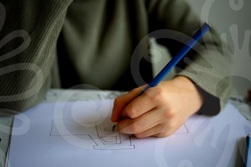
A book designer sits at the point where editing, printing, and image handling collide. People often imagine the job as choosing a typeface and placing a cover image, but the harder part is deciding what the reader notices first, what they skip, and how fatigue builds over 180 to 300 pages. When that judgment is weak, even a well-written manuscript can feel longer than it is.
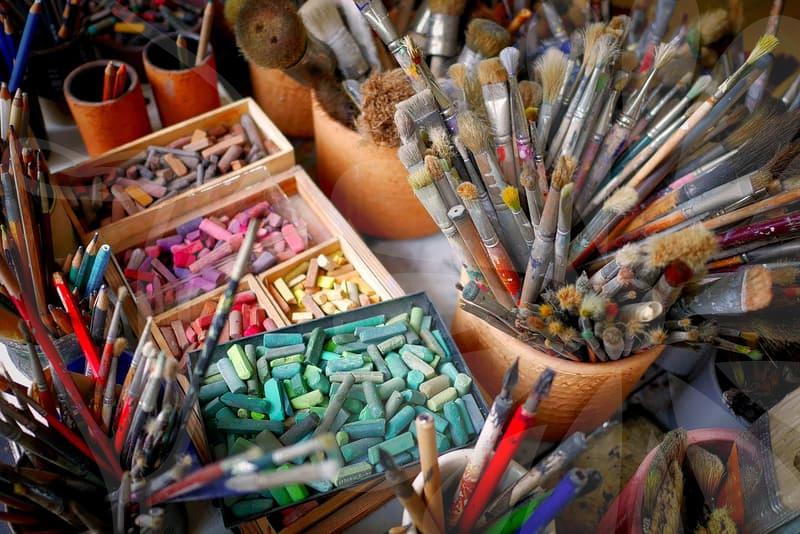
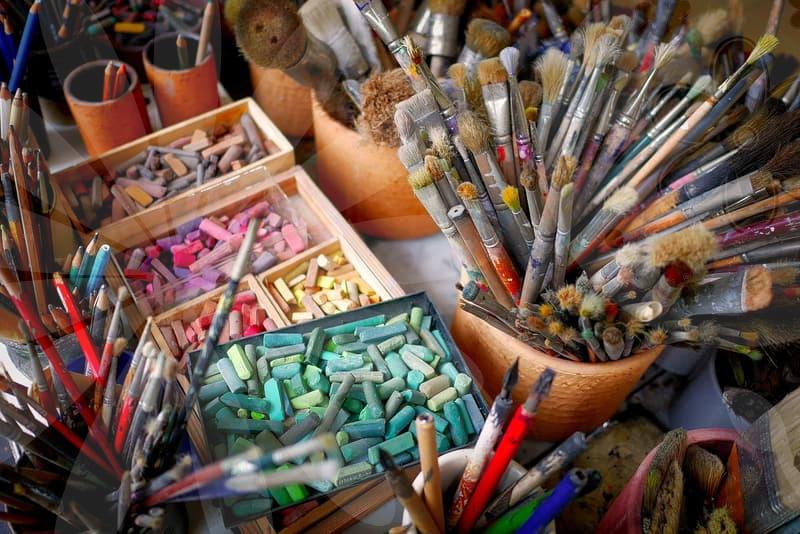
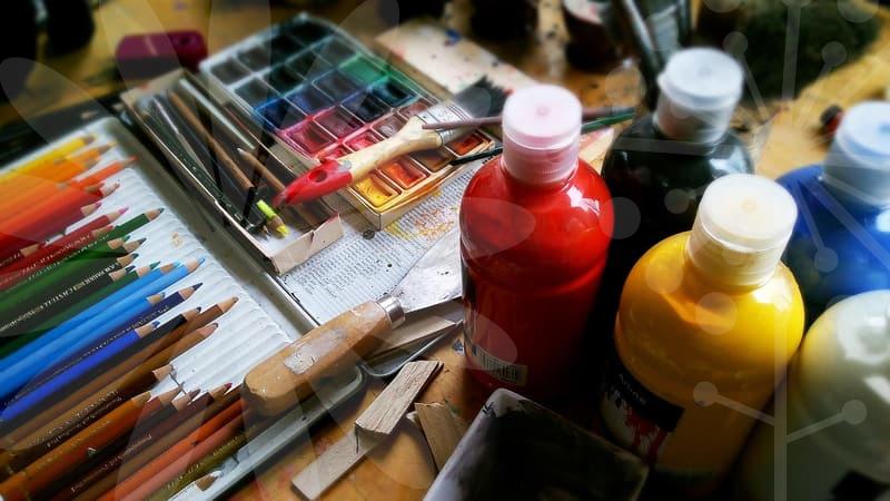
From an image editing perspective, the work starts before layout software is even opened. A manuscript may come with author photos taken on a phone, scanned diagrams from an old textbook, and stock images downloaded in mixed resolutions. If one image is 72 dpi, another is oversharpened, and a third carries a muddy black background, the book already has a visual argument happening inside it. The designer has to calm that argument down.
This is why book design is less about taste than about control. A reader may not consciously notice a 2 millimeter shift in margin balance or a cover image that has been corrected from a green cast to a neutral tone. Still, those changes affect whether the book feels cheap, stable, academic, giftable, or worth keeping on a shelf.
What changes when the book is printed, not just viewed on screen.
Screen-first thinking creates many avoidable mistakes. A cover that looks crisp on a bright monitor can turn dull once coated paper reflects light differently, and a deep navy background may print almost black if ink values are not managed carefully. In image work, that means the designer cannot trust the screen alone.
The practical sequence is usually stricter than newcomers expect. First, check the trim size and spine width because image cropping depends on them. Next, normalize all visual assets, often to a consistent color space and target resolution, usually 300 dpi for print images. Then test contrast at actual size, not enlarged at 200 percent, because many cover problems disappear on zoom and reappear in the hand.
The last step is where experience shows. A designer often prints a rough proof on an office printer, even knowing the color is inaccurate, simply to judge hierarchy and scale. If the subtitle disappears at arm’s length or the author name competes with the main image, that proof has already saved time. Ten minutes with paper can prevent a full rework after final export.
How do image decisions shape the reading pace.
In illustrated books, photo books, and educational covers, image editing is not separate from storytelling. Crop too tightly and the page becomes aggressive. Leave too much empty background and the energy drains out. Readers rarely say the crop is wrong, but they do say the book feels awkward or oddly slow.
A useful way to think about this is pacing by density. A spread with one dominant image, one short caption, and generous white space gives the eye a rest. Follow that with three small images, a pull quote, and a colored sidebar, and the reading rhythm speeds up. The book designer is composing tempo, not just arranging objects.
Cause and effect become obvious in children’s books and instructional material. If an illustration has weak edge contrast, children lose the focal point faster than adults do. If a textbook cover is overloaded with icons, gradients, and five colors fighting at once, parents may not explain why they dislike it, but they often read it as low trust. The same problem appears in ebook covers, where a thumbnail only a few centimeters high must still survive on a crowded marketplace screen.
Cover design choices that look small but cost money later.
The cover is where budget mistakes are easiest to hide until production begins. A metallic effect built only as a screen simulation may require a separate finishing process later. A full-bleed background image with weak retouching near the trim can reveal awkward edges once cutting tolerance is applied. That is not rare. A 3 millimeter bleed sounds minor until a face or title drifts too close and starts looking nervous.
The smarter process usually follows four checks. First, decide the sales context. A novel sold mostly online needs stronger thumbnail recognition than a museum catalog displayed in person. Second, test the title against the image in grayscale because value contrast matters before color charm does. Third, inspect skin tones, shadow detail, and small text at final size. Fourth, ask whether the finish, paper, and binding style support the visual concept or quietly contradict it.
This is where practical skepticism helps. Gloss lamination can make some photographic covers feel richer, but it also amplifies fingerprints and reflections. Uncoated stock can give seriousness and warmth, yet it may flatten saturated images. A book designer who understands image behavior will not chase the prettiest mockup. The point is to choose what survives production, shipping, browsing, and actual reading.
The difference between sample book polish and real production readiness.
Many portfolios look polished because they stop at the sample book stage. A sample can get away with five perfect spreads, carefully selected images, and no messy back matter. A real book has chapter openers, index pages, copyright text, barcode placement, running heads, and images that were not photographed under the same light on the same day.
That gap matters if someone wants to work as a book designer rather than only make attractive mockups. In production, image consistency becomes a discipline. One common task is matching ten author portraits taken over three years so they belong in one series. Another is rebuilding a low-quality diagram so that it prints cleanly beside sharper editorial images. Neither task is glamorous, but both decide whether the book feels professionally made.
A good comparison is restaurant plating versus kitchen service. One plate prepared for a photo shoot can be perfect. Sending 120 plates during dinner requires a system. Book design works the same way. If the visual logic does not scale from the cover to page 247, it was never strong enough.
Who benefits most from understanding this work.
This way of thinking helps authors preparing a first print run, editors managing illustrated manuscripts, and junior designers who are good with software but not yet strong in judgment. It is especially useful for anyone handling educational covers, photo-heavy books, or collected editions where image consistency affects credibility as much as typography does. The benefit is not flashy creativity. It is fewer revisions, cleaner proofs, and better decisions before files go to print.
There is also a limit worth stating plainly. If the book is text-only, printed in a small quantity, and sold mainly for internal use, deep image refinement may not repay the time. Spending six extra hours perfecting tonal balance on a simple training manual cover is hard to justify if the print run is 100 copies and replacement is easy. In that case, solid typography and accurate prepress checks matter more.
For anyone trying to judge a designer, one practical next step is simple. Ask to see not only the cover, but also a chapter opener, a dense interior spread, and a printed proof that shows how images were corrected. That single request reveals whether the work is styling or actual book design.