Vector Tracing Techniques for Logos
Vector Tracing Basics
Vector tracing converts raster artwork into scalable vector paths that remain crisp when enlarged.
Understanding the difference between bitmap and vector representations helps you plan the tracing approach from the start.
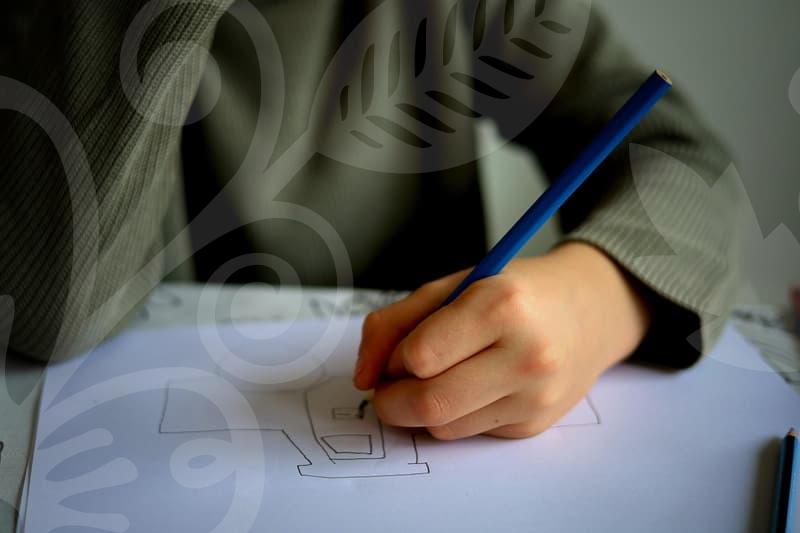
Manual tracing with the Pen tool yields precise control over curves and corners, while automated options offer speed for roughs.
Start with a reference grid and identify core shapes before you touch a single anchor point.
Begin by outlining major shapes using simple paths, then refine by adjusting anchor points and handles.
Keep line work consistent with brand geometry and match proportions to reduce later adjustments.
Organize elements into layers and groups so you can isolate complex areas without breaking the overall structure.
Regularly toggle between zoom levels to evaluate how the tracing performs at different viewing distances.
Automation can kickstart the process, but expect manual tweaks for perfect edges.
Illustrator tools like Image Trace provide a starting point, yet you must clean up noise and stray points.
Think in terms of continuity; smooth curves require fewer anchor points and better handle distribution.
This approach invites you to consider whether you trust a fully automated result for a professional logo or prefer hands on control.
Vector Tracing for Logos
Logos demand pristine vector outlines that scale from business cards to billboards.
Trace with intention to preserve distinct brand geometry, symmetry, and high contrast areas.
Align key elements to a clean grid and maintain consistent stroke width where appropriate.
From the outset plan color fills and strokes to avoid rework during export and application.
Use the Pen tool for critical curves and corners, then switch to shape building techniques for flat areas.
Anchor point placement matters; choose smooth or corner points to achieve natural transitions.
Apply pathfinder or boolean operations to combine shapes without creating redundant paths.
Careful layering helps when you need to apply color shifts while preserving structure.
Color decisions should reflect brand guidelines; avoid gradients unless the brand requires depth.
When gradients are necessary, create subtle stops to preserve legibility across sizes.
Maintain vector integrity by keeping fills as solid objects and avoiding raster textures.
Would you rework a logo for print versus digital use or keep a single vector set for all mediums.
Efficient Vector Tracing
Efficiency comes from a disciplined workflow and smart tool choices.
Set up templates and guides to speed accurate tracing without sacrificing precision.
Combine automated tracing for rough layouts with deliberate manual corrections for critical shapes.
Organize your project with consistent naming and layer structures to support future edits.
Performance matters when dealing with complex artwork; simplify paths and reduce node counts.
Use path simplification and smoothing to balance detail with file size and rendering speed.
Rely on clipping masks and compound paths to manage difficult areas without increasing complexity.
Have you tried tracing in vector groups so you can quickly swap colors without touching shapes.
Version control and asset libraries save time across projects and teams.
Export cycles should preserve vector fidelity with clean groups and proper layer visibility.
Document style decisions so collaborators reproduce the same tracing behavior later.
Can a reusable vector kit reduce recurring tracing tasks in your studio workflow.
Finish and Validate
Final checks ensure all paths are closed and anchor points are clean.
Look for inconsistent stroke widths and misaligned joins that disrupt the visual flow.
Validate that the vector aligns with a grid system to maintain consistency across media.
Prepare a checklist to confirm readiness before export.
Export considerations include choosing SVG for web and AI or PDF for print.
Preserve layers and groups when possible but simplify where architecture demands it.
Verify color profiles and spot colors to avoid shifts in production.
This shows how the final artwork will perform under different viewing distances and devices.
Present proofs to clients or stakeholders with controlled lighting to assess legibility.
Compare against originals and note deviations in curves symmetry and spacing.
Use real world usage scenarios such as signage and apparel to test performance.
Suppose a production run reveals subtle distortions, what adjustments would you implement to preserve purity.