The Practical Approach to Graphic Design
When diving into graphic design, it’s easy to get lost in the sea of trendy tools and overwhelming feature lists. Most of us, especially those juggling multiple responsibilities, aren’t looking to become digital artists overnight. We need practical solutions that translate directly into better visual output, efficiently. This means understanding the core principles and how to apply them without unnecessary complexity.
Think about creating a simple social media banner for a small business. The goal isn’t avant-garde art; it’s clear communication. You need to convey a message quickly and effectively to grab attention in a crowded feed. This often involves balancing text, imagery, and brand elements. Over-engineering this with advanced gradients or intricate vector illustrations might look impressive to some, but it can also take significantly longer to produce and might not even resonate better with the target audience. A clean layout with well-chosen typography and a relevant stock photo can often do the job more than sufficiently, usually within an hour or two of actual design time.
Beyond the Hype: What Truly Matters in Graphic Design
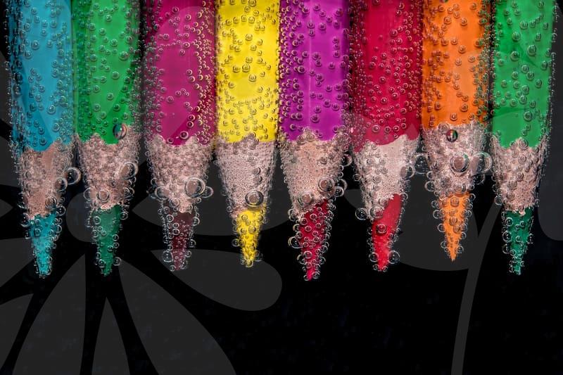
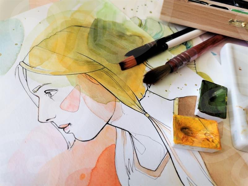
The real value in graphic design lies not in mastering every single function of a complex software, but in understanding how visual elements communicate. Color theory, for instance, isn’t just about picking pretty shades. It’s about evoking emotions and establishing brand identity. A deep dive into color psychology, understanding how a specific blue might convey trust while a red suggests urgency, is far more impactful than simply applying a gradient filter because it looks modern. Similarly, typography is more than just font selection; it’s about readability, hierarchy, and conveying tone. A well-chosen serif font can lend an air of sophistication, while a sans-serif might feel more contemporary and accessible. Getting these foundational aspects right saves countless hours later on, preventing rework that stems from poor initial choices.
Consider the common mistake of using too many fonts or colors in a single design. While tempting to showcase variety, this usually leads to visual clutter and a diluted message. Best practice often dictates limiting yourself to two or three complementary fonts and a defined brand color palette, usually around 3-5 primary and secondary colors. For a new project, I might spend 30 minutes defining this palette and selecting a font pairing, rather than randomly picking them during the design process. This initial investment streamlines the entire creation flow. This methodical approach is a hallmark of effective graphic design, ensuring clarity and impact.
Deconstructing the Layout: From Blank Canvas to Finished Product
Let’s break down the process of creating a basic marketing flyer. The objective is to present information attractively and encourage a specific action, like visiting a website or attending an event. After conceptualizing the message and identifying the key information to include – say, event name, date, time, location, and a call to action – the real work begins with the layout. A common approach is to start with a grid system. Many design programs offer pre-built grids, or you can create your own. A simple 12-column grid can provide structure without feeling overly rigid. First, I’d place the most critical element, often the headline or a compelling image, establishing visual hierarchy. This might take about 15 minutes. Then, I’d arrange secondary information, like event details, ensuring clear spacing and readability. This stage requires careful attention to white space; too little makes the design feel cramped, while too much can make elements feel disconnected. A good rule of thumb is to ensure at least 20-30% of the design area is white space. Finally, the call to action needs to be prominent, often distinguished by a contrasting color or a distinct button shape. Testing the visual flow – guiding the viewer’s eye from the main point to the details and finally to the action – is crucial. This entire layout process for a standard flyer, assuming assets are ready, could realistically take between 1 to 3 hours for an experienced designer, rather than an entire day.
This isn’t about complex masking or intricate 3D rendering. It’s about thoughtful arrangement and making conscious decisions. For instance, when placing text over an image, the common rejection reason is poor legibility. This is easily avoided by using a subtle overlay, a contrasting background block behind the text, or simply choosing an image area with less visual distraction. These are small, actionable steps that prevent bigger problems down the line.