LogoDesign for a Brand Identity
LogoDesign Foundations
Logo design sits at the intersection of art and strategy within visual content creation. It begins with clarity about what the brand stands for, its audience, and the promise behind its name. In practice, you translate that understanding into a mark you can scale from a tiny icon to a large storefront sign. A well grounded foundation reduces rework and guides every adjustment to color, shape, and typography.
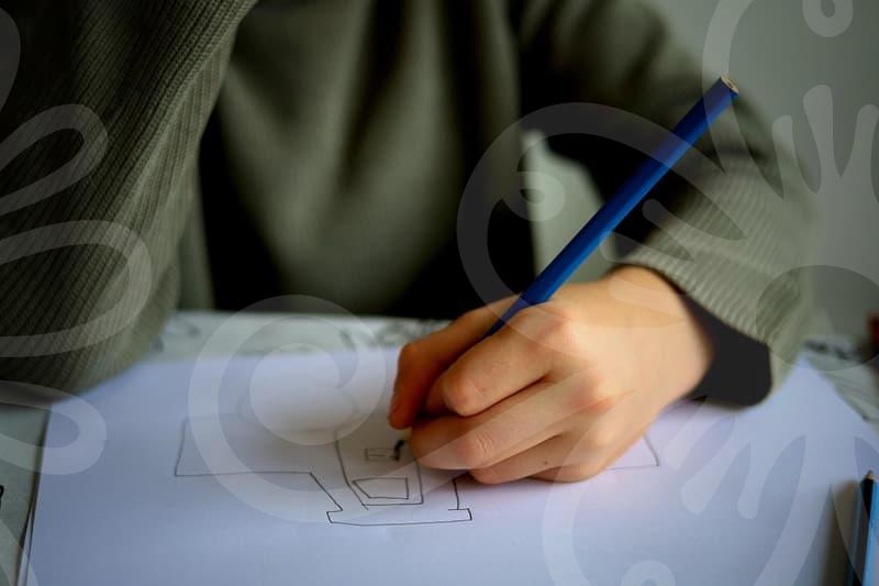
Start with a concise brief that spells out the core values, target audience, and what the logo should evoke. Sketching quickly helps you explore proportional relationships and negative space before committing to a vector file. When you align the mark with the brand narrative, you create a visual shorthand that users remember. Consider existing logos in the domain of university logos or sports teams to study how simple marks signal legitimacy.
Consistency across platforms is the backbone of a durable identity. A logo must perform in color and monochrome, on crowded signage, and in tiny digital avatars. Build a grid system that respects symmetry and balance, because perception loves order. The goal is a flexible symbol that feels confident whether it appears on a poster or a postcard.
Color and Typography
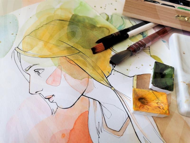
Color choice in logo design goes beyond aesthetics; it frames mood, trust, and recognition across media. You should map color psychology to your audience and to the category you serve. For instance, a healthcare brand favors cool blues for calm authority, while a startup might explore bold contrasts for energy. Typography selection should harmonize with the mark rather than dominate it.
Pairing a simple sans serif with a minimal symbol can yield a timeless look, while a serif may add tradition and gravitas. Test color scales across backgrounds to ensure legibility on signage and digital banners. The typographic rhythm should align with the logo’s geometry; rounded shapes convey approachability, sharp edges signal precision. Avoid using more than two type families to keep visual coherence.
Accessibility must guide every choice, including contrast and readable forms at small sizes. You should evaluate how the logo behaves when reduced to an app icon or embroidered on fabric to ensure legibility. Create multiple colorways to support different campaigns or seasons, but keep a single dominant identity. The practical test is whether the mark remains recognizable in real world usage.
Symbolism and Shapes
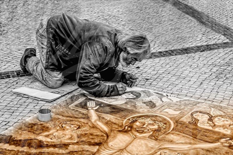
Symbolism in logo design helps encode story, values, and memory into a single mark. You can translate abstract ideas into geometric shapes that communicate at a glance. Circles suggest unity, squares imply stability, and triangles convey direction; the choice should reflect the brand stance. When shapes align with narrative, the logo speaks without words.
Shape language guides how a logo scales, from a storefront to a digital badge. Avoid clutter by simplifying curves and corners without losing character. A mark should be identifiable in grayscale and at tiny sizes; this reduces distraction and strengthens recall. Test variations that preserve identity even when color is unavailable.
Consider cultural associations with symbols in the target market and avoid ambiguous imagery. Regional meanings can shift how a shape is read, so verify interpretations across audiences. Keep shapes modular so you can rearrange elements for different formats while preserving core geometry. The result is a flexible emblem that travels across campaigns and channels.
Brand Systematization
Brand systematization describes how logo rules guide all visual decisions. A well documented grid, color library, and typography rules prevent drift over time. You define clear usage cases for signage, packaging, and digital surfaces. This discipline preserves recognition as teams expand.
Create a logo family that scales with product lines or regional markets without losing core identity. Include explicit do and don’t examples to educate design partners. Provide file formats, size benchmarks, and safe clearances to ensure consistent output. A disciplined kit reduces risk whenever a campaign evolves.
Embedding accessibility and localization into the system makes logos resilient. Consider how the system adapts to various signage materials such as metal, acrylic, or wood to ensure consistent performance. Build a revision history that records rationales for changes and keeps the brand stable. The end goal is a timeless symbol that grows with the company rather than chasing trends.
Editing and Delivery
After the conception phase, the editing process polishes the logo for real world use. Vector masters ensure clean scalable lines and predictable curves at every size. You validate color profiles, file naming, and package completeness for client handoffs. The workflow should minimize surprises during production.
Delivery extends beyond files; it includes guidelines for usage and monitoring. You might draft one page of rules for co branding, signage, merchandise, and digital avatars. A clear policy reduces misinterpretation and protects the brand from accidental changes. The goal is seamless application across channels.
Regular audits of logos in the field reveal drift and opportunities for refinement. Maintain a living guideline that evolves with market feedback while preserving the core mark. You can reference local market signals such as a 광주 logo and a salon signboard identity to illustrate context. This approach keeps visuals relevant without fragmenting the brand identity.