Logo design decisions that age well
Why logo design fails more often in use than on screen.
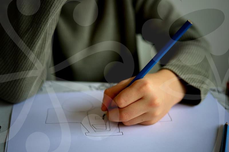
A logo usually looks acceptable in the first mockup. The trouble starts when it leaves the artboard and enters daily work. It is placed on a website header, shrunk into a social profile, stamped onto packaging, printed on a dark box, and exported by someone who was not in the original meeting. That is where weak decisions show themselves.
The most common failure is not lack of creativity. It is lack of restraint. A mark with five small ideas packed into one shape may look clever during review, but at 24 pixels it turns into visual dust. Many teams discover this late, after the business card file, favicon, app icon, and storefront sign all demand different fixes.
I have seen this happen with small retail brands and with internal company projects that had larger budgets than they needed. Someone approves a detailed symbol because it feels complete, then the production team spends the next two weeks simplifying, redrawing, or removing background artifacts from exports. If a logo needs constant rescue work, the design was not finished. It was only presented well.
What should be decided before drawing anything.
Most logo problems start before the first sketch. People jump into style references too quickly and confuse mood with function. A founder says the brand should feel premium, modern, and friendly, but none of those words explain whether the logo will live mainly on mobile screens, shipping labels, storefront vinyl, or presentation decks. Without that context, the design brief is only decoration.
A better starting point is a short sequence of decisions. First, define the main point of contact. Is the logo seen first on a website header, a product package, a delivery bag, or a business app. Second, list the size extremes. A logo that must work at 16 pixels and on a 2 meter sign cannot rely on the same level of detail. Third, clarify whether the brand needs a symbol, a logotype, or both. Many businesses do not need an emblematic icon at all. They need a stable wordmark that survives frequent use.
This step usually takes 30 to 45 minutes if the client answers directly. It often saves several rounds of wasted design. The interesting part is that people feel more creative after narrowing the problem, not less. Once the real constraints are visible, choices become sharper. A bakery logo can lean into warmth and rhythm in the lettering. A legal service platform probably needs calm spacing, stronger contrast, and fewer tricks.
Symbol or logotype which one carries the brand better.
This is where many teams overestimate the value of a symbol. They assume a serious brand needs a mark plus a custom icon, because that feels complete. In practice, a strong logotype often does more work, especially for newer businesses that still need name recognition. If people do not know the brand yet, the name has to carry the load.
A symbol makes sense when the brand needs shorthand. Sports brands are the obvious example. Think about how a fast, simple mark can survive on shoes, caps, app icons, and event graphics. The reason sports brand logos are studied so often is not just style. It is portability. They are built for motion, repetition, and instant recognition from a distance.
A logotype is stronger when pronunciation, memorability, or category clarity matters more than symbolic abstraction. This is often true for agencies, software tools, local stores, and personal brands. A carefully tuned wordmark can feel more distinctive than a generic icon attached to a standard font. The useful question is not which format looks more designed. It is which format still works after 200 routine uses by non designers.
There is also a middle path. Build the wordmark first, then derive a compact sign from one letter, one ligature, or one structural feature. That approach tends to age better because the symbol grows out of the name rather than competing with it. When the relationship is organic, the brand system feels calmer and easier to manage.
The practical build process that avoids rework.
A reliable logo workflow is less glamorous than many people expect, but it prevents expensive revisions. Step one is collecting only a few references with a clear reason for each one. Not a giant mood board, but maybe six to eight examples showing spacing, stroke behavior, serif attitude, or symbol simplicity. If every reference is just there because it looks nice, the project will drift.
Step two is building in black and white first. This forces structure to do the work instead of color. If a logo only feels good after a gradient or metallic effect is added, the core form is weak. Black and white review also exposes whether the design survives background removal, embroidery, vinyl cutting, and low quality office printing.
Step three is testing at fixed sizes before polishing. I usually check at 16 pixels, 32 pixels, website header scale, and one larger print view. This takes maybe 10 minutes and catches the problems that tend to become email chains later. Hairline gaps disappear, counters clog, and decorative edges become noise. It is better to discover that now than after a social media launch graphic has already been exported in five formats.
Step four is building a minimal usage set. One horizontal version, one stacked version if truly needed, one small size version, and one reversed version for dark backgrounds. Not every logo needs all of these, but most brands need more than a single hero file. The biggest mistake here is pretending one master file can solve every use case. That idea sounds clean, but it creates messy production.
Step five is documenting the red lines. Define minimum size, clear space, background restrictions, and what not to distort. This sounds bureaucratic until someone stretches the wordmark in a presentation or places a dark navy logo on a near black photo. Brand inconsistency often comes from missing instructions, not bad intent.
Why color, spacing, and removal details matter more than clever concepts.
People remember a concept pitch, but users encounter execution details. Color is a clear example. A bright accent may look fresh in a presentation, yet print muddy on uncoated paper or lose contrast on common mobile screens in daylight. When that happens, the logo feels less confident even if the underlying idea is sound.
Spacing creates a similar effect. Slightly tight kerning can make a wordmark feel energetic on a large slide, but at small sizes it starts to blur into itself. Too much spacing has the opposite problem. It feels elegant in isolation and weak in real placement, especially in narrow headers or app onboarding screens. These are not tiny designer concerns. They change readability, perceived trust, and how expensive the brand feels.
Background handling is another place where practical design separates itself from decorative design. A logo often ends up on photos, textured packaging, glass doors, social banners, and scanned documents. If the mark depends on a perfect white background, someone will spend time removing backgrounds, redrawing edges, or placing awkward boxes behind it. That extra work accumulates quietly. Across a quarter, even a small marketing team can lose several hours to avoidable cleanup.
The useful metaphor here is footwear. A logo can be like a stylish pair of shoes that only works on dry pavement, or it can be something you can actually walk in all week. The second type may look simpler at first glance, but it earns trust through repetition. That is what good logo design does. It reduces friction every time the brand appears.
When a simple logo is the smarter choice.
There is a point where refinement becomes overworking. A local business, an early startup, or a one person consultancy often benefits more from a disciplined, simple logo than from a highly expressive system. That does not mean bland. It means the identity is matched to the stage of the business. If the company still changes its offer every six months, an ornate logo will not create stability.
This is also where honest trade offs matter. A simpler mark may feel less dramatic in a portfolio lineup, but it usually costs less to implement and fewer people will misuse it. A complex identity can be worth it for consumer brands with packaging scale, campaign budgets, and dedicated brand management. For everyone else, clarity tends to outperform ambition.
The people who benefit most from this way of thinking are business owners, in house marketers, and designers who are tired of fixing the same preventable issues after launch. If the current logo looks fine in a slide deck but keeps breaking in real production, the next step is straightforward. Print it small, place it on a dark background, test it in a website header, and see what survives.