Graphic Design That Works Under Pressure
Why does graphic design fail in everyday work.
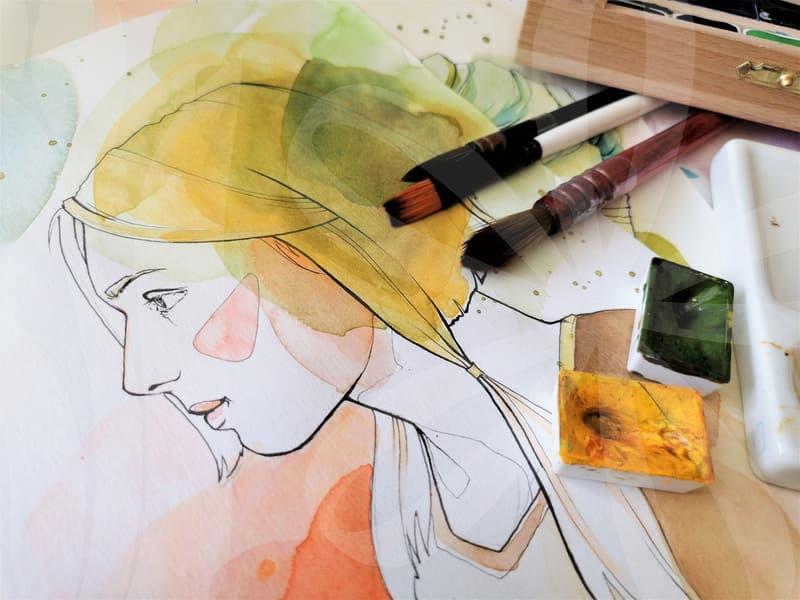
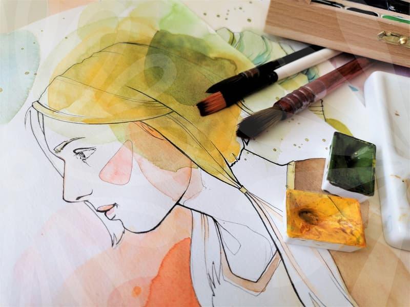
Most weak design does not fail because the software was limited or because the designer lacked taste. It fails because the piece was made in isolation from its job. A sales banner that looks polished but hides the price until the last second has already lost. A presentation cover that uses dramatic imagery but makes the topic hard to scan slows the meeting before it begins.
In work settings, graphic design is usually asked to do one of three things within the first three seconds. It must attract attention, organize information, or create trust. If it tries to do all three with equal force, the result often becomes noisy. That is why a simple internal poster can outperform an expensive-looking one when the hierarchy is clear and the reader knows where to look first.
I see this most often when teams copy visual trends from social feeds into business material. Large outlined fonts, overprocessed gradients, and decorative shadows can look current on a phone screen, yet collapse when printed at A4 size or shown on an office projector. The problem is not style itself. The problem is forgetting where the design will live and how it will be used at 9:10 a.m. by someone already late for a meeting.
A practical way to judge a design is to ask one narrow question. What should the viewer remember ten minutes later. If the answer is vague, the design is still unresolved. Good graphic design is not the art of adding more. It is the discipline of deciding what can be removed without damaging the message.
What should come first, layout or image.
Many people start with the image because it feels concrete. They drop in a photo, stretch it to fit, then try to place text wherever space remains. That method works only when the message is secondary. In most graphic design work, the message pays the bill, so layout has to come first.
The sequence is more important than many realize. First define the reading path. Second decide the block structure. Third test the headline length. Only after that should the image be chosen or cropped. This order feels slower for the first ten minutes, but it saves rework later because the visual frame is already stable.
Take a social campaign tile and a printed brochure cover. Both may use the same photo, yet the crop cannot be identical. On a square tile, the image can carry more emotional weight because the text load is lighter. On a brochure cover, the title, subtitle, date, and logo create fixed demands, so the image has to support empty space rather than dominate it.
This is where many junior designers get trapped by a beautiful asset. They want to preserve every detail in the image, even when the layout needs a cleaner crop. But design is not evidence preservation. If the left side of the frame contains distracting highlights that fight the headline, cutting them is not a loss. It is the job.
A useful test is to blur the screen or step back two meters. If the page still has a visible structure, the layout is leading correctly. If everything turns into one flat block, the image probably took control too early.
The real work is in hierarchy, not decoration.
Hierarchy sounds basic, but it is where most professional-looking design is won or lost. Readers do not consume a design all at once. Their eye jumps. Headline, image, key number, button, logo. That sequence can be shaped, and when it is shaped well, even a plain composition feels reliable.
The first layer of hierarchy is size. The second is contrast. The third is spacing. People often overestimate color and underestimate spacing. Yet a 12-pixel change in margin can improve readability more than adding another accent color ever will. White space is not empty real estate. It is a timing device that tells the eye when to pause.
There is also a business cost to bad hierarchy. If a landing banner forces the viewer to reread the same area twice, attention leaks. If a product card treats the product name, discount, and disclaimer with similar weight, trust drops because the design feels evasive. Users may not say this out loud, but they feel it immediately. Visual confusion often reads as commercial insincerity.
Think of hierarchy as traffic control rather than ornament. A well-designed page does not shout from every corner. It gives one direction at a time. In a crowded workday, that restraint is often what makes the design feel expensive, even when the production budget was not.
Color management becomes a problem later than it should.
Color is one of those topics teams ignore until the result looks wrong on another screen or in print. By then, the schedule is already tight. A designer exports a graphic that looked balanced on a laptop, then a client opens it on a wide-gamut display and suddenly the reds push too hard and skin tones drift. This is not rare anymore because better displays have become common across offices and homes.
A practical starting point is knowing the purpose of the file. If the work is for standard web use, sRGB remains the safest baseline because it behaves predictably across most browsers and devices. If the work is aimed at photo-heavy or premium display environments, understanding wider color spaces such as Adobe RGB or DCI-P3 matters because the same asset can appear either richer or unstable depending on the export path. The issue is not that one profile is superior in all cases. The issue is mismatching the profile to the final environment.
There is a simple cause-and-result chain here. The designer edits in one color space. The export is made with another assumption. The receiving device interprets the file differently. The viewer sees a result the designer never approved. When people call this a monitor problem, they are often describing a workflow problem.
In practice, I recommend a short checkpoint before delivery. Confirm the working profile. Export one test version. Review it on at least two displays and, if print is involved, one hard copy. This extra 15 to 20 minutes is cheaper than explaining why a brand color shifted after the file has already been circulated to a sales team of 30 people.
Another overlooked issue is perceived contrast. A deep charcoal background may look elegant on an OLED display with strong blacks, but on a washed office monitor it can swallow body text. The more premium the visual concept, the more brutally it should be tested in ordinary viewing conditions. Design is not finished when it looks good on the best screen in the room.
How do professionals build a design faster without making it look templated.
Speed matters. Many graphic design tasks are not museum pieces. A campaign resize set, a webinar cover, a proposal deck, or an in-app banner often needs to be finished within a few hours. The trap is leaning so hard on templates that every output starts to feel interchangeable.
The better approach is to standardize decisions, not appearances. Keep a reusable type scale, grid logic, and spacing rules. Keep a short set of approved text treatments for headlines, captions, and data callouts. Then let the visual tone change according to the job. That way the production process stays fast without producing the same face over and over.
My own workflow for a quick but solid piece usually follows five steps. First, define the single action or memory target. Second, sketch the hierarchy using plain boxes before touching detailed visuals. Third, place live text early because dummy text lies about spacing. Fourth, insert imagery and adjust crop only after the text has settled. Fifth, do one ruthless pass where at least one decorative element is removed.
That last pass matters more than people expect. On rushed jobs, clutter enters quietly. A thin stroke here, a secondary gradient there, a badge that seemed useful at 11 a.m. but is just noise by 2 p.m. Removing one or two of those elements often makes the work look more deliberate than adding another polish layer.
There is also a difference between speed and haste. Speed comes from systems, repeated judgment, and predictable file organization. Haste comes from skipping the thinking step. If a designer has spent years naming layers properly, maintaining margin rules, and building adaptable source files, the final hour becomes lighter. That is not glamorous, but it is what makes same-day revisions survivable.
The portfolio instinct can damage client work.
A lot of graphic design advice online is shaped by portfolio culture. The work is shown large, isolated, and perfectly lit. Real client-facing design is rarely consumed that way. It appears in inboxes, on mobile screens under sunlight, in rushed pitch decks, or printed on a copier that no one trusts.
This creates a hard trade-off. The version that looks strongest in a portfolio spread may not be the version that performs best in the field. A dramatic low-contrast poster can look sophisticated on a curated page, yet fail on a busy hallway wall where viewers only glance for two seconds. The market does not reward the cleanest mockup. It rewards the clearest outcome.
That is why practical designers sometimes make choices that are less stylish and more durable. They increase text contrast beyond what feels elegant in the design app. They widen spacing because real content tends to grow during review. They leave safer margins because one late logo request can ruin a tighter composition. None of this makes for exciting before-and-after content, but it prevents the kind of revisions that eat an afternoon.
Ask yourself a blunt question in the middle of the process. Am I making this for the thumbnail, or for the moment it is actually used. That question tends to separate vanity decisions from working decisions. Once you get used to asking it, the quality of your design choices changes fast.
Who benefits most from this approach to graphic design.
This way of working helps people who create visual material inside time pressure. In-house marketers, solo business owners, content managers, junior designers, and anyone building presentation graphics weekly will get the most from it. They need work that survives edits, mixed screens, tight approvals, and imperfect assets. A design that remains legible after three rounds of changes is often more valuable than one that looked sharper in the first draft.
There is an honest limitation, though. This approach is not aimed at every kind of creative work. If the project is an art-driven campaign where ambiguity is the point, strict hierarchy and cautious color decisions can flatten the idea. Some work deserves friction, surprise, and even a bit of discomfort. In those cases, clarity is not always the highest value.
For most professional use, however, graphic design earns trust when it reduces hesitation. It helps the viewer know what matters, where to look, and what to do next. If you want a practical next step, take one recent design file and review it in three minutes with only three checks. Can the message be understood at a glance, does the hierarchy hold from a distance, and would the colors survive a different screen. That small review catches more problems than another round of decoration ever will.