Free logo design for small brands
Why do people look for free logo design in the first place?
Most people searching for free logo design are not trying to build the next global brand in one afternoon. They usually have a narrower problem. A side project needs a profile image, a cafe popup needs a simple sign, or a one-person online shop wants something better than plain text on a package label.
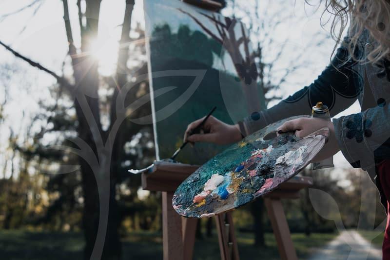
From an image editing perspective, that starting point matters. A logo is not only a symbol. It is a shape that must survive resizing, compression, bad lighting on print, social media cropping, and cheap sticker output. When someone says they need a free logo, what they often mean is that they need a usable mark without spending 300 to 1,000 dollars before the business has even made its first sale.
That budget pressure is understandable, but it creates a trap. People save on design cost, then lose time fixing files, replacing blurry exports, and redoing layouts because the logo only existed as a tiny PNG. The money saved upfront can quietly return as labor.
Free does not mean careless
A free logo can work if the job is small and the decision is honest. If the brand will live mainly on Instagram, a simple delivery app thumbnail, and a printed receipt, the logo does not need the same depth as a company preparing franchise packaging or exhibition panels. The problem begins when a temporary mark is treated like a permanent identity.
I have seen this many times with small sellers. They download an icon, add a script font, and feel relieved because the store now looks finished. Two months later they need a banner, a stamp, a product sticker, and a dark-background version, and suddenly the free logo has no clean edges, no spacing rules, and no file source. The logo was free, but every later edit became expensive in minutes.
This is where practical judgment matters more than creativity. Free logo design is strongest when it is used as a first-stage tool, not as a final destination. If the brand concept is still moving, free is often enough. If the brand is already printing boxes in batches of 500, hesitation usually costs more than design itself.
How to make a free logo without creating future repair work
The safest process is simpler than many people expect. First, decide where the logo will appear in the next 30 days. Limit it to three surfaces, such as website header, social profile, and package sticker. If you cannot name the first three uses, you are designing too early.
Second, build the mark in black and white before touching color. This step reveals whether the shape has any strength on its own. If the logo only looks convincing because of a gradient, it will fail the moment it is printed in one color on a label printer or engraved onto acrylic signage.
Third, test it at two sizes: around 24 pixels for icon use and around 120 millimeters for print visibility. A lot of free logo ideas collapse here. Thin lines disappear at small size, while decorative details look awkward when enlarged. Good logo design often survives because it knows what to remove.
Fourth, export more than one file type if the tool allows it. At minimum, keep a transparent PNG and an editable source file. If SVG is available, that is better. Many free logo tools look fine until the day you need to adjust spacing between letters and realize the logo exists only as a flattened image.
Fifth, place the logo in a real mockup before you approve it. Not a glossy branding presentation, just a shop thumbnail, a paper cup, or a shipping label. A logo may look polished in the editor and look timid on a brown carton. That gap is where most first-time users misjudge quality.
Free logo tools versus paid logo production cost
People often compare free logo design with paid logo creation cost as if the difference were only money. In practice, the real difference is control. Free tools reduce entry cost, but they also narrow originality, spacing precision, font licensing certainty, and revision depth. Paid design buys thinking time as much as files.
A common pattern is this. A free logo takes one to two hours to assemble, another two hours to tweak, and then several scattered revisions later because the original choices were weak. A paid designer may cost more on day one, but they usually remove that loop by deciding hierarchy, proportion, and file structure properly from the start.
There is also a middle ground that people ignore. Instead of commissioning a full identity package, some businesses use a free logo for launch and set a clear replacement point. For example, after the first 100 orders or after the second offline event, they upgrade. That approach is often more sensible than pretending a free tool can solve every branding problem forever.
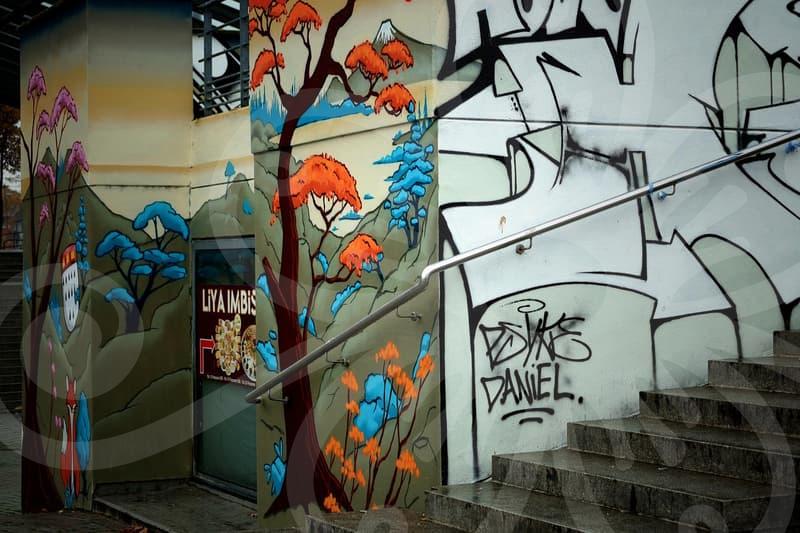
Another issue is sameness. Many logo creation sites guide users toward the same geometric symbols, the same sans-serif fonts, and the same spacing patterns. When five nearby dessert shops all look like cousins, price becomes the only visible differentiator. That is not a design failure alone. It is a business signal problem.
What should you watch inside the editing screen?
This is where image editing habits make a noticeable difference. Beginners spend too much attention on symbols and not enough on edge quality, alignment, and empty space. Yet those dull-looking details decide whether the logo feels reliable.
Start with spacing between the icon and the name. If the gap is too tight, the logo feels cramped. If it is too loose, the pieces stop reading as one unit. A difference of 4 to 8 pixels can change the impression more than swapping the icon itself.
Then inspect stroke thickness and contrast. A mark with hairline strokes may look elegant on a bright laptop display, but disappear on a low-cost print or a dark storefront image. Ask a basic question in the middle of the process. If this were seen for one second while someone scrolls, would the shape still hold together.
Color also needs restraint. One main color and one support tone are usually enough for a free logo stage. People add a third or fourth color because it feels unfinished otherwise, but logos are not posters. The more colors you add, the more places you create failure: poor print matching, weak contrast, and inconsistent background handling.
Finally, check the typography like you would check photo retouching at 200 percent zoom. Are the letters balanced, or does one side feel heavier. Does the font look too close to a law office when the brand sells handmade soap. Does the personality match the object being sold, or is the logo speaking in the wrong voice.
When free logo design is enough, and when it is not
Free logo design is enough for test launches, internal projects, short seasonal events, student teams, and solo businesses validating demand. In those cases, speed matters more than formal brand architecture. The logo only needs to be clean, readable, and consistent across a few touchpoints.
It stops being enough when the business enters production where mistakes multiply. Acrylic logo fabrication, packaging plates, storefront signs, uniforms, and paid advertising all expose weakness. A logo that looked acceptable on screen can become thin, awkward, or legally risky once it turns into physical output.
The biggest trade-off is not artistic pride. It is replacement cost. Once customers begin recognizing a mark, changing it later has a price, even if the first version was free. That is why free logo design benefits people most when they know it is a draft with a job to do, not a forever answer.
If your next step is practical, do this: make one black-and-white logo, test it on three real surfaces, and wait a day before finalizing it. If it still feels clear after that pause, keep moving. If you already know the brand will need signage, packaging, or repeated print runs, skipping straight to a stronger paid solution is often the cleaner choice.