E-Publishing Practical Exam Tips
Why this exam feels harder than it looks
The Electronic Publishing Practical Exam is not just a software test. It checks whether you can build a clean page under pressure, move between Photoshop, Illustrator, and InDesign without hesitation, and keep the final layout stable until export. Many people study tools one by one, then get stuck when the exam asks them to connect everything in one flow.
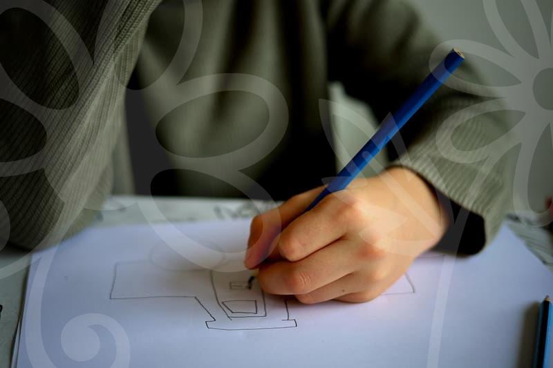
That gap shows up in small places. A cropped image looks fine in Photoshop, but the placed file sits awkwardly inside the InDesign frame. A title made in Illustrator has the right shape, yet its size overwhelms the text block once it lands on the page. In real work, you would adjust slowly and ask for feedback. In the exam, you usually have to make that judgment alone in a limited window, often within a couple of hours.
This is why the test feels closer to production than to theory. You are being asked to think like a junior editorial designer who has no time for trial and error. If your hands know the commands but your eyes cannot judge hierarchy, margin balance, and image weight, the page starts to collapse.
What should you practice first
The fastest way to improve is to train the order of work, not just the software menus. Start with document setup, then typography, then image placement, then refinement, and only after that move to export checks. People often do the opposite because image editing feels more visible, but the page structure is what holds the score together.
A practical routine works better than broad study. On day one, build only the document and master page elements. On day two, practice text frames, paragraph styles, and line spacing control. On day three, place images and correct alignment problems. In four or five study sessions, repeated in the same order, your speed improves more than from watching long lectures.
There is a reason this sequence matters. If the baseline text area is unstable, every image decision becomes harder. If margins and columns are fixed first, you can tell within seconds whether a visual element belongs on the page or is simply taking up space.
A step by step workflow that reduces mistakes
When I see candidates lose points, it is rarely because they do not know a command. It is usually because they skip sequence control. The safer workflow is simple and strict.
First, read the task and mark the required outputs before opening any program. That takes about three to five minutes, but it prevents the common mistake of polishing the wrong area. Second, create the InDesign document with the correct page size, margins, bleed, and basic guides. Third, place text early, even if the styling is rough, because text amount determines the true visual pressure of the page.
After that, move to image treatment. In Photoshop, correct only what affects print or layout clarity, such as crop, brightness, contrast, and distracting color cast. In Illustrator, build or clean vector elements only if the task clearly needs them. Then return to InDesign and solve composition problems there, because that is where balance can actually be judged.
The final stage is not decoration. Check overset text, broken alignment, inconsistent spacing, accidental font substitution, and image links. Export only after a full page scan at high zoom and then another scan at reduced zoom. One close view catches technical errors. One distant view tells you whether the page breathes.
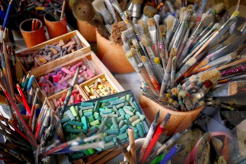
Photoshop, Illustrator, and InDesign do not carry equal weight
Candidates sometimes spend too much time on advanced effects because they want the output to look rich. That is usually the wrong trade. In this exam, InDesign tends to carry the structural burden, Photoshop supports image correction, and Illustrator plays a smaller but important role when graphic elements or logo-like treatments are required.
Think of it like preparing a magazine spread for a client who only cares whether it prints cleanly and reads well. Photoshop is the darkroom. Illustrator is the drawing table. InDesign is the actual room where the furniture must fit. If the room is cramped, nobody praises the drawing table.
A simple comparison helps. Strong Photoshop skill with weak layout judgment often produces attractive pieces that feel amateur once text is added. Strong InDesign skill with modest image editing can still produce a composed and believable result. That is why many passers are not the flashiest designers in practice sessions. They are the ones who know when to stop editing an image and return to the page.
Where scores are quietly lost
The dangerous mistakes are boring ones. Misaligned captions, uneven spacing between heading and body text, inconsistent indent logic, and careless crop ratios can make a page feel unsettled even when every required element is present. Examiners may not describe it that way, but the work looks unprofessional at a glance.
Typography is often the silent divider. If line spacing is too tight, the page feels cheap. If it is too loose, the text loses force and the layout starts drifting apart. A difference as small as 1 or 2 points in leading can change the entire reading rhythm, especially in narrow columns.
Time management also creates visual mistakes. A candidate who spends 40 minutes polishing one image often rushes the last 20 minutes and misses link checks or text overflow. That is the exam version of a common studio problem. People protect the part they enjoy and neglect the part that clients actually notice first.
Ask yourself one question in the middle of practice. If this were printed at actual size right now, where would my eye land first, and would that be the right place. That question is more useful than memorizing one more panel setting.
Who benefits most from this approach
This approach helps people who already know the basic tools but cannot turn that knowledge into a stable exam result. It also works well for candidates moving in from adjacent licenses such as graphic design or image editing, because they often have enough software familiarity but not enough page judgment. For them, the missing piece is usually sequence and restraint, not raw technical range.
There is also an honest limitation. If your software basics are still shaky, workflow advice alone will not save you. Someone who cannot control text frames, image links, paragraph settings, and export options without hesitation should spend a week on command repetition before worrying about style.
The practical takeaway is simple. Run at least three full mock sessions with a timer, keep the same work order each time, and review the page at both close and distant zoom before export. If that routine still feels unstable, the next step is not another design tutorial. It is slower repetition on one complete page until your hands stop negotiating with the software.