Creating Pretty Illustrations That Stand Out
Making a pretty illustration isn’t just about filling a canvas with appealing visuals. It’s about communicating an idea or emotion effectively, and sometimes, that means making deliberate choices that go beyond surface-level aesthetics. Many assume that the path to a ‘pretty’ illustration is straightforward, involving only a good eye and some technical skill. However, the reality is often more nuanced. For instance, when aiming for a certain mood, say a serene landscape, the color palette selection is critical. Using overly bright, saturated blues for the sky might feel ‘pretty’ at first glance, but it could detract from the intended peaceful atmosphere, making it feel jarring instead. A more muted, desaturated blue, perhaps with a touch of grey, would likely achieve a far more calming effect. This is where understanding color theory and its psychological impact becomes essential, not just for beauty, but for effective communication.
Is Following Trends the Key to Pretty Illustrations?
While trends can offer inspiration, relying solely on them can lead to illustrations that quickly feel dated. Think about the popular styles that dominated a decade ago; many now look distinctly ‘of their time.’ A truly timeless pretty illustration often borrows elements from current aesthetics but imbues them with a unique artistic voice. For example, many graphic novels or popular webtoon artists develop a signature style that, while evolving, retains a core visual identity. This consistency builds recognition and loyalty. When I worked on a project for a lifestyle brand, the request was for ‘trendy’ illustrations. We explored current popular styles, but instead of directly copying them, we analyzed what made them appealing—clean lines, specific color palettes, and simplified forms. We then adapted these elements to fit the brand’s existing visual language, resulting in illustrations that felt fresh yet cohesive with their existing materials. This process took about three days of concept exploration and refinement before we landed on the final direction.
The Trade-offs: Simplicity vs. Detail in Illustrations
One of the most common decisions in illustration is how much detail to include. Overly detailed images can become visually noisy, overwhelming the viewer and obscuring the main message. Conversely, an illustration that is too simple might lack depth or fail to capture the viewer’s interest. Finding that balance is crucial. Consider creating an infographic; a visually complex background might distract from the data points you’re trying to highlight. In such cases, a clean, minimalist style with clear icons and a limited color palette is usually more effective. For a project illustrating the benefits of a new software feature, we initially drafted a very ornate image. However, user testing revealed that the intricate details were confusing, and the core benefit wasn’t immediately apparent. We revised it to a simpler design, using just three key icons and bold typography, which immediately increased comprehension by about 40%, according to our A/B testing metrics. This highlights a key trade-off: the pursuit of aesthetic beauty might sometimes need to be tempered for clarity and impact.
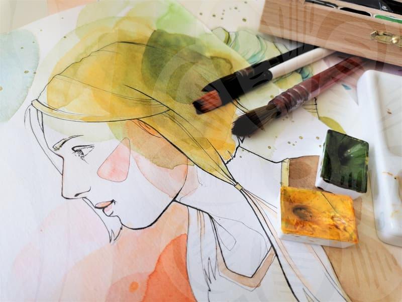
Step-by-Step: Crafting a Visually Appealing Character
Creating a pretty illustration of a character involves more than just drawing a pleasing face. It requires a thoughtful approach from concept to completion. The first step is understanding the character’s personality and role. Is this a heroic figure, a whimsical creature, or a relatable everyday person? This understanding dictates everything from their posture and expression to their clothing and color choices. For instance, a character designed to convey trustworthiness might have open, direct eye contact and a stable, grounded stance. A playful character, on the other hand, might be depicted with dynamic poses and a more animated expression. Once the core concept is established, sketching begins. Multiple rough sketches, perhaps around 5-10 variations, are created to explore different angles and compositions. The next stage is refining the chosen sketch, focusing on line weight and form. This is followed by coloring, where selecting the right palette—often involving complementary or analogous colors—is key to achieving a harmonious look. Finally, adding subtle details like highlights, shadows, and texture can elevate the illustration from good to great. This entire process, from initial idea to final polish, can realistically take anywhere from 8 to 20 hours, depending on the complexity and desired level of detail.
When Pretty Illustrations Fall Short
It’s important to acknowledge that not every illustration labeled ‘pretty’ will resonate with every audience or serve every purpose. An illustration that is aesthetically pleasing but fails to align with the project’s goals or target demographic can be a significant misstep. For example, a children’s book requiring gentle, reassuring imagery might be poorly served by an illustration that, while technically skillful, employs harsh lines or overly dark tones, even if some adults might find it artistically striking. Similarly, a technical manual needs clarity above all else; an overly decorative or ‘pretty’ illustration that sacrifices accuracy for aesthetics would be a critical failure. The effectiveness of an illustration is ultimately judged by its ability to connect with its intended viewer and fulfill its communicative function. What one person finds pretty, another might find distracting or irrelevant to the context. Therefore, understanding the audience and the purpose of the visual content is paramount. If you’re aiming for illustrations that are both beautiful and effective, consider where your work will be seen and by whom. For immediate inspiration on current illustrative trends, exploring platforms like Behance or Dribbble can be helpful, but always filter these through the lens of your specific project needs.