Company logo design that holds up
Why does company logo design fail so early.
Most weak logos do not fail because the designer lacks taste. They fail because the company tries to solve three jobs with one mark. It wants to look trustworthy, modern, premium, friendly, local, and memorable at the same time, and the result turns into a shape that says nothing clearly.
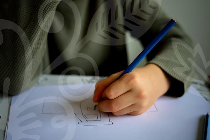
This happens a lot when the first brief is only a mood word list. Clean, bold, simple, unique, and global sound useful, but they are too vague to guide actual editing decisions. When I review logo drafts, the problem is often visible within ten seconds: the stroke weight is too thin for small use, the letter spacing collapses at signboard size, or the icon looks generic once the color is removed.
A company logo is not a poster. It has to survive in a browser tab, on a dark footer, on a stamped invoice, and sometimes on a cheap printed uniform patch. If the mark only looks good as a large centered image on a white mockup, the design process has not reached the hard part yet.
The practical question is not whether the logo looks impressive. The question is whether someone can still identify it at 24 pixels, on a delivery box, or in a profile image seen for less than three seconds. That is where many first drafts break apart.
Start with use before style.
Before touching Illustrator or any AI logo maker, define where the logo will live for the next twelve months. A software startup, a clothing label, and a neighborhood clinic need different tolerances. A clothing logo may need embroidery and woven labels, while a service company may depend more on website headers, proposal PDFs, and office signage.
I usually reduce the planning stage to four decisions. First, decide whether the brand will be remembered mainly by wordmark, symbol, or a combined system. Second, decide the smallest likely display size. Third, decide whether the logo must work in one color. Fourth, decide whether the name itself is short enough to carry recognition.
That sequence sounds basic, but it prevents expensive revisions later. If the company name is long, forcing it into an ornate symbol plus a decorative type treatment usually creates a scaling problem. If the business expects vehicle decals or storefront lettering, hairline details and soft gradients are a bad bet from day one.
A quick working method helps here. Spend about 30 minutes listing actual placements, another 30 minutes collecting references, and another 30 minutes sketching black and white options before any polished version is made. That 90 minute block saves far more time than jumping straight into a shiny concept image.
There is also a small decision that changes everything: does the company need recognition or explanation. A new consulting firm often needs a clear wordmark more than a clever icon, because the name is still doing the heavy lifting. A café, apparel label, or creator brand may benefit more from a tighter visual symbol if repeat exposure is expected.
Typography carries more brand memory than people expect.
In logo work, typography gets underestimated because it feels less dramatic than illustration. Yet font structure often decides whether a brand feels stable, cheap, serious, or disposable before anyone reads the full name. People respond to rhythm, width, spacing, and contrast long before they analyze meaning.
That is why the typography point from recent design discussions still matters in the AI era. Even when a logo is absent or the message is short, people often recall a brand through letterform mood alone. This is easy to observe in the market: many readers can recognize a familiar entertainment or sports brand from the shape of the text before they process the full word.
A useful real-world comparison is how toy and hobby brands treat their logos when launching sub-brands. When Bandai introduced a tabletop game brand, the mark needed to feel connected to a larger corporate family while still signaling a new play context. That balance is rarely achieved by icon tricks alone. It usually comes from disciplined type choices, spacing, and how the parent brand relationship is managed.
For company logo design, I check typography in a strict order. First, I view the wordmark in black only. Second, I blur the screen or zoom out until the name is barely readable, because weak spacing problems show up fast. Third, I compare the same wordmark in all caps, title case, and a mixed custom form. Small edits such as narrowing a round letter or opening the counter inside an a or e can improve recognition more than adding an icon.
This is where many founders ask the wrong question. They ask which font looks premium. The better question is which letterform continues to look intentional on a sign, a favicon, and a one-color stamp. Premium is not a style preset. It is often the result of restraint.
AI logo makers save time, but they also hide risk.
AI logo making tools are useful for speed, and pretending otherwise would be outdated. They are good at generating direction when the team has no visual vocabulary yet. For early exploration, an AI logo tool can give you twenty routes in the time a manual sketching round would produce five.
The problem is not generation speed. The problem is that AI tends to smooth away business context. It produces polished marks that look finished, but many are built on common geometry, predictable negative space tricks, or font pairings that several other brands could also receive on the same day.
Here is the comparison I use when a client asks whether to rely on logo production AI. AI is strong at breadth, weak at consequences. Manual editing is slower at the beginning, but much better at fixing spacing, legal distinctiveness, production realism, and file hygiene.
A hybrid process works best for most small companies. Use AI to generate visual territories, not final assets. Pull three directions, discard the literal ones, then rebuild the chosen route manually in vector form so every anchor point, stroke, and proportion is under control.
This matters even more if you are also handling background removal, product cutouts, or campaign images in-house. A logo that looks fine on a transparent PNG can still fail when placed over textured photography, stitched onto fabric, or knocked out of a busy package design. Image editing experience teaches this quickly: edge clarity, contrast behavior, and shape balance matter more in use than in isolated presentation.
If someone searches for a background removal site and an AI logo maker on the same day, the temptation is obvious. They want a fast brand kit by tonight. Sometimes that is reasonable for a test launch, but if the company will print signage, boxes, labels, or business cards, the shortcut often creates a second project two weeks later.
Build the logo file like a production asset.
A lot of pain around company logo design comes after approval, not before it. The logo looks settled, then someone asks for a white version, a stamp version, a business card version, and a file that the sign shop can actually use. If the original build is messy, every request becomes a repair job.
My production sequence is simple and it holds up well. Start with a primary vector file in outlines or carefully managed live type. Create a one-color black version and a one-color white version before touching gradients. Then export an SVG for digital use, a PDF for print sharing, and a PNG set with at least three sizes such as 512, 256, and 128 pixels.
After that, test the mark in context. Put it on a mock website header at realistic size. Put it on a business card where the logo width is around 30 to 45 millimeters. Put it on a dark background and a mid-tone background. If it disappears anywhere, the issue is usually not color magic but structural weakness.
Signboard lettering exposes another class of mistakes. A logo with delicate inner cuts may look stylish on screen, then fill in when fabricated in acrylic or painted metal. Strokes that seem elegant at 800 percent zoom can become fragile or unreadable from across a street. This is why sign text production and logo design should not be treated as separate worlds.
There is also a common file mistake with names and variants. Teams save final final real final versions until nobody knows which one is approved. Keep a tight naming rule from the start: primary, horizontal, symbol, black, white, and small-size. It sounds boring, but it prevents the wrong mark from reaching a printer or developer.
For image editing teams, one more step matters. Check how the logo behaves after background removal and compositing. A mark with thin exterior gaps may create dirty halos when placed on compressed web graphics, especially if someone exports low-quality PNG files. That issue looks minor in isolation, but across a homepage it makes the brand feel cheaper than it is.
What makes a logo feel credible instead of busy.
Credibility in logo work usually comes from subtraction. When a company is unsure of its market position, it often adds symbols for reassurance: a leaf for eco claims, a globe for scale, a shield for trust, a spark for creativity. The design starts behaving like a checklist rather than a brand.
A better approach is to choose one signal and let the rest come from execution. If the company needs to feel precise, build that through spacing, line control, and alignment. If it needs warmth, do it through proportion and rhythm rather than adding extra decoration that will age badly.
This is easy to test with a simple cause and result exercise. Remove the icon and look at the wordmark alone. If the brand collapses instantly, the typography was probably never carrying enough weight. Remove the color next. If the logo loses personality the moment color disappears, it may have been relying on styling instead of structure.
The same thinking applies to industry-specific work such as clothing logos. Apparel brands often chase uniqueness through aggressive custom lettering, but the best marks usually survive because they can move from neck label to shopping bag to social avatar without changing their basic logic. If the design needs a full illustration every time to feel alive, it is not a strong everyday logo yet.
There is a useful metaphor here. A good logo should behave more like a well-cut jacket than a costume. You notice the fit first, not the decoration. That is the difference between a mark that keeps working for five years and one that already feels dated by the second packaging run.
Who benefits from this approach, and when is it too much.
This method helps most when the company is small, busy, and cannot afford repeated redesign cycles. Founders handling proposals, websites, social profiles, and print materials themselves get the biggest return from a logo system that is plain to manage and hard to misuse. In-house marketers also benefit because consistent assets reduce the daily friction of resizing, exporting, and adapting visuals.
It is less suitable when the brand goal is temporary theater rather than long-term recognition. A one-off event, a seasonal campaign, or a short pop-up launch can tolerate a faster, looser identity. In those cases, spending too much time polishing vector discipline may not be the best use of budget.
The honest trade-off is that restrained logo design can feel slower and less exciting during the concept stage. AI outputs and decorative mockups create quicker emotional reactions. But if the logo needs to survive invoices, profile images, signage, and small print without constant repair, a stricter process wins more often.
The practical next step is not to search for more inspiration first. Take the current logo or draft, convert it to black, reduce it to favicon size, and place it on both light and dark backgrounds. The weaknesses will show up fast, and those weaknesses are usually a better guide than another round of mood boards.