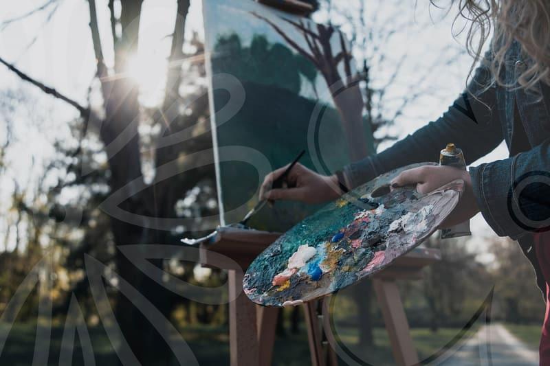
Color grading for vibrant photos
Color tone fundamentals
Color tone shapes the mood of an image before the viewer notices the subject. It begins with the balance of temperature, tint, and the overall balance across shadows, midtones, and highlights. Think of color tone as the DNA of a photo, guiding how every element communicates with the viewer.
Begin with a neutral judgment of the scene and avoid drifting toward an overbearing palette. Adjust white balance to reduce color casts and set a base that preserves natural skin tones and material colors. The histogram becomes a map, showing whether the tonal range remains evenly distributed or leaks into unwanted hues.
For beginners, it’s helpful to calibrate a simple starting point using a neutral gray reference and a monitor you trust. Small, incremental shifts in temperature and tint can dramatically improve perceived realism. Color tone is not a one click fix, it is a careful dialogue between the image and the observer.
Color contrast mastery
Contrast is more than making darks darker and lights brighter. It also involves how color contrast interacts with subject matter, lighting, and the surrounding environment. Mastery comes from understanding warm versus cool relationships and choosing palettes that enhance readability.
Experiment with shadows and highlights to sculpt depth without flattening the image. Adjust color channels thoughtfully, letting blues cool the shadows and yellows warm the highlights when appropriate. You might wonder how to keep the subject from drifting into the background while the background gains color.
Keep variety in your palette so the scene does not read as monochrome, while maintaining legibility on crucial details. Practice with layer blending modes to see how color changes affect luminance and texture. This mastery grows through repeated edits and careful observation of how color shifts influence perception.
Practical color grading
Practical color grading emphasizes non-destructive workflows and repeatable results. Current trends favor non-destructive workflows and LUT-based tweaks that keep edits reversible. Use non-destructive adjustments, soft curves, and selective color tools to refine tones without overstepping the original capture.
Portraits, wedding moments, and landscapes demand different priorities for color grading, from skin tone accuracy to environmental mood. For portraits, keep skin tones neutral to slightly warm while letting the background harmonize with the overall palette. In landscapes, let the sky and foliage push the color relationships without introducing color noise.
Export choices matter because color spaces and bit depth shape how the grade survives the journey from screen to print. Choose sRGB for web and keep an eye on color management to protect consistency across devices. The workflow evolves as you learn to balance realism with expressive tone, and that evolution invites curiosity and practice.