Art Portfolio That Shows Clear Intent
Why do many art portfolios fail before the work is judged.
An art portfolio is often treated like a storage box. People collect ten, fifteen, sometimes twenty pieces, place them in a neat order, and assume the volume will speak for itself. In review situations, that usually backfires. The reviewer is not asking whether you have made many things. The reviewer is trying to understand what kind of visual thinker you are, how you make decisions, and whether your strongest work can survive comparison.
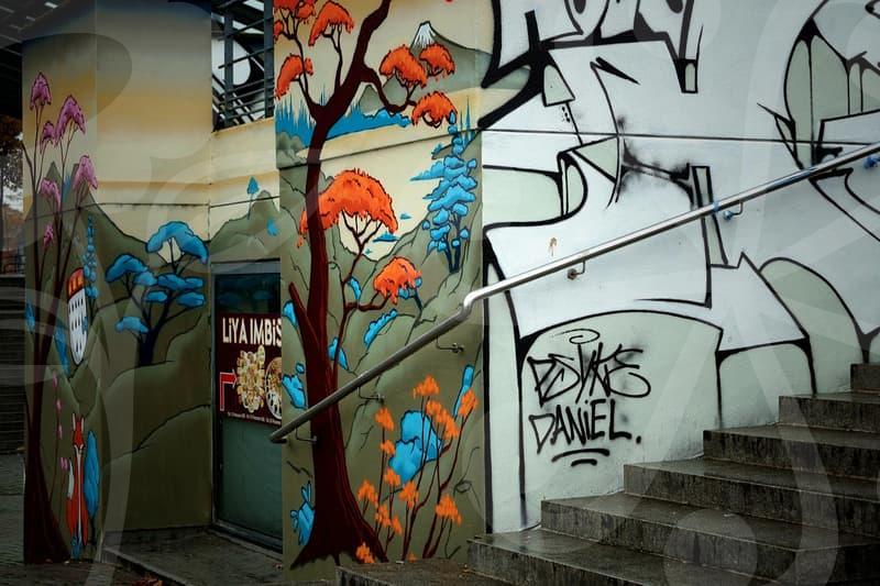
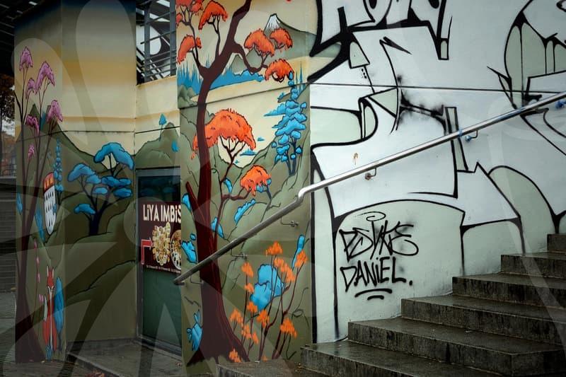
This is where image editing matters more than many applicants expect. A strong drawing can look weak if it is photographed under yellow room light, cropped with extra table edges, or exported at a size that makes the line quality look soft. I have seen portfolios improve noticeably in under 40 minutes just by correcting white balance, straightening perspective, and matching margins between pages. The artwork did not change, but the judgment around it did.
There is also a common mismatch between effort and evidence. Someone may spend 18 hours on a painting, then give the final portfolio image only two careless minutes on a phone screen. That is like ironing a shirt and then throwing it into a bag before a meeting. Reviewers may not say it directly, but they read presentation as part of your working method.
Another reason portfolios fail is that they try to look universally impressive. That instinct sounds safe, yet it flattens personality. A portfolio for a furniture design department, a spatial design department, and a school with a strong fine art culture should not feel identical. If every page uses the same polished template and the same detached captions, the work starts to feel less like a practice and more like a file transfer.
Building an art portfolio step by step.
The first step is selection, and it should be harsher than most people want. Start with all candidate works, then cut them to roughly twice the final count. If you think you need 12 pieces, shortlist 24. Lay them out as thumbnails and ask three practical questions. Which works still hold up when viewed small, which works reveal your decision making, and which works become redundant when placed next to stronger pieces.
The second step is grouping by function rather than medium. Many people sort by painting, drawing, sculpture, digital work, and photography. That is tidy, but not always persuasive. A better sequence often moves from observation to experimentation to resolution. In other words, show that you can look carefully, test ideas, and then finish something with control.
The third step is image capture and correction. Photograph flat works in even daylight or under consistent artificial lighting, then align edges so the piece does not lean. If the work is three dimensional, make one honest full view, one angle that explains form, and one close shot that proves material quality. This three-image logic is usually enough. More images only help when each one answers a different question.
The fourth step is page construction. Keep margins steady, captions short, and background neutral. When every page has a different spacing rule, the portfolio starts to feel anxious. A reviewer should move through it without noticing the layout machinery. If they keep noticing the template, the template is doing too much.
The fifth step is compression and export. This is where many good portfolios are quietly damaged. A file that is too heavy may lag or fail to upload, but a file that is too compressed will muddy graphite texture, paper grain, and tonal transitions. A practical target for a digital submission is to test the portfolio on both a laptop and a phone, then zoom to 100 percent on two or three detailed works. If the edges look brittle or the dark areas block up, export again.
What changes when the target is school, job, or mixed direction.
An art portfolio for admission and a portfolio for employment may share images, but they are not asking for the same proof. Schools such as CalArts or UAL often want evidence of thinking in motion. They are not only looking for finished polish. They want to see process, risk, and the ability to move beyond first ideas.
A job-facing portfolio, especially for a UI UX designer moving from an art background, has a different burden. Employers want clarity of problem solving, consistency, and evidence that visual choices were made for a user or client context. A beautiful sketchbook page can still be useful here, but only if it shows how raw visual thinking became structure, interface, motion, or hierarchy. Without that bridge, the work stays personal when the employer needs it to become applicable.
Department differences matter too. A furniture design department will care about form, use, scale, material thinking, and how the object occupies the body and room. A spatial design department will care more about circulation, volume, light, user path, and the relationship between plan and atmosphere. The mistake is presenting the same portfolio with minor caption changes. The smarter move is to keep a common core, then adjust 20 to 30 percent of the portfolio so the emphasis shifts with purpose.
Students from an art academy often worry that tailoring a portfolio means becoming strategic in a dishonest way. I do not see it that way. Editing is not lying. It is deciding what to make legible for a specific reader. If two schools value different things, showing the same evidence in the same ratio is not neutral. It is careless.
Editing decisions that make artwork read correctly.
Image editing for an art portfolio is less about decoration and more about translation. The job is to make the digital version behave as closely as possible to the original viewing experience. If the artwork is subtle, the edit should protect subtlety. If the work is sharp and graphic, the edit should preserve edge and contrast without making it look synthetic.
Start with color correction before you touch anything dramatic. Paper whites that drift warm can make charcoal drawings look dirty. Blues that shift toward cyan can flatten a painting that depended on muted temperature contrast. This is why I prefer comparing the screen image to the artwork under neutral light instead of trusting memory. Memory is generous in the wrong places.
Then check geometry. A small keystone distortion in a photographed drawing tells the eye that the page was not handled carefully. On a sculpture or installation image, perspective correction needs restraint. Overcorrecting can make an object lose scale or feel unnaturally stiff. The goal is not perfect mathematics. The goal is believable presence.
Next comes tonal control. This is where many portfolios become overprocessed. Raising contrast can make the image feel cleaner for two seconds, then destroy detail in shadows and paper texture. I usually advise a simple cause and result test. If increasing contrast makes the focal area clearer but starts hiding secondary information that matters to craft, the edit has gone too far.
Finally, compare all pages side by side. One image with deep blacks and another with washed highlights can make the portfolio feel assembled from different people. Consistency across pages is not cosmetic. It gives the reviewer a stable viewing condition, which means each work has a fair chance to speak.
How much process should be shown.
People often hear that process matters and respond by showing everything. Thumbnail pages, failed studies, screenshots, raw sketches, material tests, half painted canvases, workshop photos, and notebook scans all flood the portfolio at once. The intention is honest, but the result can feel like a hard drive emptied onto the table. Process only helps when it reveals a decision chain.
A better method is to choose one or two projects and unpack them with discipline. Show the first observation, the shift in direction, and the final resolution. Three to five stages are often enough. That sequence tells the reviewer whether you can identify a problem, test an alternative, and improve the work instead of decorating the idea you had on day one.
This is especially useful for applicants coming from an art academy or private studio training. Technical skill is often visible from the finished work already. What reviewers may still need is evidence that you are not only good at following established standards. Can you edit your own idea. Can you abandon a pretty but weak direction. Can you recognize when the second attempt is structurally better than the first.
There is a useful metaphor here. A portfolio is not a museum warehouse. It is closer to a courtroom exhibit. You are not asked to submit all available material. You are asked to present the evidence that makes your case understandable.
The honest trade off in a polished art portfolio.
A polished art portfolio saves the reviewer time, and that matters more than many applicants like to admit. In a stack of submissions, clear sequencing, disciplined editing, and faithful images create trust quickly. Trust does not guarantee acceptance, but it buys attention. That is already a meaningful advantage.
The trade off is that polish can hide uncertainty so well that the work starts to feel closed. This is a risk for younger applicants aiming at schools that value experimentation, and it also affects career changers building a design portfolio from art practice. If every page looks resolved in the same smooth voice, the reviewer may struggle to see your edge, curiosity, or willingness to revise.
Who benefits most from this approach. People applying to art school, design departments, or early career visual roles who already have enough work but are not presenting it with intent. They do not need more output first. They need stricter selection, better image handling, and a sequence that proves judgment.
This approach does not help much if the underlying work is still too thin, repetitive, or borrowed from trends without personal stakes. In that case, editing the portfolio is like cleaning a shop window before there is enough in the store. The practical next step is simple. Print small thumbnails of your current portfolio, remove one third of the pages, and ask whether the remaining sequence tells a sharper story than the full version. If it does, you are finally editing like someone who understands what an art portfolio is for.