Indesign Course for Visual Content
Foundational Layout Skills
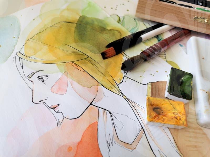
InDesign serves as a central tool for arranging text, images, and graphics into cohesive layouts that communicate ideas with precision. This module focuses on grids, margins, baseline grids, and alignment principles that underpin professional pages across print and digital formats. Think of page design as a blueprint where balance guides reader attention and readability, creating flows that feel natural to skim and linger.
Start with a clear grid system and establish margins that maintain consistency across spreads, enabling editors to place elements without guesswork. Learn to create and apply paragraph and character styles so typography rules are centralized, scalable, and easy to update when brand guidelines shift. You may wonder how readability is tested across different devices and print sizes, prompting you to compare metrics and simulate real user experiences.
With the grid, you can align images and text at dozens of breakpoints, creating a harmonious rhythm that feels intentional rather than accidental. Introduce a baseline grid to sync typography across columns and pages, preserving line length, leading, and color relationships as layouts evolve. This practice creates a rhythm readers can follow from cover to last page, reducing cognitive load and enhancing retention.
Use guides and smart alignment features to speed up production, while maintaining flexibility to adapt layouts for different formats. Practice with sample layouts such as magazine spreads or catalog pages to internalize visual hierarchy, contrast, and typographic pairing. The goal is to reduce guesswork and focus on content clarity, so future edits remain predictable and efficient.
Styles and Master Pages
Master pages set recurring elements such as headers, footers, page numbers, and consistent margins across sections. Styles unify typography and object attributes across a document, so changes propagate with a single update rather than manual edits. Why does consistency matter for visual storytelling and reader trust.
Create paragraph, character, and object styles to manage fonts, colors, spacing, and alignment throughout the project. Use paragraph styles for body text and character styles for emphasis to maintain typography rules across chapters and layouts. The real power arrives when changes update across the entire project instantly, powering smooth collaboration among designers and editors.
Apply masters across chapters to ensure uniform margins, header layouts, and consistent gutter widths across all spreads. Practice with a multi-section brochure to see how styles propagate from cover through internal sections. This discipline saves time and reduces errors in collaborative workflows where feedback loops are common.
Exporting and Print Setup
Export settings directly influence print quality, color accuracy, and the suitability of files for different distribution channels. Understand presets for print and digital outputs, color profiles, and bleed settings so files are production ready. You may need web-optimized PDFs or high fidelity for commercial print, depending on the audience and medium.
Use preflight checks to catch missing fonts, embedded images, and linked assets before sending to production. Learn to package a project with fonts and links to ensure smooth handoffs between designers and printers. The habit reduces last-minute errors during production reviews and keeps teams aligned on output goals.
When preparing assets, maintain organized exports with consistent naming, versioning, and folder structures to simplify revisits. Test exported files on multiple devices and media types to verify readability, color integrity, and typography legibility. This practice mirrors real-world editorial and branding workflows where timely delivery hinges on solid export decisions.