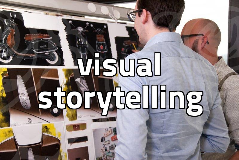
Practical Graphic Design Choices for Professional Results
Graphic design is often misunderstood as an artistic endeavor that prioritizes aesthetic flair over functional clarity. In reality, the most effective professional work originates from a rigid focus on the objective at hand. When you are tasked with creating a layout for a product detail page or an interface element, the temptation to experiment with exotic fonts or complex gradients is high. However, seasoned designers understand that these choices often detract from the primary goal of guiding the user toward a specific action. A disciplined approach to layout ensures that your work remains readable and purpose-driven across different screens.
Why minimalism beats complexity in layout structure
The most common mistake junior designers make is overcrowding a canvas with unnecessary visual weight. When every element screams for attention, the viewer eventually ignores everything. Consider the classic example of the New York City subway map designed by Massimo Vignelli. By stripping away extraneous geographical details and focusing strictly on color-coded lines and clear typography, he transformed a chaotic network into a usable tool. In modern digital projects, this lesson translates to prioritizing white space. If your layout is cluttered, your user will likely abandon the task within five seconds. Think of white space not as empty room, but as a deliberate framing tool that directs the eye exactly where you want it to land.
Step by step workflow for efficient graphic design
To move from an idea to a final deliverable without wasting hours, a structured workflow is mandatory. First, draft a low-fidelity wireframe on paper or a simple white canvas. This step takes about fifteen minutes and forces you to define the information hierarchy before applying any stylistic polish. Second, select a typography pair that adheres to high legibility standards. Third, apply a limited color palette derived from your brand identity, keeping contrast ratios in mind for accessibility. Fourth, review your output on both mobile and desktop screen sizes to ensure the design remains responsive. This final check often reveals hidden bugs in alignment that you would otherwise miss on a single monitor setup.
Comparing software tools for better decision making
Many professionals spend excessive time debating between industry-standard suites and newer, lighter tools. If your primary focus is vector-based graphic design or game UI assets, the choice of software directly impacts your iteration speed. For instance, high-end applications like Adobe Illustrator provide immense precision but come with a steep learning curve and heavy subscription costs. In contrast, tools like Clip Studio Paint are often pigeonholed into illustration, but they possess powerful features for comic panel layouts and specific line-art tasks that can be repurposed for UI elements. When deciding, evaluate if you actually need advanced automation or if a simpler, faster tool allows you to reach the output goal sooner. An over-featured program can often lead to analysis paralysis, slowing down your output rather than accelerating it.
Reality check on technical limitations
Technical performance is another critical factor often overlooked by beginners. A stunning design that causes a website to lag or renders poorly on a tablet is essentially a failed design. Hardware limitations, such as the NPU performance of your machine or the processing power of the target device, dictate how complex your visual assets can truly be. If you are designing for a web environment, keep your file sizes under two megabytes per asset to maintain acceptable load times. Achieving a balance between visual depth and technical stability is the hallmark of a professional who respects both their craft and the end-user. If your design requires excessive resources, you are likely sacrificing performance for a marginal gain in aesthetic quality that the average user will not even notice.
How to refine your design process
Ultimately, your skill in this field is measured by your ability to solve problems, not by the complexity of the files you generate. The trade-off is clear: you can either aim for visual maximalism and risk usability issues, or you can commit to a cleaner, modular design that is easier to maintain and faster to implement. The most successful designers are those who treat their work as a living system rather than a static piece of art. Start by auditing your current workflow to see where you spend the most time on redundant tasks, and then replace those steps with a system that prioritizes speed. To improve your next project, try setting a strict limit on the number of typefaces and colors you use from the very beginning. This constraint will often lead to a more cohesive result than if you had infinite options at your disposal. If you feel stuck, try searching for design system documentation of established tech brands to see how they maintain consistency across different channels.