I spent more time resizing banners than actually making them
Fighting with aspect ratios for a simple banner
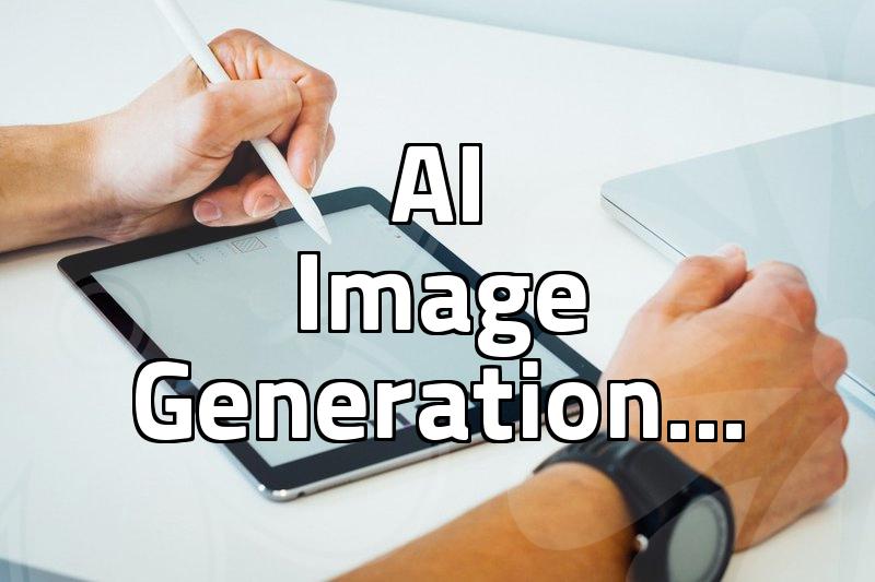
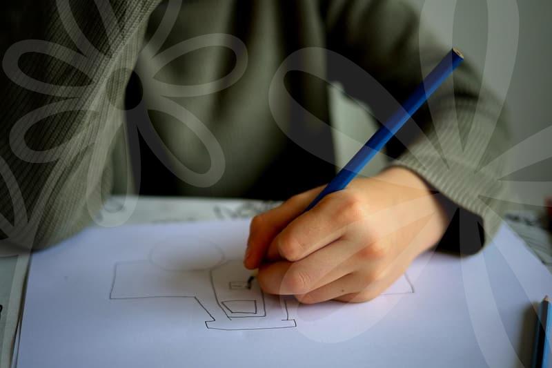
I sat down yesterday to draft some assets for a small campaign. It started with a simple request to create a set of banners for an upcoming event, similar to the ones I saw for the local Starfield Anseong festival. You know how it goes. You have a vision of a clean, high-impact image, but once you start actually moving the text around in Canva or Photoshop, it feels like a never-ending game of Tetris. I spent at least three hours just trying to get the logo placement right for both a standard 1080×1080 feed post and those annoying tall story formats. It is honestly absurd how much space is ‘wasted’ just to make sure the text doesn’t get cut off by the interface overlays on Instagram.
The endless cycle of Meta ads and feedback
When I look at the recent headlines about reality show stars and their chaotic social media fallout, I realize that the audience really does pick up on the smallest inconsistencies. It made me hyper-aware of the tiny details in my own work. I was tweaking a simple review event banner, and suddenly I’m wondering if a font change makes it look too ‘commercial’ or if the color palette is too aggressive for an organic look. It is a weird pressure, knowing that one wrong visual choice can lead to someone just scrolling past without a second thought. I wasn’t even doing paid Meta ads yet, just trying to finalize the organic assets, but the fatigue was already setting in.
Trying to measure the actual worth of a pixel
I keep thinking about the costs. People always ask about the Instagram ad spend, but nobody talks about the cost of the sheer time spent moving elements around. If I were to charge for this, the hourly rate would be depressing. I saw a job posting recently that asked for everything—website management, YouTube growth, and all social media assets—for a fixed monthly fee that honestly made me wince. They even explicitly stated that all source files and edit projects belong to the company. Dealing with those ownership clauses feels like a chore, especially when you are just trying to get a design to look decent on a phone screen.
Why local ads still feel like a physical struggle
Earlier in the week, I saw a Seongnam banner advertisement while I was out. It was printed on actual vinyl and hung up on a street pole. It looked so much easier than the digital version. You print it, you hang it, you’re done. There is no algorithm to fight, no aspect ratio to worry about, and no hidden buttons blocking your headline. I found myself feeling almost jealous of that physical print. Even though I deal with digital files, sometimes I just want to walk away from the monitor and not think about whether the image quality is being compressed by the platform.
Unresolved feelings about the output
I finished the files late last night. I sent them off, but I don’t feel that sense of accomplishment people usually talk about in these ‘how-to’ guides. I just feel like I’ve satisfied a requirement. Did the banner look good? Probably. Is it going to perform well? Who knows. I’m still staring at the screen wondering if I should have used a different shade of blue. It feels like a loop that doesn’t really have a satisfying end point, just a series of deadlines. Maybe I’m just tired of the screen, but I suspect I’ll be doing the exact same thing again next week for the next project.