Brochure design mastery for impact
Brochure Layout Essentials
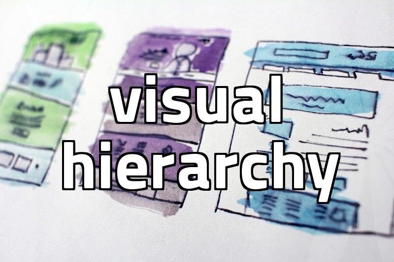
A brochure starts with a disciplined grid that guides where headlines, images, and blocks sit. Think in three or four columns and let the fold dictate where content flows. Hierarchy should be obvious from the moment someone glances at the cover. If readers must search for what matters, your layout has failed its primary job.
Margins, gutters, and safe zones protect your design from printer drift. Maintain consistent typography across panels so the eye travels smoothly. Whitespace is strategic breathing room that lets key messages stand out. Ensure grid alignment remains visible across pages to reinforce a cohesive look.
Choosing a fold type reshapes how content unfolds, and tri-folds often feel approachable. Consider what appears on each panel so the story flows without abrupt jumps. If you stack scenes like a storyboard, readers will anticipate what comes next. Test with real readers and adjust the sequence before going to print.
Accessibility should shape typography scale and high-contrast choices for every panel. Test readability across devices and print to ensure legibility in different contexts. Document your layout decisions so future updates stay aligned with the original vision. Maintain a living style guide that records fonts, spacing, and fold rules.
Print Specs and Finishes
Paper stock sets a tone that digital previews cannot fully capture. Choose weight and finish to reflect brand personality and durability needs. Bleed and trim marks ensure edges look precise after the guillotine finishes its cut. Color management hinges on calibrated proofs and consistent ink behavior across printers.
Gloss, matte, or satin finishes influence legibility and perception under different light. A protective coating may extend life, but it can mute subtle image tones. Sustainability choices, such as recycled stock or soy inks, matter to savvy buyers. Ask for a finish swatch library to compare options side by side.
Proofing blocks silence surprises by catching misalignments, color shifts, or missing captions. Request a press proof that mirrors the final sheet and check every panel. Plan production timelines with the printer to align with distribution windows. Track every change with version notes to avoid mixups.
Budgeting for print requires a balance between ambition and practicality. Estimate lead times, run proofs early, and plan for color correction rounds. Keep a versioned archive of proofs to avoid costly revisions. Develop contingency plans for delays or stock shortages.
Storytelling in Brochures
A brochure should narrate a concise journey from problem to solution. Lead with a hook on the cover and then guide readers through benefits. Ask a question on the first inside panel to invite engagement. Place a clear call to action at the end to complete the arc.
Bullet points condense value propositions without overwhelming the eye. Use captions that add context to images and reinforce the narrative. Avoid jargon and ensure every sentence earns its place in the flow. Use headers and bullets to keep the structure clear and scannable.
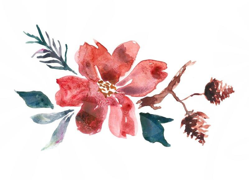
Visuals should illustrate claims and not distract from them. Photography styling, iconography, and charts must share a consistent mood. Consider how to compare options visually without fragmenting the message. Layout should support multiple channels so the brochure works in print and digital.
Budgeting for print requires a balance between ambition and practicality. Use a modular approach to content blocks and ensure each module can stand alone. Include client-ready quotes or data visuals to reinforce credibility. A modular approach reduces production time when updates are needed.
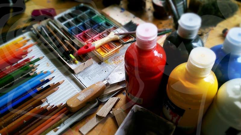
Images and Color Strategy
Select images with consistent lighting and composition to unify the spread. Resolve resolution and crop early so readers never notice jagged edges. Color decisions should reveal brand personality while preserving legibility across panels. Choose imagery that echoes the brochure’s emotional tone across all pages.
A limited palette reinforces recognition, but contrast remains essential for accessibility. Simulate different lighting conditions to confirm that all text stays readable. Test color contrast against simple backgrounds and avoid color alone conveying meaning. Typography pairing should harmonize with color to guide attention naturally.
Licensing and ethics matter when sourcing images for brochures. Prefer authentic, diverse representations that reflect the audience you serve. Always include alt text for images to support accessible design. Ensure that image library supports future campaigns without compromising quality.
Rhythm in color and image pauses keeps readers engaged through the entire piece. Seasonal or regional themes can be reflected with adaptive visuals while preserving brand cohesion. Document the visual guidelines so future designers can reproduce the look accurately. Review the motif alignment in a final pass to ensure consistent storytelling.