Mastering Photo Color Correction: Beyond Basic Adjustments
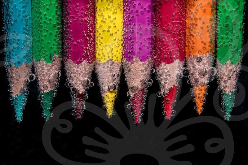
Adjusting the color tone of photos, or ‘사진색감보정’, is a crucial step in visual content creation. It’s more than just making a picture look pretty; it’s about conveying the right mood and ensuring accuracy. Many professionals, myself included, approach this process with a practical mindset, focusing on efficiency and impact rather than chasing every possible feature.
The core of effective color correction lies in understanding how light and color interact and how that perception can be subtly manipulated. For instance, a product shot for an online store needs to display accurate colors. If a red dress appears slightly orange in the final image, that’s a direct hit to its credibility and a potential reason for a customer to reject it. This isn’t about artistic flair; it’s about objective representation.
Why Does Color Tone Matter So Much?
Think about a cozy cafe scene. To evoke that feeling, you might want to lean into warmer tones – yellows, oranges, and soft browns. Conversely, a high-tech gadget might benefit from cooler, bluer tones to suggest innovation and precision. These decisions aren’t arbitrary; they tap into psychological associations we have with different colors. Getting the ‘사진색감보정’ right means aligning the visual output with the intended message or feeling.
This is where the trade-off between speed and precision becomes apparent. While many software tools offer automated color correction presets, they often fall short for critical applications. An AI-powered ‘auto-color’ function might make a dull photo brighter, but it rarely understands the specific requirements of, say, architectural photography where straight lines and accurate color rendition are paramount. Relying solely on these can lead to over-correction or an unnatural look, requiring more manual work to fix.
A Practical Approach to Color Correction Steps
Let’s break down a common workflow for achieving professional results in color correction, focusing on practical application. This isn’t about a rigid set of rules, but a flexible framework. I typically begin by assessing the white balance. If the white balance is off, everything else will be skewed. For example, if a photo taken under fluorescent lighting has a green cast, correcting this first is essential before attempting other adjustments. This might involve using a white or grey card in the original shot, or manually adjusting the white balance in editing software like Adobe Lightroom or Capture One.
My process usually involves these steps:
- White Balance Correction: This is foundational. Using the eyedropper tool on a neutral grey or white area in the image, or manually adjusting the temperature and tint sliders, corrects any color cast. Aim for neutral whites and greys first.
- Exposure Adjustment: Ensure the overall brightness is appropriate. Overexposed areas lose detail, and underexposed areas appear muddy. The histogram is your best friend here. I try to keep the main data within the mid-tones, avoiding clipping at either end.
- Contrast and Tone Curve: This refines the image’s depth. A subtle ‘S-curve’ can enhance contrast and add a professional look without making the image look harsh. I’m often looking for a subtle lift, not a dramatic overhaul.
- Saturation and Vibrance: Use these sparingly. Vibrance is generally safer as it protects skin tones from becoming oversaturated. I might boost vibrance slightly for landscapes but rarely touch saturation for portraits.
- Color Grading (Optional but Powerful): This is where artistic intent really comes in. Using tools like split toning or color wheels to add specific color casts to highlights and shadows can dramatically alter the mood. For instance, adding a slight blue to the shadows and a touch of yellow to the highlights can create a cinematic look. This is also where I might spend an extra 5-10 minutes per image if the client requires a specific mood.
This methodical approach, starting with fundamentals and layering on refinements, helps avoid the common pitfall of over-editing. It’s about making deliberate choices, not just blindly moving sliders.
When Automated Tools Fall Short
While advancements in AI for photo editing are impressive, they often operate on generalized principles. Consider a scenario where you need to color-correct a series of vintage photographs for an archive. An AI might try to ‘modernize’ the colors, removing the nostalgic sepia tone or the unique patina of age. This would be a complete misinterpretation of the goal. In such cases, a deep understanding of color theory and historical context is far more valuable than any automated tool.
Another common rejection reason is inconsistent color correction across a set of images. If you’re editing photos for a wedding or a corporate event, maintaining a consistent look and feel is paramount. An automated tool might apply different ‘corrections’ to images taken seconds apart due to slight variations in lighting, leading to a jarring visual experience. Manual control, even if it takes a bit longer, ensures this consistency. I’ve spent time re-doing batches of photos because an automated process introduced unwanted variations.
Understanding the Trade-offs: Speed vs. Control
Ultimately, the decision of how much effort to put into ‘사진색감보정’ depends on the context. For quick social media posts, a few minutes with a mobile app like VSCO or Adobe Lightroom Mobile might suffice. For professional portfolios, commercial work, or archival purposes, investing 15-30 minutes per image in software like Capture One or Photoshop is often necessary. The latter offers granular control over every aspect of color and tone, allowing for precise adjustments.
There’s a point where chasing perfection in color correction becomes diminishing returns. If an image is fundamentally flawed in its capture, no amount of color correction will salvage it. Understanding the limits of post-processing is as important as knowing how to use the tools. For instance, trying to recover extreme highlights that are completely blown out (pure white with no detail) is usually an exercise in futility.
For those looking to deepen their understanding, I recommend focusing on the practical application of color theory and practicing with advanced editing software. Start by analyzing existing professional work: why do certain colors evoke specific emotions? How is contrast used to guide the viewer’s eye? Exploring resources on color grading techniques in film and photography can provide valuable insights. Don’t get lost in endless features; focus on mastering the fundamentals of white balance, exposure, and tone. A solid understanding of these core elements will serve you far better than a superficial knowledge of every new filter or AI tool available.