Mastering Graphic Design: Essential Skills for Professionals
When we talk about graphic design, it’s easy to get lost in the endless sea of tools and software. But at its core, effective graphic design isn’t about mastering every single button; it’s about clear communication and strategic problem-solving. My daily work involves sifting through visual assets, and I’ve learned that a solid understanding of design principles trumps chasing the latest shiny software update.
Before diving into software specifics, consider the foundational elements. Think about composition, color theory, and typography. These are the building blocks that make any design impactful, whether it’s for a social media post or a complex brand identity. For instance, understanding complementary colors can instantly elevate a design’s energy, while choosing the wrong font can make even the most brilliant concept feel amateurish. Getting these basics right saves significant rework later on.
The Trade-offs of Software Choices in Graphic Design
Many aspiring designers focus heavily on acquiring every possible tool. While having a diverse toolkit is beneficial, there’s a significant trade-off: the time invested in learning and managing numerous programs. For professionals, especially those managing tight deadlines, this can be a drain. I’ve seen colleagues spend hours figuring out obscure features in one software, only to realize a simpler tool would have achieved the same result in minutes. For example, creating a simple social media graphic might tempt you to open a high-end illustration program, when a more user-friendly design tool like Canva or Adobe Express could suffice. This isn’t to say advanced software isn’t valuable; it’s about choosing the right tool for the specific job. A complex infographic requiring intricate vector shapes necessitates professional software like Adobe Illustrator, but a promotional banner might be better handled with simpler tools.
The crucial point is efficiency. If a task takes 30 minutes in one program and 3 hours in another, the practical choice is clear, provided the output quality is acceptable. This often means understanding the ‘good enough’ principle for certain projects. Not every design needs to be a masterpiece of technical execution; some just need to convey information quickly and effectively. This pragmatic approach is key to surviving in a fast-paced professional environment.
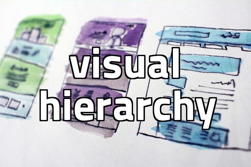
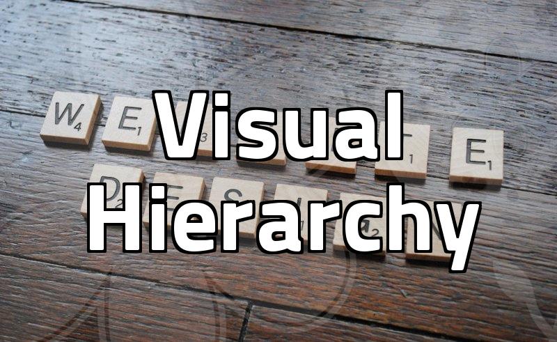
Deconstructing a Visual Hierarchy for Graphic Design
Creating a strong visual hierarchy is fundamental to effective graphic design. It guides the viewer’s eye through the design, ensuring the most important information is noticed first. This isn’t just about making things bigger; it’s a deliberate process involving several interconnected elements. Consider a typical product landing page. The headline needs to grab attention, followed by a compelling image, then key features, and finally a call to action.
Here’s a breakdown of how this is achieved:
- Size and Scale: Larger elements naturally draw more attention. A prominent headline or a striking image will be perceived before smaller text or secondary graphics. For instance, in a brochure, the main offer might be in a 24pt font, while supporting details are in 10pt.
- Color and Contrast: Using contrasting colors for important elements helps them stand out. A vibrant call-to-action button against a muted background is a classic example. The goal is to create focal points that guide the user’s gaze.
- Typography: Font choice, weight, and style play a crucial role. Bold or italicized text can emphasize points, while different font families can distinguish between primary and secondary information. For example, using a sans-serif font for body text and a serif font for headings can create clear distinction.
- Whitespace and Proximity: Strategic use of empty space (whitespace) helps to isolate and draw attention to elements. Grouping related information together (proximity) also creates visual relationships, making the design easier to parse. Leaving ample space around a logo helps it breathe and become more prominent.
Without a clear hierarchy, a design can feel chaotic and overwhelming, leading viewers to disengage. This is a common reason why marketing materials fail to achieve their objectives. For instance, a website where the ‘Add to Cart’ button is hidden amongst other elements will inevitably lead to fewer conversions. Aiming for a hierarchy that aligns with the communication goals is paramount.
Evaluating Graphic Design Tools: A Practical Perspective
When choosing graphic design tools, it’s easy to fall into the trap of ‘feature creep.’ You might look at a program packed with hundreds of functions and think it’s superior. However, from a professional standpoint, the real value lies in how quickly and effectively you can achieve your intended results. I’ve seen designers struggle with overly complex software for simple tasks, essentially treating a scalpel like a hammer. This inefficiency translates directly into lost time and potentially missed opportunities.
For example, if your primary need is creating social media graphics, a tool like Adobe Photoshop might be overkill and have a steep learning curve. A more accessible option like Adobe Express or even Figma, which is primarily a UI design tool but excellent for quick graphics, could be significantly faster. Figma, for instance, allows for easy collaboration and asset management, which are critical in team environments. While industry-standard tools like Adobe Creative Suite offer unparalleled power, they often come with a significant learning investment and cost.
Consider the project scope. If you’re designing a complex brand guide with intricate illustrations and meticulously crafted typography, then investing time in learning Adobe Illustrator and InDesign is justifiable. However, for generating weekly promotional banners or simple infographics, dedicating significant time to mastering these complex tools might not be the most practical use of your limited hours. The decision hinges on balancing capability with usability and speed.
This approach is particularly relevant for smaller teams or individual freelancers where time is the most precious commodity. Investing in tools that streamline workflows, even if they offer slightly less raw power, can be a strategic advantage. For instance, using pre-made templates in platforms like Placeit or Envato Elements can drastically cut down design time for certain projects, allowing you to focus on strategic aspects rather than pixel-pushing.
Ultimately, the best graphic design tool is the one that best serves your specific needs and workflow without becoming a bottleneck. It’s about finding that sweet spot between functionality and efficiency. The common mistake is assuming that more features automatically equate to better design outcomes. This is rarely the case in the real world of deadlines and client demands. The real measure of success is delivering compelling visuals on time and within budget. If you’re unsure where to start with design tools, investigate platforms that offer free trials, allowing you to test their workflow before committing. This practical step helps avoid costly mistakes and wasted time.
This advice is most beneficial for professionals and intermediate designers looking to optimize their workflow and toolset for practical, efficient graphic design output. For absolute beginners, focusing on foundational design principles and perhaps one core software package is often a more manageable starting point.