When vector tracing saves time
Why vector tracing becomes necessary.
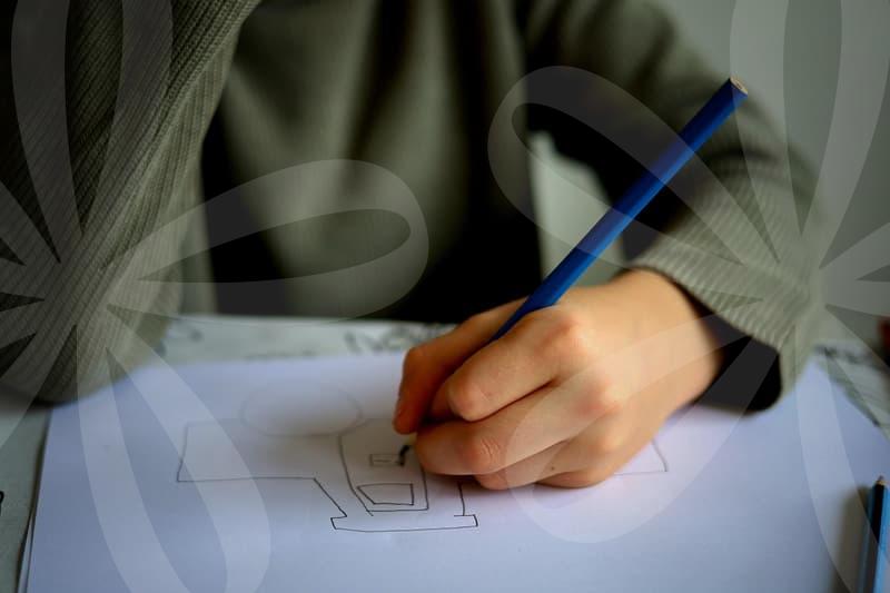
A lot of image work starts with a file that is already compromised. A client sends a logo pulled from an old website header, a scanned stamp from a paper brochure, or a product icon captured from a presentation slide. The image may look acceptable at 300 pixels wide, but the moment it is placed on packaging, signage, or a large web banner, the edges break apart. That is the point where vector tracing stops being a design preference and becomes a production task.
The practical reason is simple. Raster images store color in fixed pixels, while vector artwork stores shapes, curves, and points that can scale without softening. If the final output may be used at 24 pixels on a mobile interface and also at 2400 pixels on a trade show panel, rebuilding it as vector is often the safer route. In day to day work, this is less about visual theory and more about avoiding the awkward moment when a print vendor asks for an editable file and all you have is a blurry PNG.
There is also a hidden cost issue. Spending 20 minutes tracing a simple badge can save two rounds of revision later, especially when colors, stroke widths, or text spacing need adjustment. People often hesitate because tracing feels like redoing work, but in many cases it is the only way to regain control over the asset.
Auto trace or manual path work.
This is where many beginners lose time. Automatic tracing tools look tempting because they promise a one click solution, and for some artwork they are good enough. A flat two color icon, a clean black signature, or a simple silhouette can often be converted in under five minutes with acceptable cleanup.
The problem appears when the source image has compression noise, soft shadows, textured edges, or uneven lighting. Auto trace tends to create too many anchor points, awkward corners, and tiny shape fragments that are hard to edit later. You may finish the trace quickly, then spend 40 minutes cleaning up a result that still feels unstable.
Manual path work is slower at the start but more predictable. If I am tracing a logo that will be reused for packaging, embroidery, and social media templates, I would rather spend 30 to 45 minutes drawing the core geometry by hand. Fewer points usually mean cleaner curves, lighter files, and less trouble when another designer opens the file six months later.
A useful rule is this. If the artwork depends on exact brand shapes, manual tracing is usually the safer choice. If the artwork is decorative and only needs to preserve the general look, auto trace plus cleanup can be enough.
How to trace without making the file messy.
The cleanest vector tracing workflow is less glamorous than people expect. First, inspect the source image at 200 percent or 300 percent zoom and decide what must be preserved. Not every blur, dent, or stain deserves to become a vector path. A damaged scan should not be treated as truth.
Second, separate the artwork into logical parts before drawing. Outer silhouette, internal cutouts, text, and decorative details should be handled in sequence rather than all at once. This prevents the common mistake of building a tangled shape and then fighting with pathfinder tools later.
Third, draw the biggest shapes first with the fewest points you can manage. A smooth curve with four controlled anchors is usually better than one with twelve uncertain ones. If a traced letter or icon feels nervous on screen, it is often because the path contains too many small decisions.
Fourth, correct symmetry, spacing, and line weight before adding minor details. In production, viewers notice imbalance faster than they notice missing texture. Think of it like rebuilding a chair. The first priority is whether it stands straight, not whether the wood grain matches the original scratch for scratch.
Fifth, test the vector at small and large sizes. I usually check around 32 pixels for screen use and then view it at poster scale. If the shape collapses when small or reveals awkward bends when large, the tracing is not finished yet.
What separates usable tracing from bad tracing.
A traced file can look fine in isolation and still fail in real use. One common issue is overfitting to the source image. Designers sometimes copy every defect from a low quality original, including JPEG blocks, warped baselines, and uneven circles. The result is technically faithful but visually weak.
Another issue is false precision. A shape may have mathematically clean paths and still be wrong if the optical balance is off. This happens often with letters, badges, and geometric marks. Two circles may be equal in measurement but feel unequal because surrounding spacing changes how the eye reads them.
There is also the matter of output context. A trace prepared for web graphics may tolerate thinner strokes and tighter detail, while vinyl cutting or laser engraving demands simpler forms and cleaner negative space. Cause and result are direct here. The more fragile the detail, the higher the chance of breakage, fill errors, or poor readability in physical production.
A good trace survives translation. It can be recolored, outlined, resized, exported, or handed to another operator without falling apart. That is a better standard than asking whether it matches the original image pixel for pixel.
Where vector tracing pays off most.
The strongest use cases are not always glamorous branding projects. Restaurant menus, packaging stickers, event backdrops, old company seals, and marketplace product graphics often arrive in rough image form. Someone saved the only copy from a messenger app three years ago, and now it needs to go on a box or a storefront window. That is ordinary work, and vector tracing earns its keep there.
It also matters when teams reuse assets across tools. A traced vector can move from Illustrator to Figma, then into presentation slides, print layouts, and CNC or cutting workflows with less friction. That flexibility matters more than fancy effects when deadlines are tight and the same asset keeps appearing in new formats.
There is a less obvious benefit in collaboration. When the artwork is rebuilt as clean paths, decisions become visible. You can change corner radius, simplify a leaf shape, align text, or standardize stroke width without guessing. A fuzzy raster image invites arguments about what it should be. A well traced vector turns that into an editable decision.
Who should rely on it and who should not.
Vector tracing helps most when the source is limited but the final usage is broad. Brand managers with incomplete archives, in house designers dealing with repeated resize requests, and small businesses preparing print files all benefit from understanding when to trace and when to redraw. If you touch the same logo or icon more than three times in a quarter, rebuilding it as vector is often worth the effort.
Still, not every image should be traced. A complex photograph, painterly illustration, or texture rich artwork can lose its character when forced into vector form. In those cases, careful raster retouching or high resolution recreation may be the better route.
The practical next step is straightforward. Pick one asset you already know is troublesome, preferably a logo or symbol with two to four colors, and trace it cleanly from scratch once. That single exercise usually reveals whether your current problem is image quality, path control, or simply using vector tracing on material that was never suited for it.