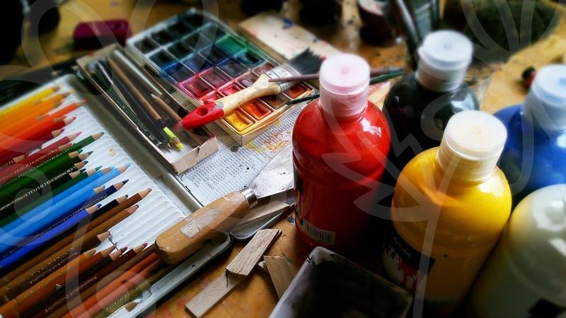
When vector tracing saves a logo
Why vector tracing becomes necessary.
Vector tracing usually enters the conversation at an inconvenient moment. A client sends a 640 pixel logo pulled from an old website header, then asks for a two meter storefront sign by Friday. On screen it may still look acceptable, but the edges break apart the second you enlarge it for print or cut vinyl.
This is where people confuse sharpening with reconstruction. Sharpening can make a small bitmap look crisper for a moment, but it does not rebuild shape logic. Vector tracing does. It converts blurry edge information into paths, curves, anchor points, and fills that can scale from a business card to a delivery truck without turning soft.
In day to day production, the need is rarely dramatic. More often it is a practical cleanup job for menus, packaging marks, app icons, stamp graphics, or charts copied from a slide deck. If the artwork will be resized more than three or four times, sent to print, or handed to a fabricator, tracing stops being optional and starts being the safer route.
Auto trace or manual redraw.
Many people ask the same question first. If software can trace in one click, why spend extra time redrawing? The honest answer is that one click is fast only when the source image is simple, high contrast, and already close to usable.
Automatic tracing works well for black logos, flat icons, and clean signatures scanned at decent resolution. In those cases, ten minutes of threshold adjustment and path cleanup can beat an hour of manual work. A single color emblem with solid edges is often the sweet spot.
The result changes quickly when the source has compression noise, soft shadows, gradients, or anti aliased edges. Auto trace starts inventing shapes that were never part of the design. You end up with hundreds of unnecessary points, lumpy curves, and corners that look nervous rather than intentional.
Manual redraw takes longer, but it gives control where it matters. A traced coffee cup icon might need only 18 anchor points to look balanced, while an automatic trace can generate 140 points for the same silhouette. More points do not mean more accuracy. They usually mean harder editing, heavier files, and worse output on cutters and CNC workflows.
The practical rule is simple. If the artwork is geometric, brand critical, or going into fabrication, manual redraw wins more often than people expect. If it is decorative, temporary, or internal, auto trace with cleanup is often enough.
How a clean vector tracing workflow actually works.
The fastest path is not starting with the trace button. First, inspect the source image at 300 to 400 percent. Check whether the edges are truly blurred, whether colors are separated cleanly, and whether any shape is hidden by shadows or compression blocks. This two minute inspection prevents twenty minutes of repairing bad assumptions.
Next, reduce visual noise before tracing. Convert to grayscale if color is distracting, increase contrast, remove background texture, and isolate the subject. When the source is a logo, I often prepare one black and white version and one original color version, because the black and white file reveals edge structure better.
Then decide what must remain exact and what can be interpreted. Text, circles, and repeated geometric forms should usually be rebuilt, not guessed from pixels. Organic shapes such as brush marks or hand drawn mascots can be traced more freely because a little irregularity belongs to the style.
After that, run a controlled auto trace only if the image qualifies. Keep corner detection and path fitting conservative. A common mistake is pushing detail too high, which creates tiny zigzags along every edge. If the trace produces a shape that looks busy at 800 percent zoom, it will still feel wrong in print even if the viewer cannot name the problem.
The last stage is where professional quality appears. Simplify paths, correct symmetry, align baseline relationships, and test scale. I usually check three sizes: favicon scale, slide deck scale, and large print scale. If the mark holds up in all three, the tracing is doing its job.
Where vector tracing fails people.
Vector tracing is often treated like a rescue tool for any bad image, but there are limits. A low quality photograph of a logo taken at an angle is not just low resolution. It also has lens distortion, lighting shifts, and perspective problems. Tracing that file may produce a usable approximation, but not a faithful master.
Text is another trap. If the original wordmark used a known typeface, tracing the letters from pixels is usually the wrong move. Rebuilding from the font and then adjusting kerning gives a cleaner and legally safer result. Otherwise you can spend an hour tracing letterforms that still look slightly off because one curve was guessed from damaged pixels.
Gradients and lighting effects also create false expectations. A vector file can contain gradients, but tracing a soft glow or metallic shine rarely gives a result worth keeping. It is often better to rebuild the flat base shapes as vector and apply fresh effects afterward, rather than force the tracing engine to translate every tonal transition into dozens of awkward objects.
There is also a business risk people overlook. If the source is someone else’s logo pulled from the web, tracing it does not make it yours. The file becomes cleaner, not freer to use. In client work, this matters more than people admit, especially when a rushed marketing team assumes a cleaned up file solves ownership questions.
Choosing settings is really choosing trade offs.
Every tracing panel promises more control, but most settings reduce to a few trade offs. Higher detail preserves edge variation, yet it also preserves junk. Smoother paths reduce noise, yet they can erase character from hand drawn artwork.
Think of it like translating a sketch into cut metal. If you respect every tiny wobble, the result may look honest up close but unstable from a distance. If you smooth everything, the piece becomes cleaner but may lose the human tension that made the original appealing.
This is why threshold, path fitting, corner angle, and minimum area should not be adjusted randomly. They work as a chain of cause and effect. Raise threshold too much and separate interior gaps close up. Increase corner sensitivity too far and letters start forming spikes. Push minimum area too low and dust becomes design.
A good test is to print the result at the intended size or at least view it on screen at physical size. On a 27 inch monitor, a logo that looks refined at 1200 percent zoom can still feel clumsy when reduced to the size of an app icon. The eye judges rhythm and proportion faster than the software does.
Who benefits most and what to do next.
Vector tracing pays off most for people who reuse graphics across formats: in house marketers, sign shops, product teams, and small business owners sitting on old brand assets. It also helps freelancers who inherit messy files from clients and need output that survives printing, embroidery, or packaging. For these cases, tracing is not about perfection for its own sake. It is about removing risk before the asset spreads into ten more deliverables.
The limitation is straightforward. If the source is too damaged, tracing can only produce an informed reconstruction, not the original truth. That is why some jobs should shift from tracing to redesign after the first inspection, even if redesign feels heavier at first.
If you are unsure whether your file deserves tracing, try one practical test today. Enlarge the artwork to 300 percent, count how many edges still look intentional, and see whether the text can be identified rather than merely recognized. If that test already feels shaky, the better comparison is not vector tracing versus doing nothing. It is vector tracing versus rebuilding the mark properly from scratch.